本文共 30044 字,大约阅读时间需要 100 分钟。
文章目录
进阶学习导图
CSS3新增选择器
CSS3新增盒子属性
圆角边框属性
边框图片属性
盒子阴影属性
盒子背景属性
CSS3渐变属性
线性渐变
重复线性渐变
径向渐变
重复径向渐变
CSS3字体与文本效果
使用字体
文本阴影
文本溢出处理
CSS3 2D/3D变换
平移变换
旋转变换
旋转变换
倾斜变换
prespective属性
变换应用案例
CSS3过渡与动画效果
过渡效果
动画效果
图像滤镜效果
CSS3应用案例
导航条
下拉菜单
响应式图片与媒体查询
关键帧动画
旋转照片墙
轮播图效果
CSS3新增选择器
新增伪类选择器
| 选择器 | 描述 |
|---|---|
| E:not() | 匹配除not()中选择的元素外的所有元素 |
| E:root | 匹配文档所在的根元素,一般是html元素 |
| E:target | 匹配锚点#指向的文档中的具体元素 |
| E:first-child | 匹配父元素下的第一个子元素 |
| E:last-child | 匹配父元素下的最后一个子元素 |
| E:only-child | 如果父元素下仅有一个子元素,则匹配 |
| E:nth-child(n) | 匹配父元素下面的第n个子元素,n从1开始且n可以是表达式 |
| E:nth-last-child(n) | 从后向前匹配父元素下面的第n个子元素 |
| E:first-of-type | 在父元素下面寻找第一个匹配的子元素 |
| E:last-of-type | 在父元素下面寻找最后一个匹配的子元素 |
| E:only-of-type | 匹配父元素的所有子元素中唯一的那个子元素 |
| E:nth-of-last-type(n) | 匹配父元素的第n个子元素 |
| E:nth-of-last-type(n) | 从后往前匹配父元素的第n个子元素 |
| E:empty | 匹配没有任何子元素的元素 |
| E:checked | 匹配用户界面上处于选中状态的元素 |
| E:enabled | E:disabled | 用户选择input的正常状态和不可操作状态 |
| E:read-only | E:read-write | 用户设置input是否只读,或者可读可写 |
E:not() 用于匹配除not()中选择的元素外的所有元素
<!DOCTYPE html><html> <head> <style> p:not(.p3){ background-color: gray;} </style></head><body> <p>p1</p> <p>p2</p> <p class="p3">p3</p></body></html>
E:target用来匹配锚点#指向的文档中的具体元素,即URL后面跟锚点#,指向文档内某个具体的元素,那么该元素就会触发target
<!DOCTYPE html><html> <head> <style> div{ width:100px;height:100px; background-color: gray; } #box1:target{background-color: red;} #box2:target{background-color: red;} </style></head><body> <a href="#box1">box1</a> <a href="#box2">box2</a><div id="box1">box1</div><br><div id="box2">box2</div></body></html>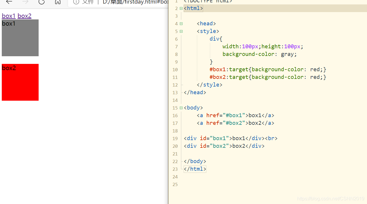
E:first-child表示选择父元素下的第一个子元素,E:last-child表示选择父元素 下最后一个子元素
<!DOCTYPE html><html> <head> <style> .div1 p:first-child{ background-color: gray;} </style></head><body> <div class="div1"><p>p1</p><p>p2</p></div></body></html>
<!DOCTYPE html><html> <head> <style> .div1 p:last-child{ background-color: gray;} </style></head><body> <div class="div1"><p>p1</p><p>p2</p></div></body></html>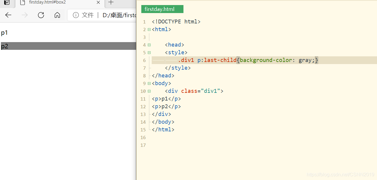
E:nth-child(n)表示选择父元素下的第n个子元素,注意在CSS中n从1开始,且n可以是表达式。E:nth-last-child(n)表示从父元素最后一个元素开始计数,反向选择
<!DOCTYPE html><html> <head> <style> li:nth-child(2n){ background-color: gray;} span:nth-child(odd){ background-color: gray;} p:nth-child(2){ background-color: gray;} </style></head><body><ul><li>1</li><li>2</li><li>3</li><li>4</li><li>5</li><li>6</li></ul><div><span>span1</span><span>span2</span><span>span3</span><span>span4</span><span>span5</span><span>span6</span></div><div><p>p1</p><p>p2</p><p>p3</p></div></body></html>
注意:odd翻译为中文是奇数的,even翻译为中文是偶数的
li:nth-child(2n){ background-color: gray;}等价于
li:nth-child(even){ background-color: gray;}E:only-child表示如果父元素下仅有一个元素,那么该元素被选中
<!DOCTYPE html><html> <head> <style> p:only-child{ background-color: gray;} li:only-child{ background-color: gray;} </style></head><body><div><p>p1</p></div><ul><li>li1</li><li>li2</li></ul></body></html>
E:first-of-type,E:last-of-type,E:only-of-type,E:nth-of-type(n),E:nth-of-last-type(n),只考虑样式中定义的子元素类型,不会受到其他元素的影响
<!DOCTYPE html><html> <head> <style> li:first-of-type{ background-color: gray;} span:first-child{ background-color: gray;} </style></head><body><ul><p></p><li>1</li><li>2</li><li>3</li></ul><div><p>p2</p><span>span1</span><span>span2</span><span>span3</span></div> </div></body></html>
E:empty表示选择没有任何子元素的父元素
<!DOCTYPE html><html> <head> <style> div{ border: black 1px solid; width: 100px; height: 100px; } .box:empty{ background-color:gray; } </style></head><body><div class="box"></div><div class="box"> </div></body></html>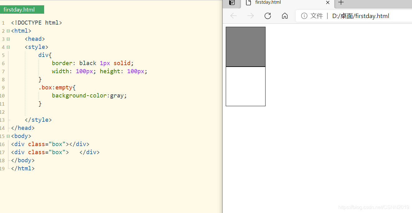
注意点:
box是个类,前面有一个小圆点
E:checked匹配用户界面上处于选中状态的元素E,该选择器主要用于检测表单中单选框或者复选框是否为选中状态
<!DOCTYPE html><html> <head> <style> input:checked+span::after{ content:"这个爱好不错哦";} </style></head><body><h1>爱好</h1>游泳:<input type="checkbox"><span></span><br>登山:<input type="checkbox"><span></span></body></html>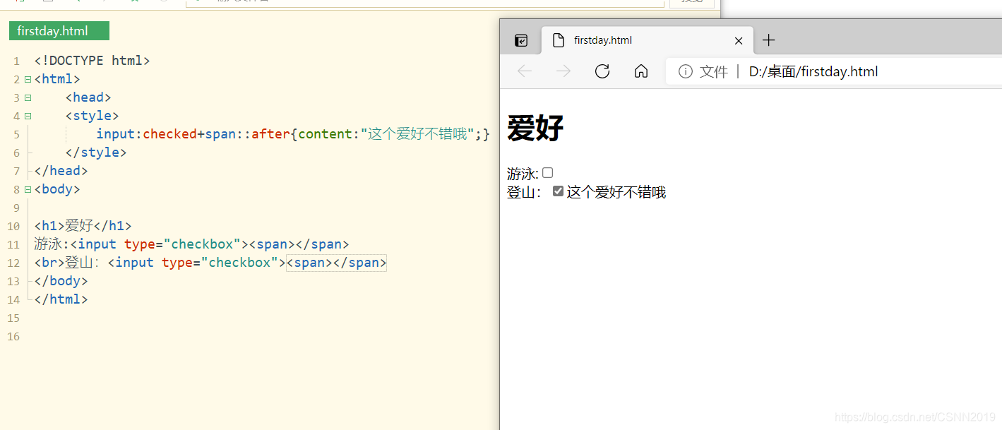
CSS3新增盒子属性
圆角边框属性border-radius
<!DOCTYPE html><html> <head> <style> #rcorner{ border-radius: 25px; border: 2px solid #333333; padding: 20px; width: 200px;height: 150px; } </style></head><body><p id="rcorner">圆角</p></body></html>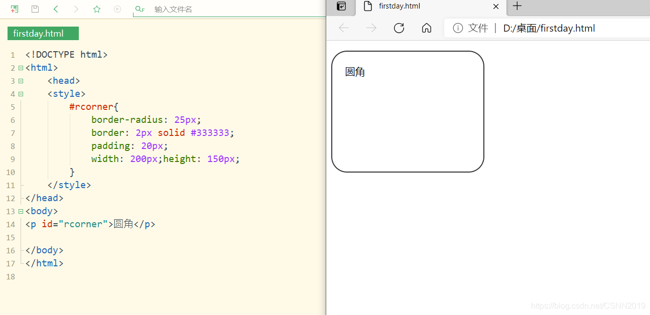
注意
当仅设置一个属性值时,边框的四个角具有相同的大小,如果希望单独设置四个角的圆角效果,可以使用border-top-left-radius,border-top-right-radius,border-bottom-right-radius,border-bottom-left-radius属性设置圆角值
设置不同个数的属性值
四个值:第一个值为左上角,第二个值为右上角,第三个值为右下角,第四个值为左下角
三个值:第一个值为左上角,第二个值为右上角和左下角,第三个值为右下角
两个值:第一个值为左上角与右下角,第二个值为右上角和左下角
一个值:四个圆角值相同
<!DOCTYPE html><html> <head> <style> #rcorner{ border-radius: 15px 50px 30px 5px; border: 2px solid #333333; padding: 20px; width: 200px;height: 150px; } </style></head><body><p id="rcorner">圆角</p></body></html>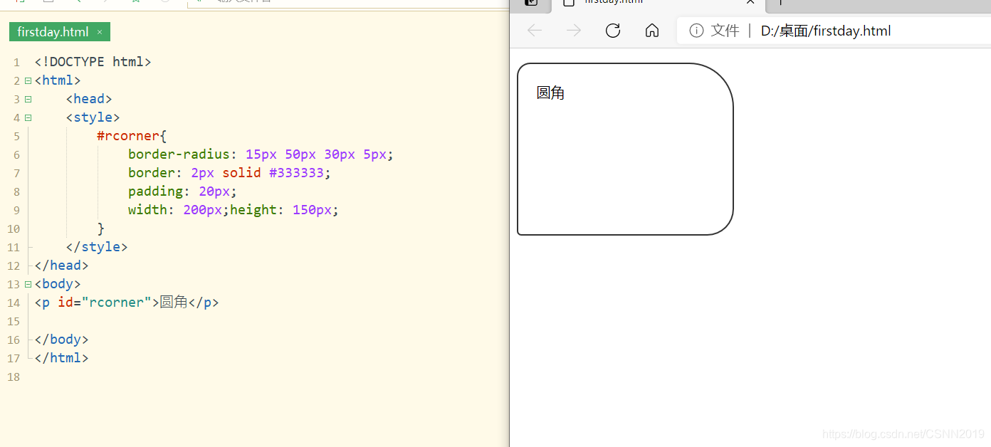
<!DOCTYPE html><html> <head> <style> #rcorner{ border-radius: 15px 50px 30px; border: 2px solid #333333; padding: 20px; width: 200px;height: 150px; } </style></head><body><p id="rcorner">圆角</p></body></html>
<!DOCTYPE html><html> <head> <style> #rcorner{ border-radius: 15px 50px; border: 2px solid #333333; padding: 20px; width: 200px;height: 150px; } </style></head><body><p id="rcorner">圆角</p></body></html>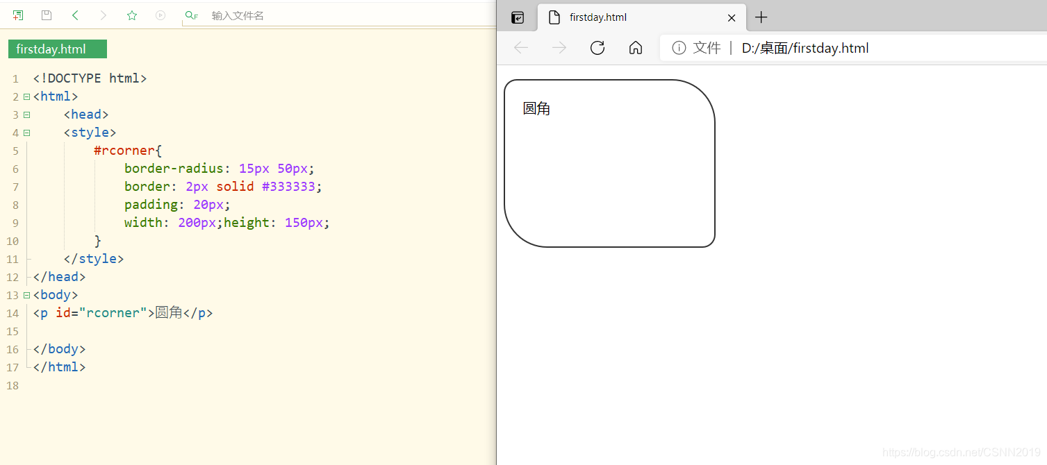
设置椭圆边框效果
第一个数值表示水平半径,第二个数值表示垂直半径
<!DOCTYPE html><html> <head> <style> #rcorner{ border-radius: 50px/15px; border: 2px solid #333333; padding: 20px; width: 200px;height: 150px; } </style></head><body><p id="rcorner">椭圆边框 border-radius:50px/15px</p></body></html>
<!DOCTYPE html><html> <head> <style> #rcorner{ border-radius: 50%; border: 2px solid #333333; padding: 20px; width: 200px;height: 150px; } </style></head><body><p id="rcorner">椭圆边框 border-radius:50%</p></body></html>
图片的圆角效果:
<!DOCTYPE html><html> <head> <style> img{ margin:10px; width: 200px; height: 150px; display: inline-block; } #rcorner1{ border-radius: 10px; } #rcorner2{ border-radius: 50%; } </style></head><body><img id="rcorner1" src="01.jpg">border-radius: 10px</img><img id="rcorner2" src="01.jpg">border-radius: 50%</img></body></html>
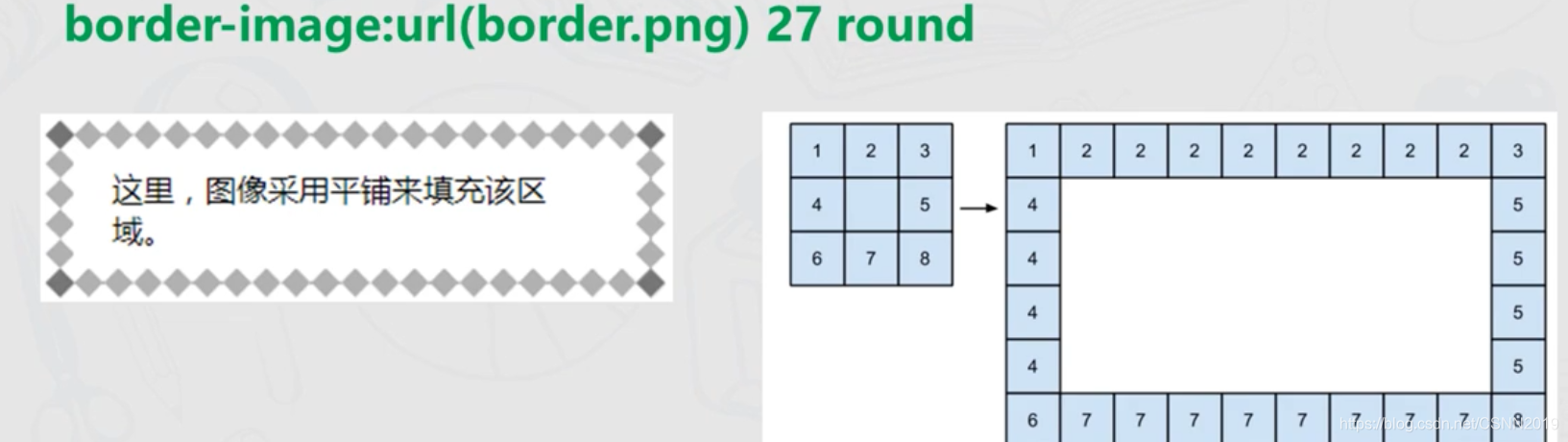
边框图片属性
CSS3中提供了border-image属性,该属性使用了图像填充盒子的边框
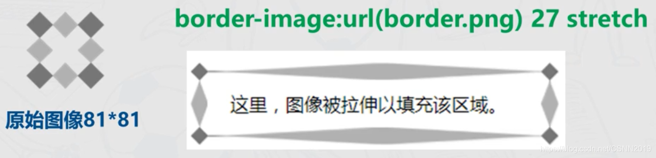
border-image:url(border.png) 30% 35% 40% 30% repeat第一个参数是border-image-source,表示背景图像的url地址;
第二个参数是border-image-slice,表示图片剪裁位置;
表示距离图片上部30%,距离右边35%,距离底部40%,左边30%的地方各裁剪一下,形成了9个分离的区域(图片裁剪九宫格)
border-image:url(border.png) 27 repeat(这里的27指27个像素 )
第三个参数是border-image-repeat.即边框图片的重复性,可取值repeat(重复),round(平铺),Stretch(拉伸),其中Stretch是默认值
border-image:url(border.png) 27 border-image:url(border.png) 27 repeatborder-image:url(border.png) 27 round repeat拉伸示意图:
平铺示意图:
<!DOCTYPE html><html> <head> <style> div{ border:15px solid transparent; width: 250px; padding:10px; } #stretch{ border-image: url(02.jpg) 50 stretch; } #round{ border-image:url(02.jpg) 50 round; } </style></head><body><div id="stretch">图像采取拉伸的方式</div><br><br><br><br><br><div id="round">图像采取平铺的方式</div></body></html>
盒子阴影属性
box-shadow属性用来定义盒子阴影效果
box-shadow:offset-x ,offset-y,blur,spread,color,inset
| 属性值 | 描述 |
|---|---|
| offset-x | 必填项,表示水平阴影的位置,它是相对于x轴的偏移量,取值正负均可,如果是负值则阴影位于元素左边 |
| offset-y | 同样是必填项,表示垂直阴影的位置,它是相对于y轴的偏移量,取值正负均可,如果是负值则阴影位于元素上面 |
| blur | 选填项,表示阴影模糊半径,只能取正值,0位无模糊效果,值越大模糊面积越大,阴影边缘越模糊 |
| spread | 选填项,表示阴影大小,取值正负均可,取正值时,阴影扩大,取负值时,阴影收缩,默认值为0,此时阴影与元素同样大 |
| color | 选填项,表示阴影颜色 |
| inset | 选填项,用于将外部投影(默认 outset)改为内部投影,inset阴影在背景之上内容之下,注意inset可以写在参数的第一个或最后一个,其它位置是无效的 |
纸质样式卡片效果
<!DOCTYPE html><html> <head> <style> div.card{ width: 250px; box-shadow: 0 4px 8px 0 rgba(0,0,0,0.2), 0 6px 20px 0 rgba(0,0,0,0.19); text-align: center; } div.header{ background-color: #4CAF50; color: white; padding: 10px; font-size: 40px; } div.container{ padding: 10px; } </style></head><body><p>box-shadow 属性用来可以创建纸质样式卡片</p><div class="card"> <div class="header"> <h1>1</h1> </div> <div class="container"> <p>January 1,2019</p> </div></div></body></html>
图片卡片阴影效果
<!DOCTYPE html><html> <head> <style> div.polaroid{ width: 250px; box-shadow: 0 4px 8px 0 rgba(0,0,0,0.2), 0 6px 20px 0 rgba(0,0,0,0.19); text-align: center; } div.container{ padding: 10px; } </style></head><body><p>box-shadow 属性用来可以创建卡片样式:</p><div class="polaroid"> <img src="01.jpg" alt="desert" style="width: 100%"> <div class="container"> <p>二次元</p> </div></div></body></html>
盒子背景属性
backgroud-image属性,将多张图片同时设置为背景,不同背景图片用逗号隔开
<!DOCTYPE html><html> <head> <style> #example1{ background-image:url(01.jpg),url(02.jpg); background-position: right bottom,left top; background-repeat: no-repeat,repeat; padding: 15px; } </style></head><body><div id="example1"> <h1>背景图片示例</h1> <p>在CSS3中,我们既可以在背景中设置多张图片,也可以指定每一张背景图片的大小和位置, 另外还可以设置渐变效果作为背景图像。</p></div></body></html>
background-size 指定背景图像的大小,
CSS3以前,背景图像大小是由图像的实际大小决定。
background-size:auto | <长度值> | <百分比> | cover | contain
auto,默认值,不改变背景图片的原始高度和宽度
<长度值>,成对出现,例如80px,60px
<百分比>,例如100% 100%
Cover,覆盖,背景图片等比缩放以填满整个容器
Contain,容纳,背景图片等比缩放至某一边紧贴容器边缘
background-origin属性指定了背景图像的起始区域
background-origin:border-box|padding-box|content-box
当background-attachment属性设置为fixed时,background-origin属性会失效
<!DOCTYPE html><html> <head> <style> div{ border: 1px solid black;padding:35px; background-image:url('02.jpg'); background-repeat:no-repeat; background-position:left; } #div1{background-origin:border-box;} #div2{background-origin:content-box;} </style></head><body> <p>border-box 作为背景图像的起始区域:</p> <div id="div1">背景图像的坐标原点设置在盒模型border-box区域的左上角</div><p>content-box作为背景图像的起始区域:</p><div id="div2">背景图像的坐标原点设置在盒模型border-box区域的左上角</div></body></html>
CSS3渐变属性
渐变效果提供了在两个或多个指定的颜色之间显示平稳的过渡。
CSS3定义了三种类型的渐变:一种是线性渐变(Linear Gradients),根据渐变方向的不同,又分为向下,向上,向左,向右,对角等不同方向的线性渐变;第二种渐变是径向渐变(Radial Gradients),由具有不同半径的圆的重心进行定义;第三种类型为重复渐变,是由单个渐变重复而成。
由于不同浏览器产商在实现渐变标准时,对于渐变方向的定义,角度的定义以及顺时针还是逆时针有所不同,所以在使用渐变时需要添加浏览器前缀。例如,对于Chrome,Safari浏览器,前缀为-webkit-,而火狐浏览器Firefox的前缀为-moz-,Opera浏览器的前缀为-o-
/*Safari*/ background:-webkit-linear-gradient(red,blue) ; /*Opera*/ background:-o-linear-gradient(red,blue) ; /*Firefox或者Chrome*/ background:-moz-linear-gradient(red,blue) ; /*标准的语法,放在最后*/ background:linear-gradient(red,blue) ;线性渐变
background:linear-gradient(direction,color-stop1,color-stop2,……)这里的direction默认是从上往下
<!DOCTYPE html><html> <head> <style> #grad1{ /*标准的语法,放在最后*/ background:linear-gradient(red,blue) ; width: 300px; height: 200px; } </style></head><body> <div id="grad1"></div></body></html>
指定线性渐变的方向(左右,对角线)
左右:
#grad2{ background:-webkit-linear-gradient(left,red,blue); background:-o-linear-gradient(right,red,blue); background:-moz-linear-gradient(right,red,blue); background:linear-gradient(to right,red,blue); }<!DOCTYPE html><html> <head> <style> #grad1{ background:linear-gradient(to right,red,blue) ; width: 300px; height: 200px; } </style></head><body> <div id="grad1"></div></body></html>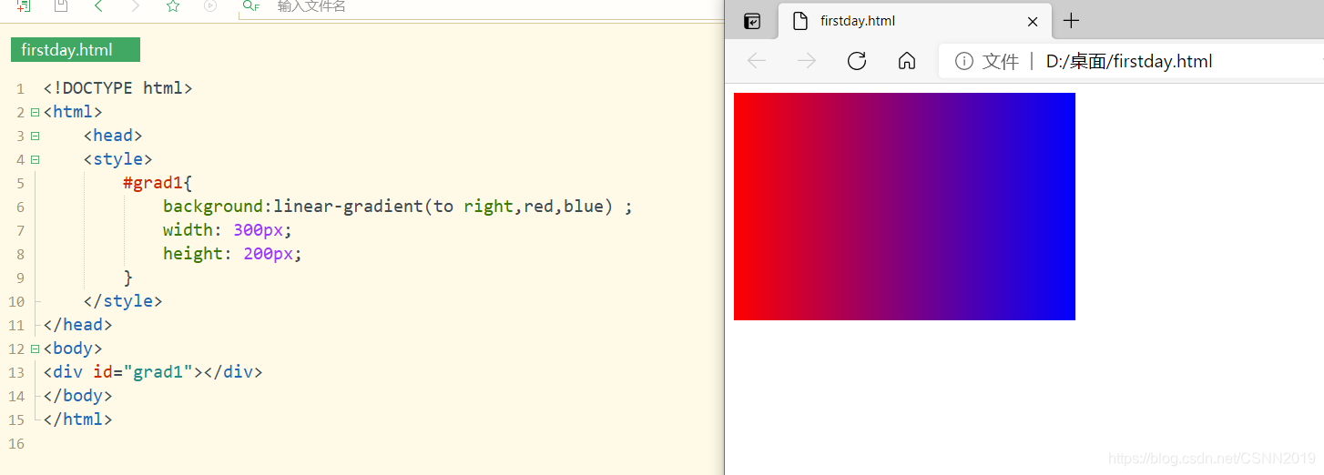
对角线:
#grad3{ background:-webkit-linear-gradient(left top,red,blue); background:-o-linear-gradient(bottom right,red,blue); background:-moz-linear-gradient(bottom right,red,blue); background:linear-gradient(to bottom right,red,blue); }<!DOCTYPE html><html> <head> <style> #grad1{ background:linear-gradient(to bottom right,red,blue) ; width: 300px; height: 200px; } </style></head><body> <div id="grad1"></div></body></html>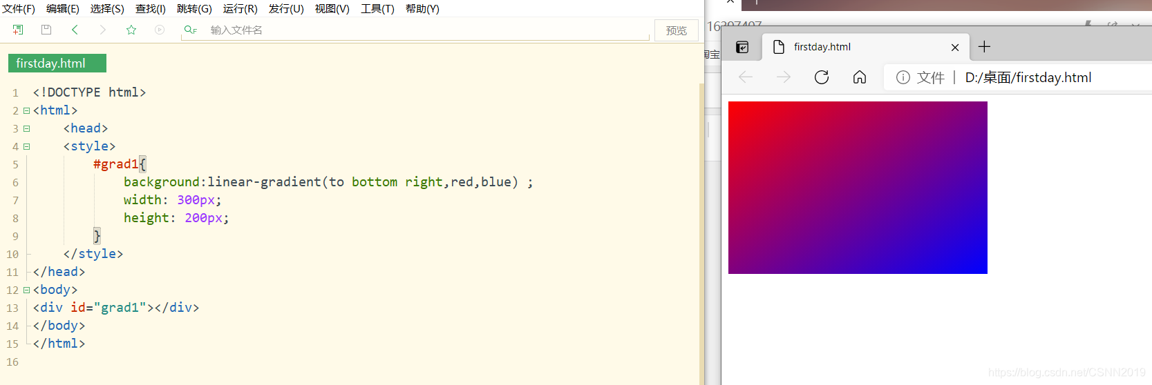
指定线性渐变的方向(指定角度)
标准语法图:

#grad4{ height: 200px; background:-webkit-linear-gradient(90deg,red,blue); background:-o-linear-gradient(0deg,red,blue); background:-moz-linear-gradient(90deg,red,blue); background:linear-gradient(0deg,red,blue); }<!DOCTYPE html><html> <head> <style> #grad1{ background:linear-gradient(0deg,red,blue) ; width: 300px; height: 200px; } </style></head><body> <div id="grad1"></div></body></html>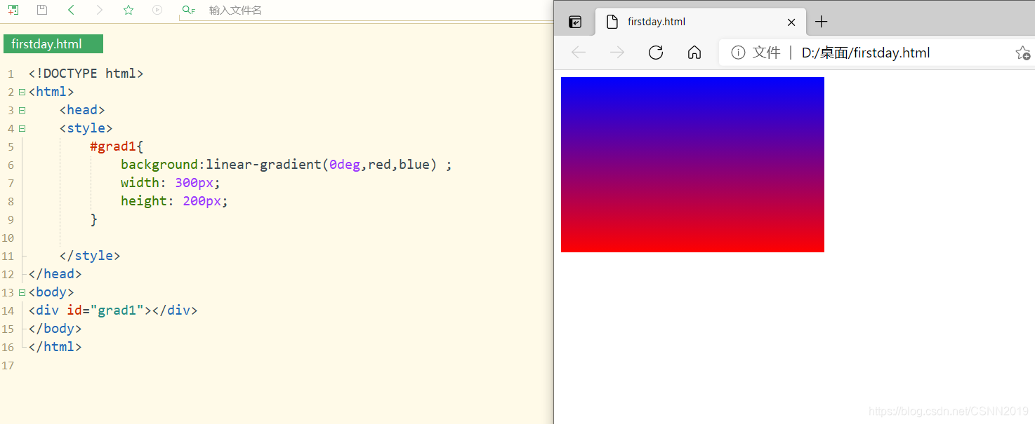
多个颜色过渡节点的线性渐变
#grad5{ height: 200px; background:-webkit-linear-gradient(left,red,orange,yellow,green,blue,indigo,violet); background:-o-linear-gradient(right,red,orange,yellow,green,blue,indigo,violet); background:-moz-linear-gradient(right,red,orange,yellow,green,blue,indigo,violet); background:linear-gradient(to right,red,orange,yellow,green,blue,indigo,violet); }<!DOCTYPE html><html> <head> <style> #grad1{ background:linear-gradient(to right,red,orange,yellow,green,blue,indigo,violet); width: 300px; height: 200px; } </style></head><body> <div id="grad1"></div></body></html>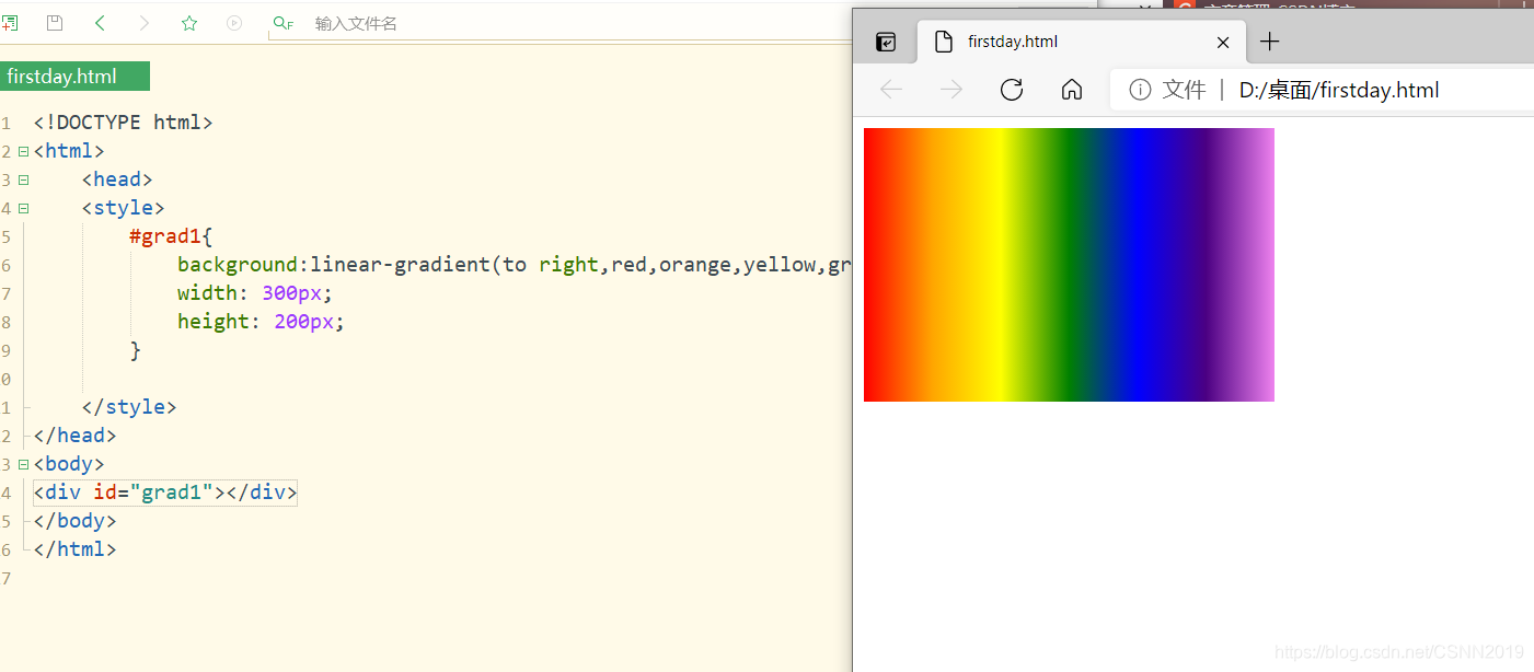
精确控制颜色过渡位置
#grad6{ width: 200px; height: 200px; background:-webkit-linear-gradient(90deg,#f0f 0px,#0ff 50px,#fff 100px); background:-o-linear-gradient(0deg,#f0f 0px,#0ff 50px,#fff 100px); background:-moz-linear-gradient(90deg,#f0f 0px,#0ff 50px,#fff 100px); background:linear-gradient(0deg,#f0f 0px,#0ff 50px,#fff 100px); }<!DOCTYPE html><html> <head> <style> #grad1{ background:linear-gradient(0deg,#f0f 0px,#0ff 50px,#fff 100px); width: 300px; height: 200px; } </style></head><body> <div id="grad1"></div></body></html>
带透明度颜色过渡的线性渐变
#grad6{ width: 200px; height: 200px; background:-webkit-linear-gradient(left,rgba(255,0,0,0),rgba(255,0,0,1)); background:-o-linear-gradient(right,rgba(255,0,0,0),rgba(255,0,0,1)); background:-moz-linear-gradient(right,rgba(255,0,0,0),rgba(255,0,0,1)); background:linear-gradient(to right,rgba(255,0,0,0),rgba(255,0,0,1)); }<!DOCTYPE html><html> <head> <style> #grad1{ background:linear-gradient(to right,rgba(255,0,0,0),rgba(255,0,0,1)); width: 300px; height: 200px; } </style></head><body> <div id="grad1"></div></body></html>
重复线性渐变(repeating-linear-gradient)
举例:
background:repeating-linear-gradient(black,gray 10%,white 15%);黑色渐变到灰色从高度的0%至10%,灰色渐变到白色从高度的10%至15%,然后重复这一渐变
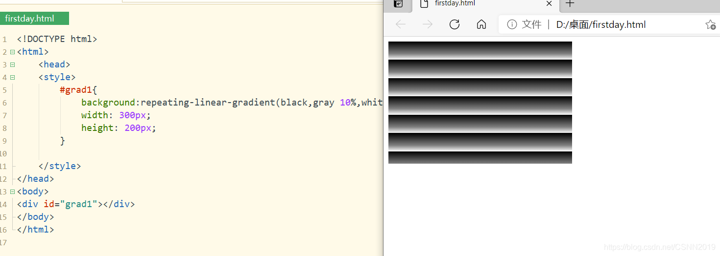
<!DOCTYPE html><html> <head> <style> #grad1{ background:repeating-linear-gradient(black,gray 10%,white 15%); width: 300px; height: 200px; } </style></head><body> <div id="grad1"></div></body></html>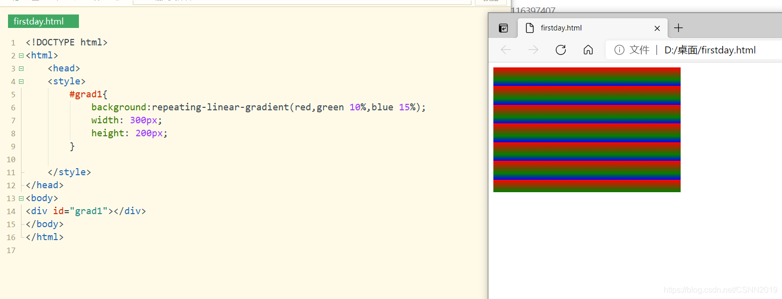
<!DOCTYPE html><html> <head> <style> #grad1{ background:repeating-linear-gradient(red,green 10%,blue 15%); width: 300px; height: 200px; } </style></head><body> <div id="grad1"></div></body></html>径向渐变
径向渐变:
background:radial-gradient(shape [size] at position,start-color,………………,last-color);颜色节点均匀分布的径向渐变
#grad7{ width: 200px; height: 200px; background:-webkit-radial-gradient(red,yellow,green); background:-o-radial-gradient(red,yellow,green); background:-moz-radial-gradient(red,yellow,green); background:radial-gradient(red,yellow,green); }<!DOCTYPE html><html> <head> <style> #grad1{ background:radial-gradient(red,yellow,green); width: 300px; height: 200px; } </style></head><body> <div id="grad1"></div></body></html>
颜色节点不均匀分布的径向渐变
#grad1{ background:radial-gradient(red 5%,yellow 15% ,green 60%); width: 200px; height: 200px;
<!DOCTYPE html><html> <head> <style> #grad1{ background:radial-gradient(red 5%,yellow 15% ,green 60%); width: 200px; height: 200px; } </style></head><body> <div id="grad1"></div></body></html>重复径向渐变
重复径向渐变用于创建重复的径向渐变图像:
background:repeating-radial-gradient(black,white 10%,gray 15%);<!DOCTYPE html><html> <head> <style> #grad1{ background:repeating-radial-gradient(black,white 10%,gray 15%); width: 600px; height: 150px; } </style></head><body> <div id="grad1"></div></body></html>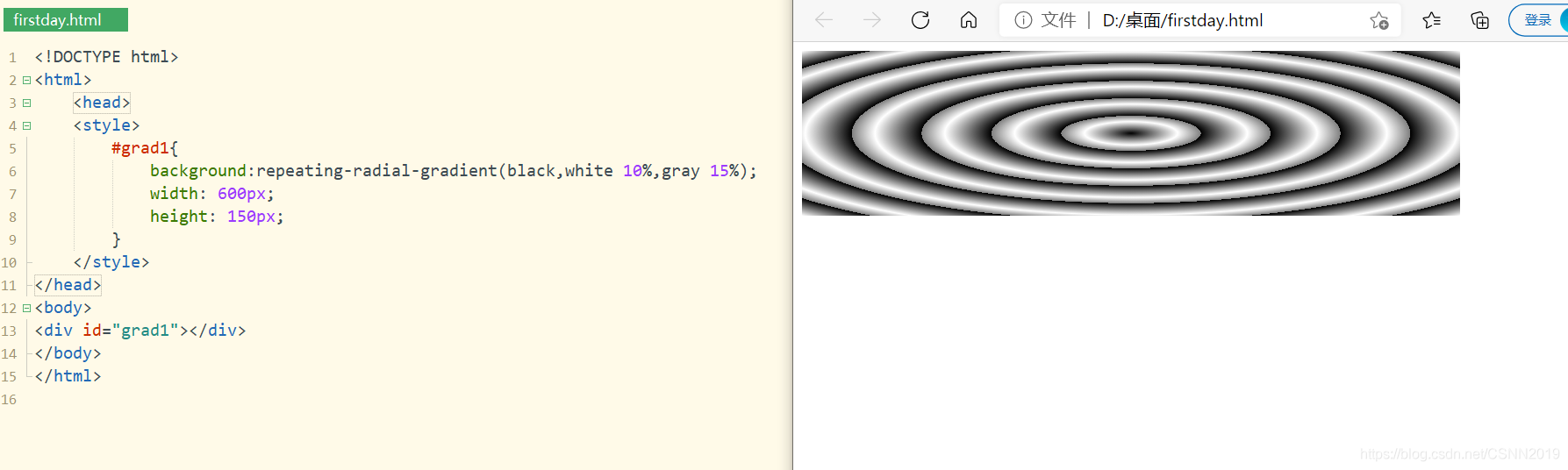
<!DOCTYPE html><html> <head> <style> #grad1{ background:repeating-radial-gradient(red ,yellow 10% ,green 15%); width: 300px; height: 200px; } </style></head><body> <div id="grad1"></div></body></html>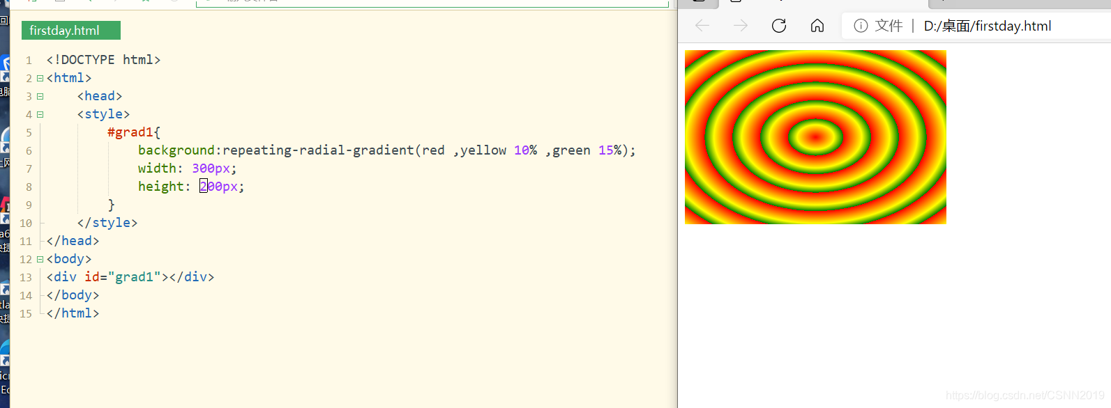
CSS3字体与文本属性
字体简介
使用@font-face加载特定的字符,@font-face语句是CSS中的一个功能模块,是为了解决由于浏览者系统中没有安装字体导致不能显示的问题,用于实现网页字体多样性
@font-face{ font-family:'FZCYS'; src:local('FZYaSongA-B-GB'); src: url('YourWebFontName.eot'); } div{ font-family:FZCYS; }font-family的作用是声明字体变量;src属性定义字体的下载地址,local表示本机地址,url表示网址,当网页加载时会自动从服务器上下载字体文件再显示出来
文本阴影
文本阴影
text-shadow:h-shadow v-shadow blur colorh-shadow水平阴影,v-shadow垂直阴影,它们为必填项,允许为负值;blur为选填项,表示模糊的距离;color为选填项,表示阴影颜色
<!DOCTYPE html><html> <head> <style> h1{ text-shadow: 2px 2px 8px #333;} </style></head><body> <h1>text-shadow with blur effect</h1></body></html>
文本溢出处理
text-overflow指定应向用户如何显示溢出内容
text-overflow:clip|ellipsis|stringclip:裁剪 ellipsis:省略号
<!DOCTYPE html><html> <head> <style> #div1{ width: 200px; background-color:#87CEEB; overflow: hidden; white-space: nowrap;/*文本不自动换行*/ text-overflow: ellipsis; } #div2{ width: 200px; background-color:bisque; overflow: hidden; white-space: nowrap;/*文本不自动换行*/ text-overflow: clip; } </style></head><body> <div id="div1">This is some long text text-overflow</div><br><div id="div2">This is some long text text-overflow</div></body></html>
注意:
text-overflow和overflow必须结合起来使用
CSS3 2D/3D变换
平移变换
translate(x,y)方法,从当前元素位置沿X轴和Y轴移动相应的位移量
transform:translateX(x) transform:translateX(y) transform:translate(100px,30px); -ms-transform:translate(100px,30px);/*IE 9*/ -webkit-transform:translate(100px,30px);/*Safari and Chrome*/<!DOCTYPE html><html> <head> <style> #div1{ width: 150px; height: 75px; border:1px dashed silver; } #div2{ width: 150px;height: 75px; background-color:#eee; transform:translate(100px,30px); } </style></head><body> <div id="div1">原始div</div><div id="div2">平移后的div</div></body></html>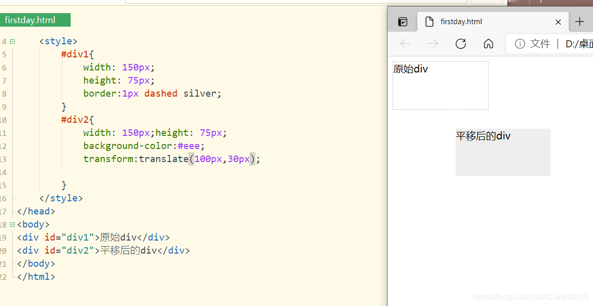
<!DOCTYPE html><html> <head> <style> #div1{ width: 150px; height: 75px; border:1px dashed silver; } #div2{ width: 150px;height: 75px; background-color:#eee; transform:translate(100px,30px); } </style></head><body> <div id="div1">原始div<div id="div2">平移后的div</div></div></body></html>
注意:
div需要嵌套
<div id="div1">原始div<div id="div2">平移后的div</div></div>旋转变换
rotate(angle)将元素对象相对中心原点进行旋转,度数为正值为顺时针旋转,负值为逆时针旋转
-ms-transform:rotate(45deg);/*IE 9*/ -webkit-transform:rotate(45deg);/*Safari and Chrome*/ transform:rotate(45deg);/*标准语法*/<!DOCTYPE html><html> <head> <style> #div1{ margin: 50px; width: 150px; height: 75px; border:1px dashed silver; } #div2{ width: 150px;height: 75px; background-color:#eee; transform:rotate(45deg);/*标准语法*/ } </style></head><body> <div id="div1">原始div<div id="div2">旋转后的div</div></div></body></html>
默认是围绕元素的中心店旋转,也可以使用 tranform-origin属性设置旋转中心点,例如tranform-origin:0 0,使元素的旋转中心为左上角
<!DOCTYPE html><html> <head> <style> #div1{ margin: 50px; width: 150px; height: 75px; border:1px dashed silver; } #div2{ width: 150px;height: 75px; background-color:#eee; transform-origin: 0 0; transform:rotate(45deg);/*标准语法*/ } </style></head><body> <div id="div1">原始div<div id="div2">旋转后的div</div></div></body></html>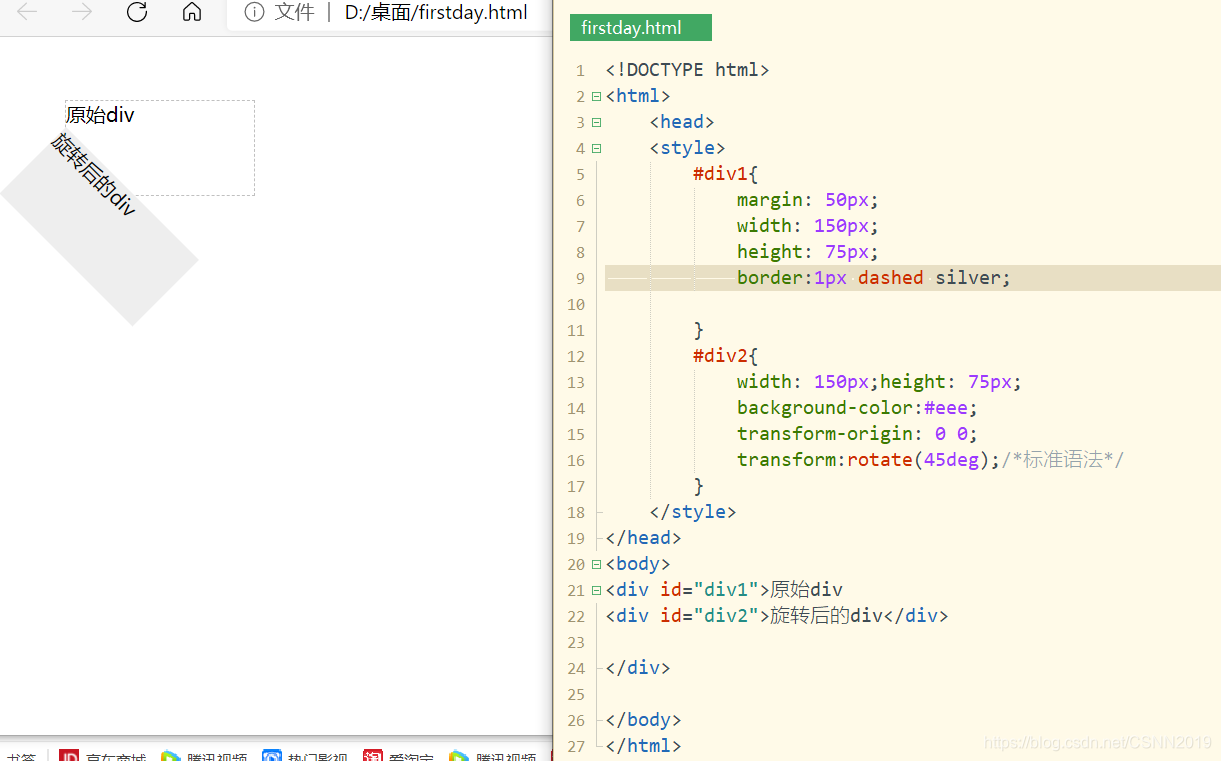
缩放变换
scale(x,y),scaleX(x),scaleY(y)方法,将元素根据中心原点进行缩放,参数可以是正数,负数或小数,默认值为1,取正数表示方法相应的倍数,取小于1的小数值表示缩小相应的倍数,取负数值不会缩小元素,而是翻转元素。
-ms-transform:scale(2,1.5);/*IE 9*/ -webkit-transform: scale(2,1.5);/*Safari*/ transform:scale(2,1.5);/*标准语法*/<!DOCTYPE html><html> <head> <style> #div1{ width: 150px; height: 75px; border:1px dashed silver; } #div2{ margin: 100px; width: 100px;height: 75px; background-color:#eee; transform:scale(2,1.5);/*标准语法*/ } </style></head><body> <div id="div1">原始div<div id="div2">缩放后的div</div></div></body></html>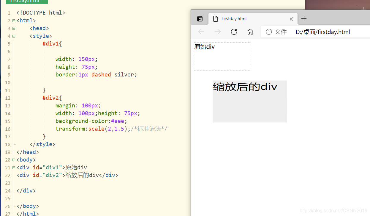
默认是按照中心原点来进行缩放(和旋转一样)
改变缩放的默认点:
transform-origin: 0 0;<!DOCTYPE html><html> <head> <style> #div1{ margin: 100px; width: 150px; height: 75px; border:1px dashed silver; } #div2{ width: 100px;height: 75px; background-color:#eee; transform-origin: 0 0; transform:scale(2,1.5);/*标准语法*/ } </style></head><body> <div id="div1">原始div<div id="div2">缩放后的div</div></div></body></html>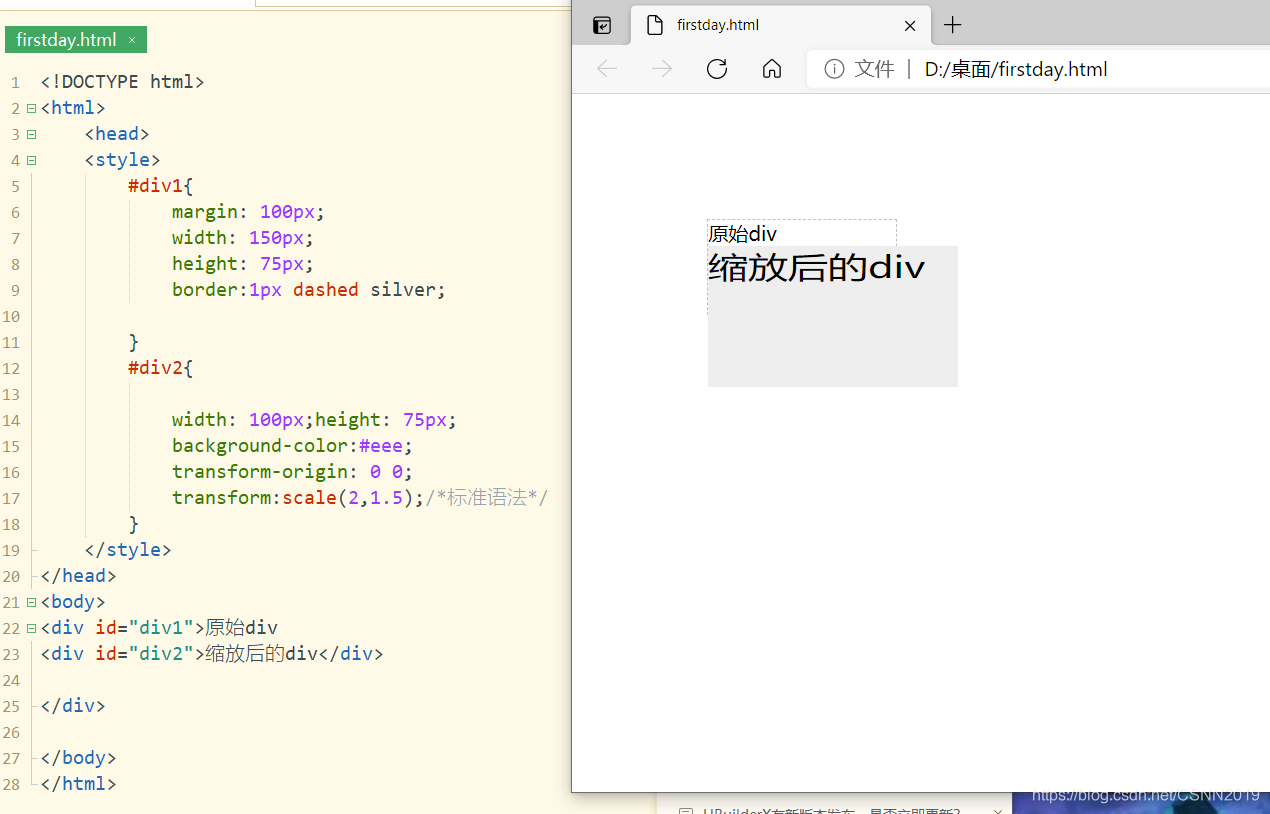
倾斜变换
skew(angle[,angle])(第一个是x方向倾斜的角度,第二个是y方向倾斜的角度)实现元素对象的倾斜显示。参数值表示元素在X轴和Y轴方向上倾斜的角度,如果第二个参数为空,则默认为0;参数取正值,表示元素沿水平或垂直方向,按顺时针倾斜,否则如果取负值,表示元素按逆时针方向倾斜
<!DOCTYPE html><html> <head> <style> #div1{ margin: 100px; width: 200px; height: 100px; border:1px dashed silver; } #div2{ width: 200px;height: 100px; background-color:#eee; transform:skewX(30deg);/*标准语法*/ } </style></head><body> <div id="div1">原始div<div id="div2">倾斜后的div</div></div></body></html>
transform:skewX(0deg);/*标准语法*/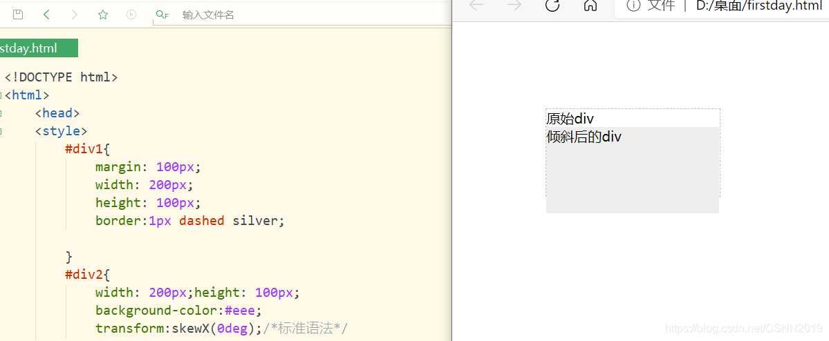
存在倾斜偏差错位的原因呢,完全是因为字的存在:
<!DOCTYPE html><html> <head> <style> #div1{ margin: 100px; width: 200px; height: 100px; border:1px dashed silver; } #div2{ width: 200px;height: 100px; background-color:#eee; transform:skewX(30deg);/*标准语法*/ } </style></head><body> <div id="div1"><div id="div2"></div></div></body></html>
transform:skewX(0deg);/*标准语法*/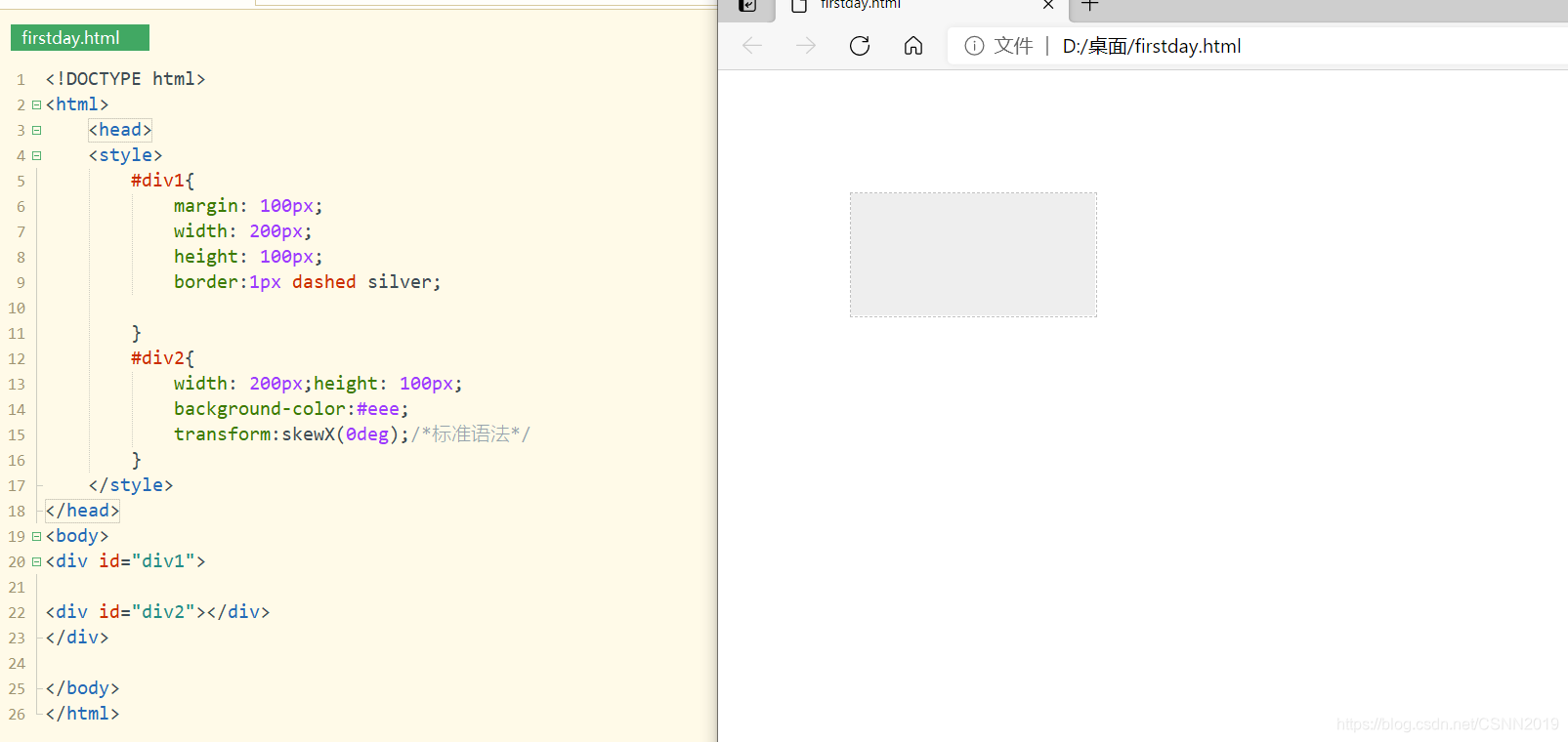
透视变换(开启3D)
perspective属性:定义元素举例视点(人眼)的距离,当元素设置该属性,其子元素会获得透视效果,而不是元素本身
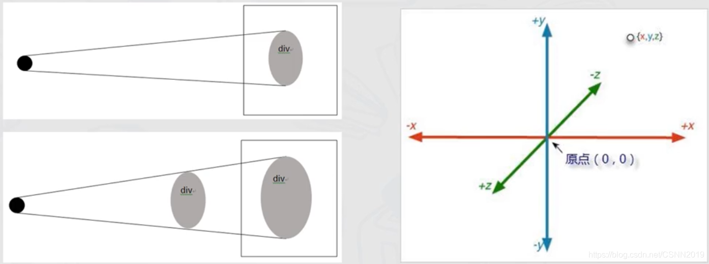
黑色实心点是观察点,即视点,视点到投影平面的距离称为视距。
translate3d(x,y,z),translateZ(z)实现元素在三位空间的平移变换
<!DOCTYPE html><html> <head> <style> #div1{ width: 500px; height: 300px; border:1px solid black; perspective: 600px; } #div2{ margin: 100px 0 0 100px; width: 200px;height: 100px; background-image:url(02.jpg); background-size: cover; transform:translateZ(0px); } </style></head><body> <div id="div1"><div id="div2"></div></div></body></html>
按出F12后,然后按键盘↑或↓对translateZ(0px)进行数据内容的增减

然后就可以对透视变换的一种很直观的展现。
近一步观察
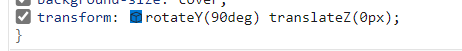
transform:rotateY(0deg) translateZ(0px);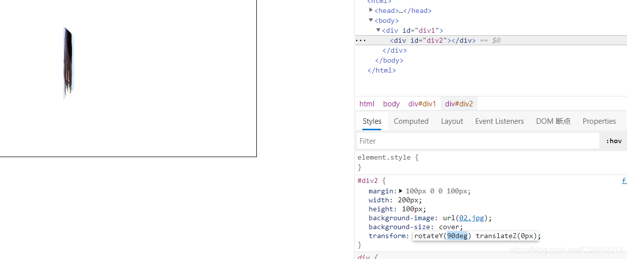
分别对rotateY和translateZ进行数据内容的改变,这样会对透视变换有更加深刻的体会
变换应用案例
<!DOCTYPE html><html> <head> <style> div{ width: 294px; padding:10px 10px 20px 10px ; border:1px solid #BFBFBF; background-color:white ; box-shadow: 2px 2px 3px #aaa; } div.rotate_left{ float: left; transform: rotate(7deg); } div.rotate_right{ float: left; transform: rotate(-8deg); } </style></head><body> <div class="rotate_left"> <img src="01.jpg" width="284" height="213" > <p>二刺螈</p></div><div class="rotate_right"> <img src="02.jpg" width="284" height="213" > <p>二次元</p></div></body></html>
CSS3过渡与动画效果
过渡
过渡transition是元素从一种样式主键改变位另一种的效果
transition: width 2s; -webkit-transition:width 2s;transition:property duration timing-function delay| 值 | 描述 |
|---|---|
| linear | 动画从头到尾的速度是相同的 |
| ease | 默认。动画以低速开始,然后加快,在结束前变慢 |
| ease-in | 动画以低速开始 |
| ease-out | 动画以低速结束 |
| ease-in-out | 动画以低速开始和结束 |
| cubic-bezier(n,n,n,n) | 在cubic-bezier函数中自己的值。可能的值是从0到1的数值 |
<!DOCTYPE html><html> <head> <style> div{ width: 100px; height: 100px; background:red; transition: width 2s; } div:hover{ width: 400px; } </style></head><body> <div class="hover">过渡效果</div></body></html>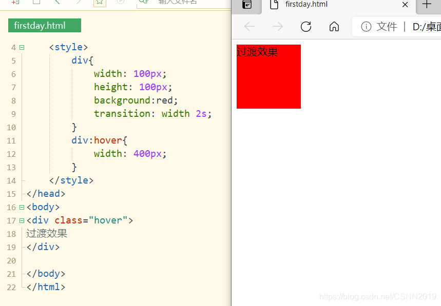

<!DOCTYPE html><html> <head> <style> div{ width: 100px; height: 100px; background:red; transition: width 2s,height 2s,background-color 2s; } div:hover{ width: 400px; height: 400px; background-color:#000000; } </style></head><body> <div class="hover">过渡效果</div></body></html>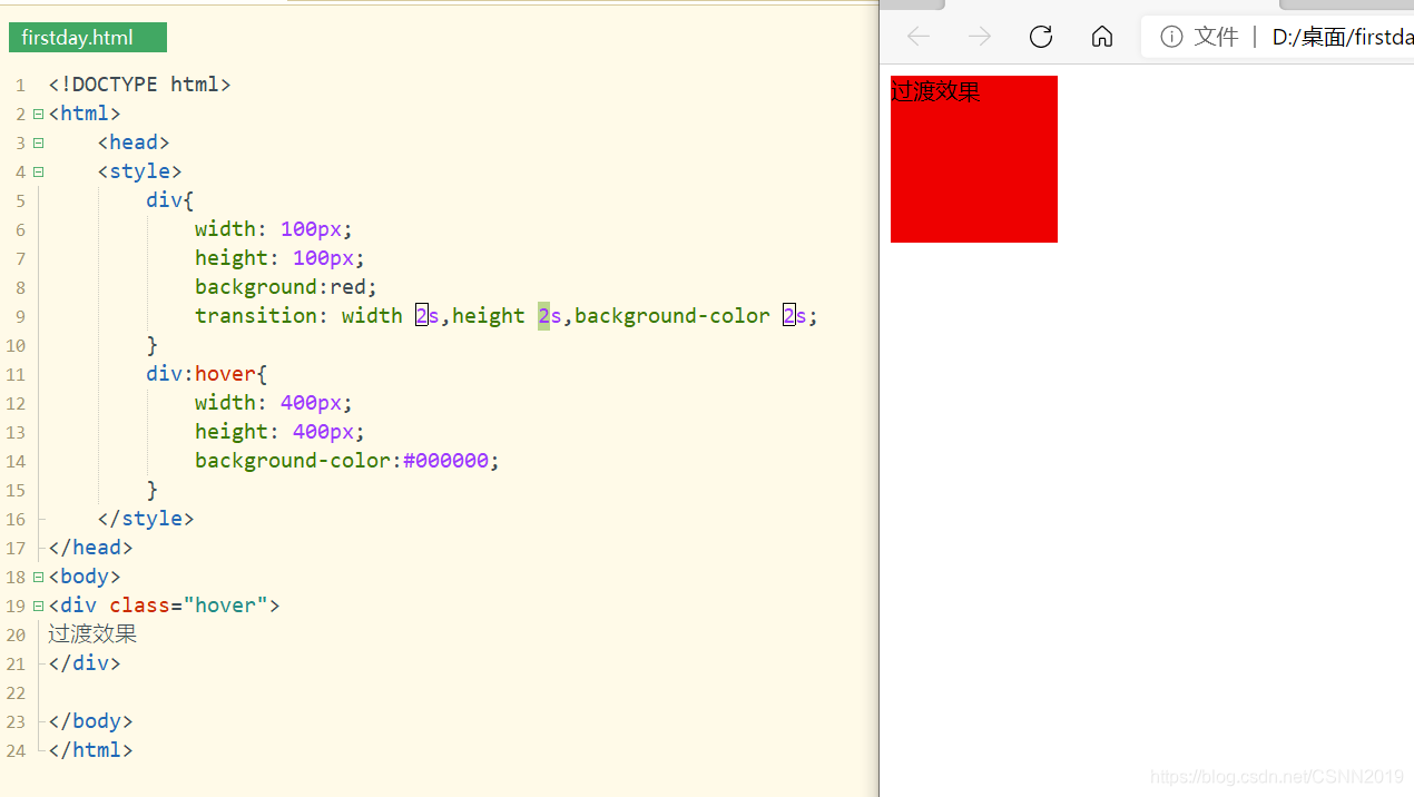

动画效果
动画和过渡一样,是使元素从一种样式变化为另一种样式的效果。
CSS3中使用@keyframes规则创建动画
<!DOCTYPE html><html> <head> <style> @keyframes myfirst{ 0% { background-color: red;} 25% { background-color: yellow;} 50% { background-color: blue;} 100% { background-color: green;} } div{ width: 100px; height: 100px; background:red; animation: myfirst 10s; } </style></head><body> <div class="hover">动画效果</div></body></html>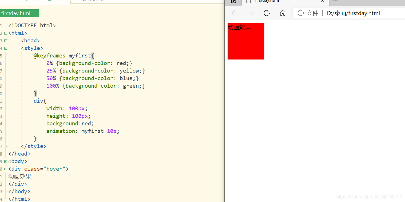
<!DOCTYPE html><html> <head> <style> @keyframes myfirst{ 0% { background-color: red;left:0px;top: 0px;} 25% { background-color: yellow;left:200px;top: 0px;} 50% { background-color: blue;left:200px;top: 200px;} 75% { background-color: green;left:0px;top: 200px;} 100% { background-color: red;left:0px;top: 0px;} } div{ width: 100px; height: 100px; background-color:red; position: relative;/*因为div位置会发生变化*/ animation-name: myfirst; animation-duration: 5s; animation-timing-function:linear; animation-delay: 2s; animation-iteration-count: infinite; animation-direction:alternate; animation-play-state: running; } </style></head><body> <div class="hover">动画效果</div></body></html>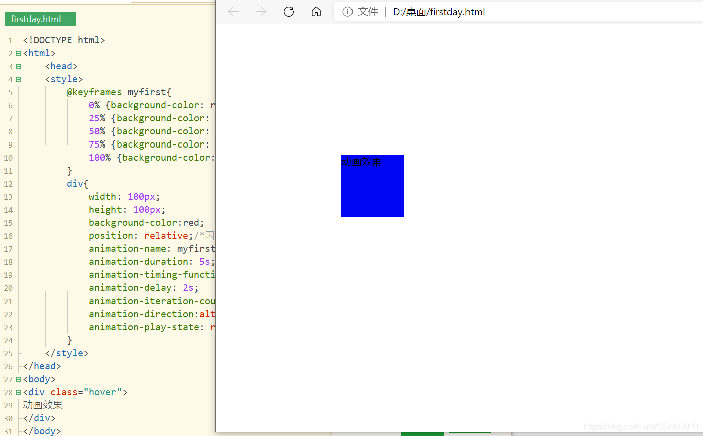
图片过滤效果
filter属性为元素添加可视效果(例如:模糊和饱和度)
<!DOCTYPE html><html> <head> <style> img{ width: 20%; height: auto; float: left; } .blur{ filter: blur(4px);} .brightness{ filter: brightness(150%);} .contrast{ filter: contrast(150%);} .grayscale{ filter: grayscale(100%);} .huerotate{ filter: hue-rotate(180deg);} .invert{ filter: invert(100%);} .opacity{ filter: opacity(90%);} .saturate{ filter: saturate(5);} .sepia{ filter: sepia(100%);} .shadow{ filter: drop-shadow(5px 5px 5px gray);} </style></head><body> <img src="02.jpg"><img class="blur" src="02.jpg"><img class="brightness" src="02.jpg"><img class="contrast" src="02.jpg"><img class="grayscale" src="02.jpg"><img class="huerotate" src="02.jpg"><img class="invert" src="02.jpg"><img class="opacity" src="02.jpg"><img class="saturate" src="02.jpg"><img class="sepia" src="02.jpg"><img class="shadow" src="02.jpg"></body></html>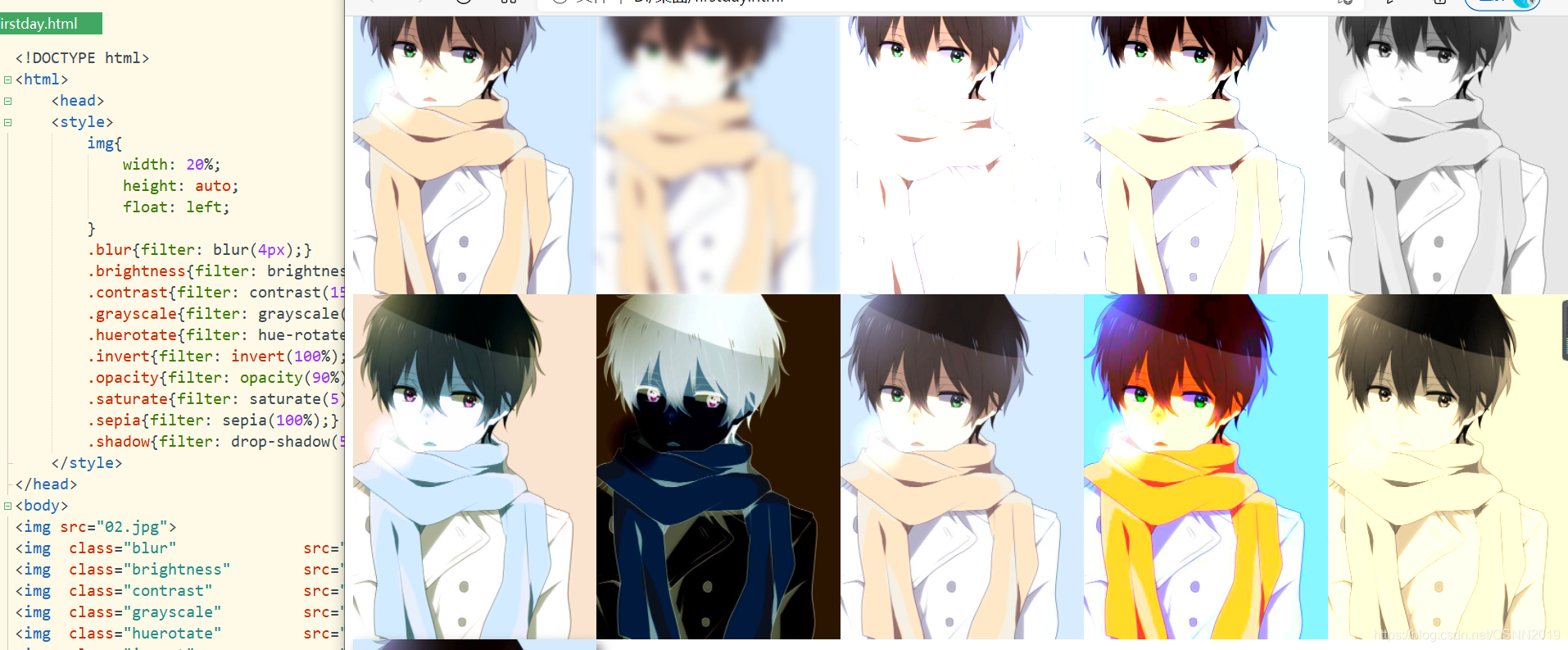

CSS3应用案例
水平导航条
<!DOCTYPE html><html> <head> <style> ul{ list-style-type:none; margin: 0; padding: 0; overflow: hidden; } a:link,a:visited{ display: block; font-weight: bold; color: #FFFFFF; background-color: #98bf21; width:120px; text-align: center; padding:4px; text-decoration: none; text-transform: uppercase; } a:hover,a:active{ background-color:#7A991A; } li.fl{ float: left; } </style></head><body> <p>垂直导航条</p><ul> <li><a href="#">Home</a></li> <li><a href="#">News</a></li> <li><a href="#">Contact</a></li> <li><a href="#">About</a></li></ul><p>水平导航条</p><ul> <li class="fl"><a href="#">Home</a></li> <li class="fl"><a href="#">News</a></li> <li class="fl"><a href="#">Contact</a></li> <li class="fl"><a href="#">About</a></li></body></html>
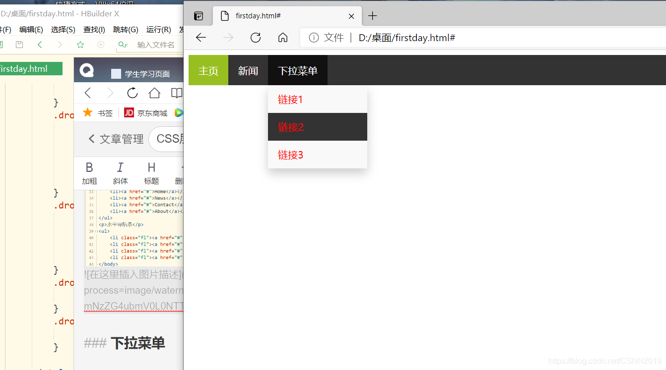
下拉菜单
<!DOCTYPE html><html> <head> <style> ul{ list-style-type:none; margin: 0; padding: 0; overflow: hidden; background-color: #333; } li{ float: left; } li a, .dropbtn{ display: inline-block;/*即具有行内元素的特点,又具有块级元素可调节*/ color: white; text-align: center; padding:14px 16px; text-decoration:none; } li a.active{ background-color: #98bf21; } li a:hover,.dropdown:hover .dropbtn{ background-color: #111; } .dropdown{ display: inline-block; } .dropdown-content{ display: none; position: absolute; background-color: #f9f9f9; min-width: 160px; box-shadow: 0px 8px 16px 0px rgba(0,0,0,0.2); } .dropdown-content a{ color: red; padding: 12px 16px; text-decoration:none; display: block; } .dropdown-content a:hover{ background-color: #333; } .dropdown:hover .dropdown-content{ display: block; } </style></head><body> <ul> <li><a class="active" href="#">主页</a></li> <li><a href="#">新闻</a></li> <div class="dropdown"> <a href="#" class="dropbtn">下拉菜单</a> <div class="dropdown-content"> <a href="#">链接1</a> <a href="#">链接2</a> <a href="#">链接3</a> </div> </div> </ul></body></html>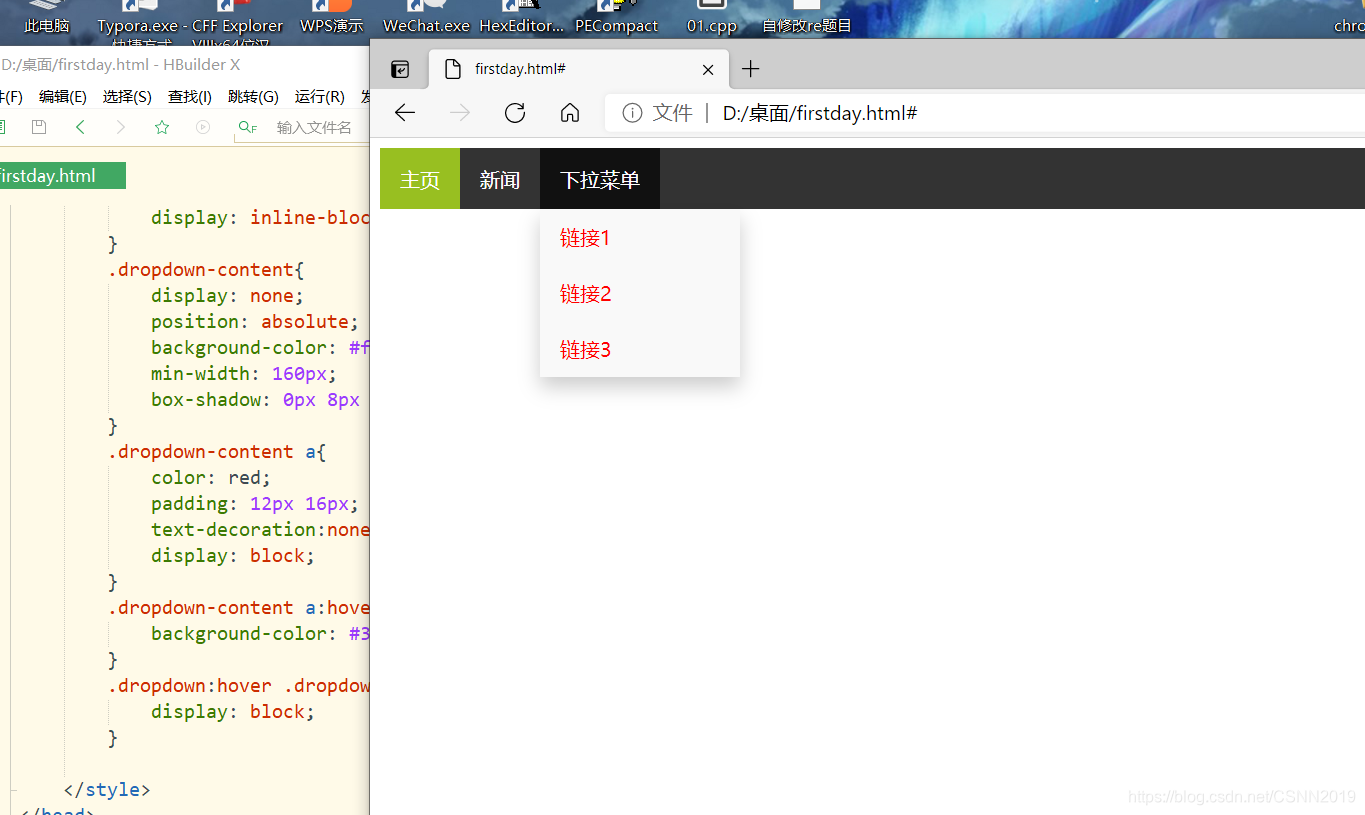
响应式图片与媒体查询
响应式图片
- 响应式图片会自动失配各种尺寸的屏幕
- 通过重置浏览器大小查看效果
<style> img{ max-width: 100%; height: auto; }</style>媒体查询
- 媒体查询@media可用于检测viewport(视窗)的宽度与高度,设备的宽度与高度,朝向(智能手机横屏,竖屏),分辨率等
- 媒体查询由多种媒体组成,可以包含一个或多个表达式,表达式根据条件是否成立返回true或false
基本语法:
@media not|only mediatype and(expressions){ CSS代码……; }例子:
@media screen and(min-width:480px){ body{ background-color:lightgreen; } }在屏幕可是窗口尺寸大于480像素的设备上修改背景颜色
<!DOCTYPE html><html> <head> <style> div.img{ border: 1px solid #ccc; } div.img:hover{ border:1px solid #777 } div.img img{ width: 100%; height:auto; } div.desc{ padding: 15px; text-align: center; } * { box-sizing: border-box; } .responsive{ padding:0 6px; float: left; width: 24.9%; } @media screen and (max-width:700px) { .responsive{ width: 49.9%; margin: 6px 0; } } @media screen and (max-width:500px) { .responsive{ width: 100%; } } </style></head><body> <div class="responsive"> <div class="img"> <img src="02.jpg"> <div class="desc">二刺螈</div> </div></div><div class="responsive"> <div class="img"> <img src="01.jpg"> <div class="desc">二次元</div> </div></div><div class="responsive"> <div class="img"> <img src="03.jpg"> <div class="desc">二刺猿</div> </div></div><div class="responsive"> <div class="img"> <img src="04.jpg"> <div class="desc">二刺螈</div> </div></div></body></html>
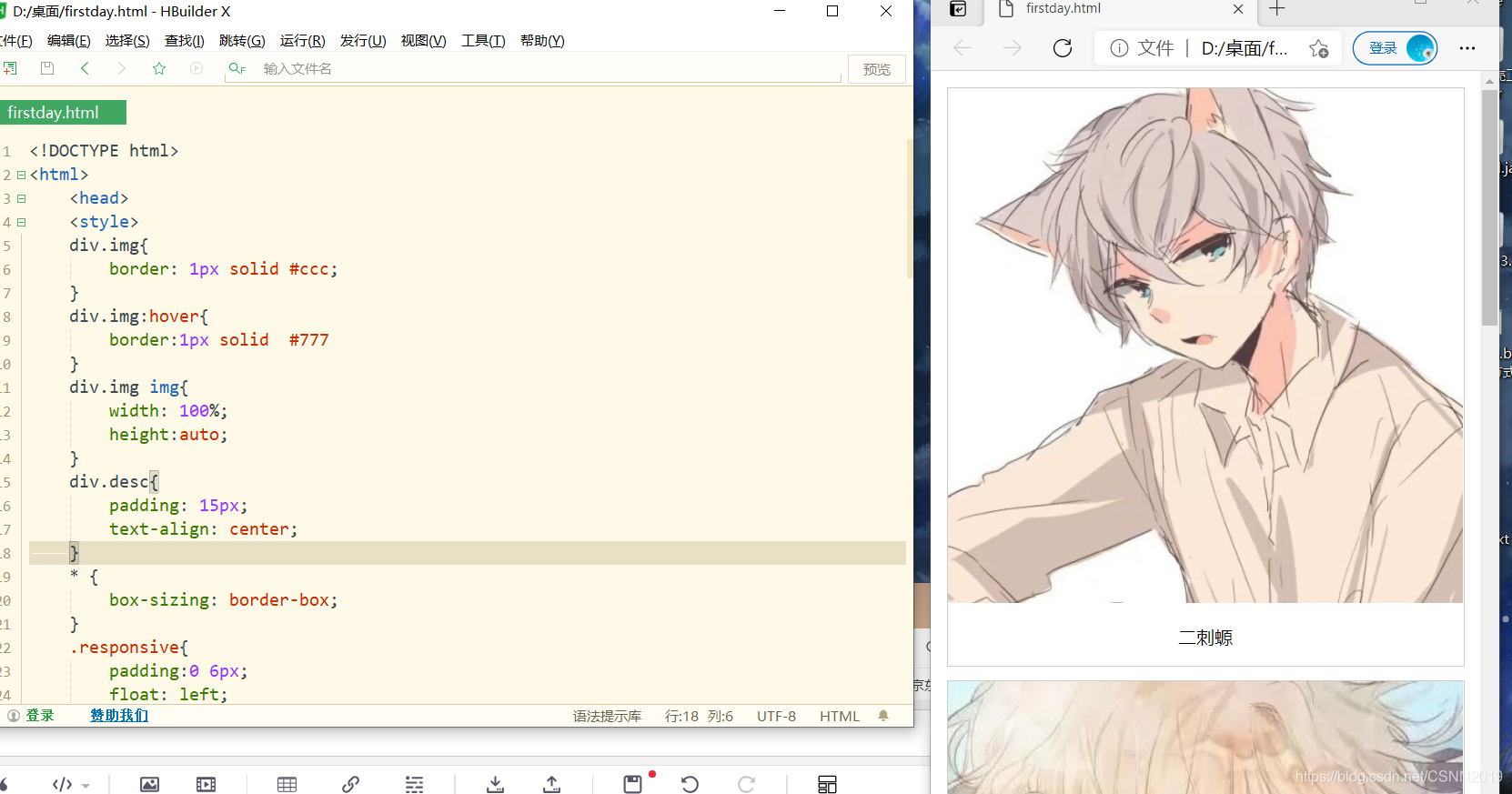

注意:
这里所用到的图片需要同样大小,否则没用。。。。
关键帧同样大小,动画
<!DOCTYPE html><html> <head> <style> @keyframes run{ from { left:0px;} to { left: -2400px;} } .wra{ position: relative; width: 200px; height: 100px; overflow: hidden; } .box{ position:absolute; left: 0; top:0 ; width:2400px; height:100px; background-image: url(horse.png); animation:run 1s steps(12, end) infinite; } </style></head><body> <div class="wra"> <div class="box"></div></div></body></html>
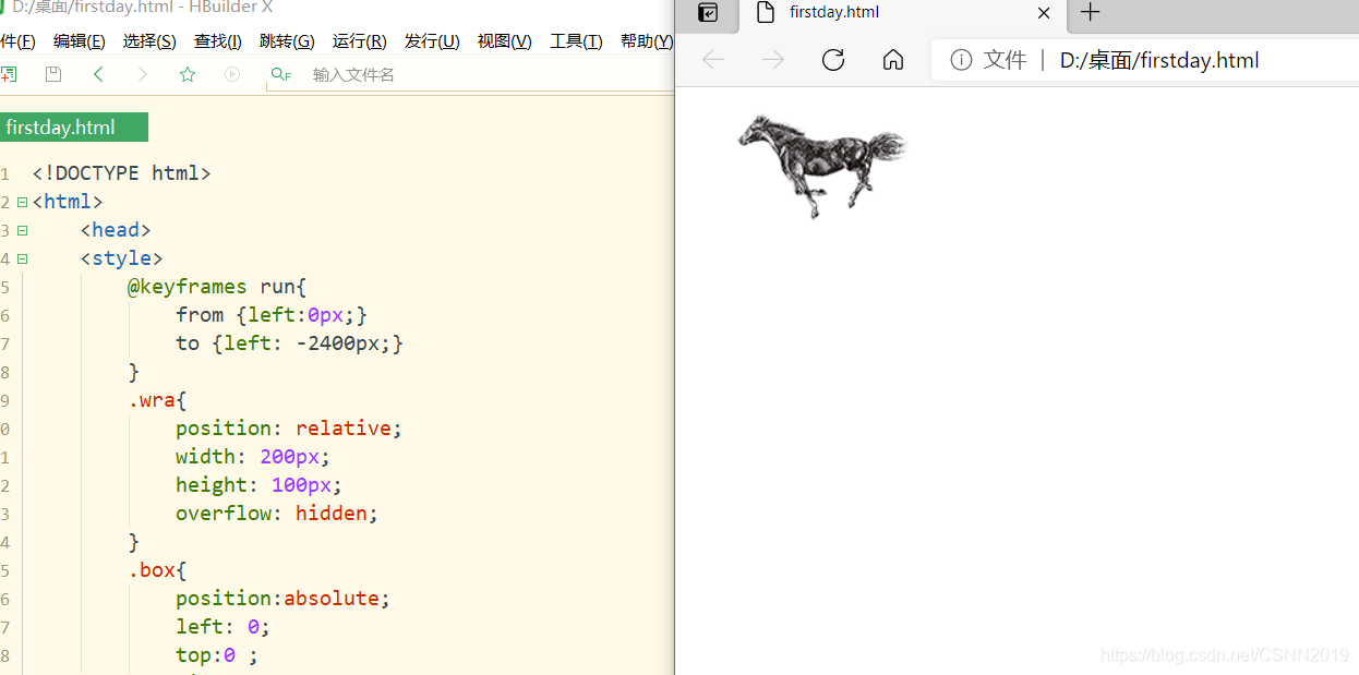
注意:
animation:run 1s steps(12, end) infinite;这里是steps而不是step
steps()是一个timing function,允许将动画或者过渡分割成段,而不是从一种状态持续到另一种状态
steps(<number_of_steps>,<direction>)第一个参数是一个正值,指定动画分割的段数。第二个参数可选,接收start和end两个值,指定在每个间隔的起点或是终点发生阶跃变化,默认为end。start第一帧是动画结束的时候状态;end第一帧是动画开始的时候状态
旋转照片墙
<!DOCTYPE html><html> <head> <style> * { padding: 0; margin: 0; } @keyframes run{ from{ transform:rotateY(0deg);} to{ transform: rotateY(360deg);} } :root,body{ height: 100%; perspective: 1000px; } .wra{ position:absolute; width:200px; height:100px; left: calc(50% - 100px); top: calc(50% - 50px); transform-style:preserve-3d; animation:run 30s linear infinite; } .img{ position:absolute; width:200px; height:100px; } .img:nth-last-of-type(1){ background-image: url(01.jpg); background-size: cover; transform: translateZ(350px); } .img:nth-last-of-type(2){ background-image: url(02.jpg); background-size: cover; transform: rotateY(45deg) translateZ(350px); } .img:nth-last-of-type(3){ background-image: url(03.jpg); background-size: cover; transform: rotateY(90deg) translateZ(350px); } .img:nth-last-of-type(4){ background-image: url(04.jpg); background-size: cover; transform:rotateY(135deg) translateZ(350px); } .img:nth-last-of-type(5){ background-image: url(05.jpg); background-size: cover; transform:rotateY(180deg) translateZ(350px); } .img:nth-last-of-type(6){ background-image: url(06.jpg); background-size: cover; transform:rotateY(225deg) translateZ(350px); } .img:nth-last-of-type(7){ background-image: url(07.jpg); background-size: cover; transform:rotateY(270deg) translateZ(350px); } .img:nth-last-of-type(8){ background-image: url(08.jpg); background-size: cover; transform:rotateY(315deg) translateZ(350px); } </style></head><body> <div class="wra"> <div class="img"></div> <div class="img"></div> <div class="img"></div> <div class="img"></div> <div class="img"></div> <div class="img"></div> <div class="img"></div> <div class="img"></div></div></body></html>
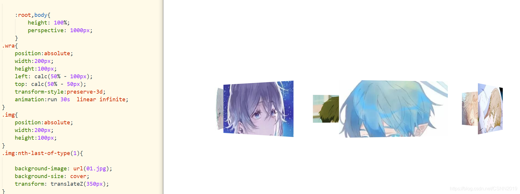
注意
left: calc(50% - 100px);top: calc(50% - 50px);这里是居中图片,- 号左右都需要有空格,否则位置无效
发表评论
最新留言
关于作者
