本文共 27196 字,大约阅读时间需要 90 分钟。
七大布局分别为:线性布局(LInearLayout)、相对布局(RelativeLayout)、帧布局(FrameLayout)、表格布局(TableLayout)、绝对布局(absoluteLayout)、网格布局(GridLayout)、约束布局(ConstraintLayout)
一 线性布局LinearLayout
顾名思义,指的是整个Android布局中的控件摆放方式是以线性的方式摆放的。
属性 android:orientation = “vertical” | “horizontal” 竖直或水平,默认水平
android:orientation控制方向,属性值垂直(vertical)和水平(horizontal),默认水平方向。
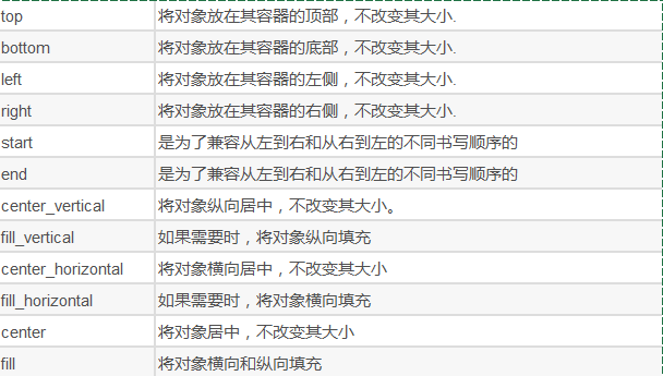
属性 android:gravity = “top”|"center”|“bottom” 相对于父容器的对齐方式
android:gravity:内部控件对齐方式,常用属性值有center、center_vertical、center_horizontal、top、bottom、left、right等。
这个属性在布局组件RelativeLayout、TableLayout中也有使用,FrameLayout、AbsoluteLayout则没有这个属性。
center:居中显示,这里并不是表示显示在LinearLayout的中心,当LinearLayout线性方向为垂直方向时,center表示水平居中,但是并不能垂直居中,此时等同于center_horizontal的作用;同样当线性方向为水平方向时,center表示垂直居中,等同于center_vertical。
top、bottom、left、right顾名思义为内部控件居顶、低、左、右布局。
属性 android:layout_gravity = “top” | “center” | “bottom” 内部的布局方式
layout_gravity是用来设置自身相对于父元素的布局。
属性 android:layout_weidht 使用比例方式执行控件的大小,在手机屏幕适配方面起到非常重要的作用
android:layout_weight:权重,用来分配当前控件在剩余空间的大小。
使用权重一般要把分配该权重方向的长度设置为零,比如在水平方向分配权重,就把width设置为零。
1. 排列方式
- 纵向:
android:orientation="vertical" - 横向:
android:orientation="horizontal"
系统默认采用横向布局
代码只需要修改android:orientation="horizontal"即可。下面为对比代码和对比图:
<?xml version="1.0" encoding="utf-8"?><LinearLayout xmlns:android="http://schemas.android.com/apk/res/android" xmlns:tools="http://schemas.android.com/tools" android:layout_width="match_parent" android:layout_height="match_parent" tools:context=".MainActivity" android:orientation="horizontal"> <!--横向布局--> <ImageView android:layout_width="100dp" android:layout_height="100dp" android:background="@color/colorAccent"/> <ImageView android:layout_width="100dp" android:layout_height="100dp" android:background="@color/colorPrimary"/></LinearLayout>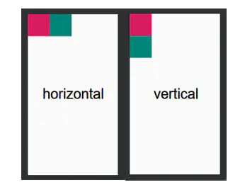
2. 对齐方式
线性布局里有两种设置边距的方式,分别是padding()和margin()。前者规定内边距,后者规定外边距。
<LinearLayout xmlns:android="http://schemas.android.com/apk/res/android" xmlns:tools="http://schemas.android.com/tools" android:layout_width="match_parent" android:layout_height="match_parent" tools:context=".MainActivity" android:orientation="vertical"> <!--横向布局--> <ImageView android:layout_width="100dp" android:layout_height="100dp" android:background="@color/colorPrimary"/> <TextView android:layout_width="300dp" android:layout_height="300dp" android:background="@color/colorAccent" android:paddingStart="150dp" //和左侧的边距 android:paddingTop="50dp" //和顶部的边距 android:text="这是一个子控件" ></TextView> </LinearLayout>
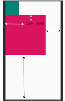
黑色箭头为margin(),白色箭头为padding(),可以看到文字可以和其背景对齐,这一整个文本控件又和界面对齐。线性布局中,各个控件不能重叠。
3. 权重
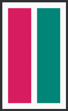
线性布局中可以规定控件的权重,通过android:layout_weight=""实现。下面我们来看一起权重的经典问题。我们先不设置总权重,设置子元素的宽度为0dp。
<?xml version="1.0" encoding="utf-8"?><LinearLayout xmlns:android="http://schemas.android.com/apk/res/android" xmlns:tools="http://schemas.android.com/tools" android:layout_width="match_parent" android:layout_height="match_parent" tools:context=".MainActivity" android:orientation="horizontal"> <!--横向布局--> <ImageView android:layout_width="0dp" android:layout_height="match_parent" android:background="@color/colorPrimary"//果绿色 android:layout_weight="1"/> <ImageView android:layout_width="0dp" android:layout_height="match_parent" android:background="@color/colorAccent"//玫红色 android:layout_weight="2"/></LinearLayout>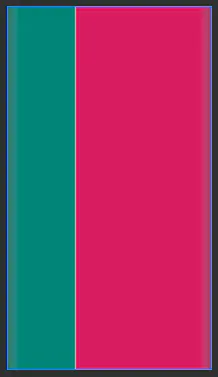
可以看到界面控件的比例与权重相符,再看一下权重超过设定的情况。下面规定总权重为3,子元素宽度都设置为0dp,看看会发生什么?
<?xml version="1.0" encoding="utf-8"?><LinearLayout xmlns:android="http://schemas.android.com/apk/res/android" xmlns:tools="http://schemas.android.com/tools" android:layout_width="match_parent" android:layout_height="match_parent" tools:context=".MainActivity" android:orientation="horizontal" android:weightSum="3"> // 规定总权重为3 <ImageView android:layout_width="0dp" // 设置宽度 android:layout_height="match_parent" android:background="@color/colorPrimary" android:layout_weight="1"/> <ImageView android:layout_width="0dp" // 设置宽度 android:layout_height="match_parent" android:background="@color/colorAccent" android:layout_weight="2"/> <ImageView android:layout_width="0dp" android:layout_height="match_parent" android:background="@color/colorPrimaryDark" android:layout_weight="3"/> </LinearLayout>
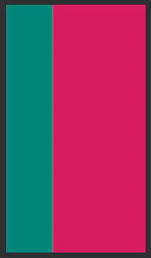
明明我们设置了1:2:3,为什么显示的却是1:2呢?这是因为系统中规定,子权重不能大于总权重,如果大于了,则“先到先得”。这里我们用了横向排列方式,故第一个控件(果绿色)实际权重为1 * (1+2+3) = 1/6,第二个控件(玫红色)的实际权重为2 * (1+2+3) = 2/6超过总权重的控件将不被显示,那么显示的比例就是(1/6) : (2/6)即1 : 2
注意:使用权重时,尽量将控件宽度设置为0dp,否则其比例并不会按其权重显示,那么如何显示呢?这里有一篇文章我觉得讲得挺好的,可以直接看其文字部分。
下面来看看代码:
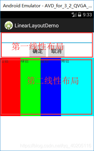
<LinearLayout xmlns:android="http://schemas.android.com/apk/res/android" xmlns:tools="http://schemas.android.com/tools" android:id="@+id/LinearLayout1" android:layout_width="match_parent" android:layout_height="match_parent" android:orientation="vertical" tools:context="${relativePackage}.${activityClass}" > <EditText android:id="@+id/edit" android:layout_width="match_parent" android:layout_height="wrap_content" /> <!-- 第一线性布局 LinearLayout一定要设置方向 android:orientation 值:horizontal 元素水平摆放 | vertical 元素垂直摆放 android:gravity="right"设置对齐方式 --> <LinearLayout android:layout_width="match_parent" android:layout_height="wrap_content" android:orientation="horizontal" android:gravity="center" > <Button android:id="@+id/button" android:layout_width="wrap_content" android:layout_height="wrap_content" android:text="确定"/> <Button android:id="@+id/button1" android:layout_width="wrap_content" android:layout_height="wrap_content" android:text="取消" /> </LinearLayout> <!-- 第二线性布局 --> <LinearLayout android:layout_width="match_parent" android:layout_height="wrap_content" android:orientation="horizontal" > <TextView android:layout_width="wrap_content" android:layout_height="200dp" android:layout_weight="1" android:background="#ff0000" android:text="红色"/> <TextView android:layout_width="wrap_content" android:layout_height="200dp" android:layout_weight="1" android:background="#00ff00" android:text="绿色"/> <TextView android:layout_width="wrap_content" android:layout_height="200dp" android:layout_weight="1" android:background="#0000ff" android:text="蓝色"/> <TextView android:layout_width="wrap_content" android:layout_height="200dp" android:layout_weight="2" android:background="#00ffff" android:text="青色"/> </LinearLayout></LinearLayout>
二 相对布局RelativeLayout
在相对布局中,可以方便地设置控件间的间距等。它在MarginLayout的基础上,添加了对齐方法——layout_alignBottom="@+id/iv"。对齐指的是和其他控件对齐。
下面是一些简单的属性:
通过相对布局,可以实现控件的重叠。当控件大量重叠时,用相对布局更加方便。
相对布局可以让子控件相对于兄弟控件或父控件进行布局,可以设置子控件相对于兄弟控件或父控件进行上下左右对齐。
RelativeLayout能替换一些嵌套视图,当我们用LinearLayout来实现一个简单的布局但又使用了过多的嵌套时,就可以考虑使用RelativeLayout重新布局。
相对布局就是一定要加Id才能管理。
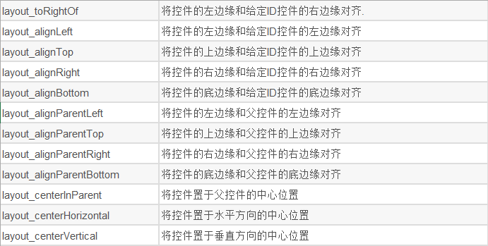
RelativeLayout中子控件常用属性:
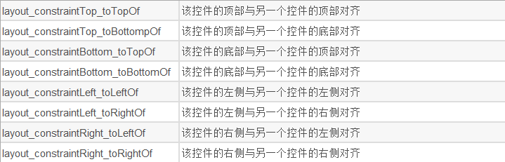
1、相对于父控件,例如:android:layout_alignParentTop=“true”
android:layout_alignParentTop 控件的顶部与父控件的顶部对齐;
android:layout_alignParentBottom 控件的底部与父控件的底部对齐;
android:layout_alignParentLeft 控件的左部与父控件的左部对齐;
android:layout_alignParentRight 控件的右部与父控件的右部对齐;
2、相对给定Id控件,例如:android:layout_above=“@id/**”
android:layout_above 控件的底部置于给定ID的控件之上;
android:layout_below 控件的底部置于给定ID的控件之下;
android:layout_toLeftOf 控件的右边缘与给定ID的控件左边缘对齐;
android:layout_toRightOf 控件的左边缘与给定ID的控件右边缘对齐;
android:layout_alignBaseline 控件的baseline与给定ID的baseline对齐;
android:layout_alignTop 控件的顶部边缘与给定ID的顶部边缘对齐;
android:layout_alignBottom 控件的底部边缘与给定ID的底部边缘对齐;
android:layout_alignLeft 控件的左边缘与给定ID的左边缘对齐;
android:layout_alignRight 控件的右边缘与给定ID的右边缘对齐;
3、居中,例如:android:layout_centerInParent=“true”
android:layout_centerHorizontal 水平居中;
android:layout_centerVertical 垂直居中;
android:layout_centerInParent 父控件的中央;
<?xml version="1.0" encoding="utf-8"?><RelativeLayout xmlns:android="http://schemas.android.com/apk/res/android" xmlns:tools="http://schemas.android.com/tools" android:layout_width="match_parent" android:layout_height="match_parent" tools:context=".MainActivity" android:orientation="horizontal" android:weightSum="3"> <View android:id="@+id/v1" android:layout_width="300dp" android:layout_height="200dp" android:background="@color/colorPrimaryDark" /> <View android:layout_width="100dp" android:layout_height="100dp" android:background="@color/colorAccent" android:layout_alignRight="@id/v1" android:layout_alignBottom="@id/v1" android:layout_marginRight="50dp"/> </RelativeLayout>

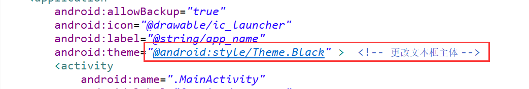
版本低了,文本框可以在AndroidManifest.xml里更改主体:
下面来看看代码:
<RelativeLayout xmlns:android="http://schemas.android.com/apk/res/android" xmlns:tools="http://schemas.android.com/tools" android:layout_width="match_parent" android:layout_height="match_parent" android:padding="10dp" tools:context="${relativePackage}.${activityClass}" > <TextView android:id="@+id/text1" android:layout_width="wrap_content" android:layout_height="wrap_content" android:layout_alignBaseline="@+id/et1" android:text="@string/username" /> <EditText android:id="@+id/et1" android:layout_width="match_parent" android:layout_height="wrap_content" android:layout_toRightOf="@id/text1" android:layout_marginTop="23dp" android:inputType="text" android:maxLines="12" android:hint="用户名" /> <TextView android:id="@+id/text2" android:layout_width="wrap_content" android:layout_height="wrap_content" android:layout_alignBaseline="@+id/et2" android:text="@string/pwd" /> <EditText android:id="@+id/et2" android:layout_width="match_parent" android:layout_height="wrap_content" android:layout_below="@id/et1" android:layout_marginTop="23dp" android:inputType="text" android:maxLines="12" android:layout_toRightOf="@id/text2" android:hint="密码" /> <Button android:id="@+id/button1" android:layout_width="100dp" android:layout_height="wrap_content" android:layout_alignBaseline="@+id/button2" android:layout_alignBottom="@+id/button2" android:layout_marginRight="14dp" android:layout_toLeftOf="@+id/button2" android:text="登录" /> <Button android:id="@+id/button2" android:layout_width="100dp" android:layout_height="wrap_content" android:layout_alignRight="@+id/et2" android:layout_below="@+id/et2" android:layout_marginTop="23dp" android:text="退出" /> </RelativeLayout>
三、FrameLayout(框架布局/帧布局)
据说这种布局方式在六大布局中最为简单,这个布局直接在屏幕上开辟出一块空白的区域,当我们往里面添加控件的时候,会默认把他们放到这块区域的左上角,而这种布局方式却没有任何的定位方式,所以它应用的场景并不多。
| 属性 | 作用 |
|---|---|
| android:foreground | 设置改帧布局容器的前景图像 |
| android:foregroundGravity | 设置前景图像显示的位置 |
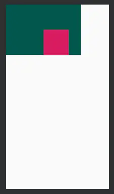
<?xml version="1.0" encoding="utf-8"?><FrameLayout xmlns:android="http://schemas.android.com/apk/res/android" xmlns:tools="http://schemas.android.com/tools" android:layout_width="match_parent" android:layout_height="match_parent" xmlns:app="http://schemas.android.com/apk/res-auto" tools:context=".MainActivity" android:foreground="@drawable/test" // 前景图片 android:foregroundGravity="right|bottom"> <ImageView android:layout_width="300dp" android:layout_height="300dp" android:background="@color/colorPrimaryDark"/> <ImageView android:layout_width="200dp" android:layout_height="200dp" android:background="@color/colorAccent"/> <ImageView android:layout_width="100dp" android:layout_height="100dp" android:background="@color/colorPrimary"/></FrameLayout>
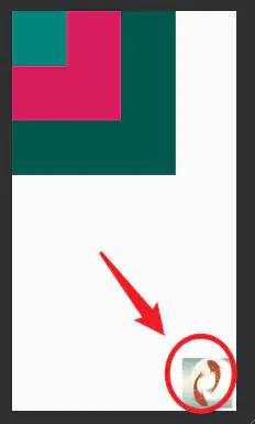
三个ImageView设置不同大小与背景色,依次覆盖,接着右下角的是前景图像,通过 android:foreground="@drawable/logo"设置前景图像的图片
android:foregroundGravity="right|bottom"设置前景图像的位置在右下角。
层布局主要应用就是地图方面。
上面有三层颜色,点击下面的案列上面会出现对应的样式

activity_main.xml中代码:
<LinearLayout xmlns:android="http://schemas.android.com/apk/res/android" xmlns:tools="http://schemas.android.com/tools" android:id="@+id/LinearLayout1" android:layout_width="match_parent" android:layout_height="match_parent" android:orientation="vertical" tools:context="${relativePackage}.${activityClass}" > <FrameLayout android:id="@+id/frame" android:layout_width="match_parent" android:layout_margin="20dp" android:layout_height="wrap_content" > <TextView android:id="@+id/text1" android:layout_width="match_parent" android:layout_height="300dp" android:background="#0000ff" /> <TextView android:id="@+id/text2" android:layout_width="match_parent" android:layout_height="300dp" android:background="#00ff00" /> <TextView android:id="@+id/text3" android:layout_width="match_parent" android:layout_height="300dp" android:background="#ff0000" /> </FrameLayout> <LinearLayout android:id="@+id/linear" android:layout_width="match_parent" android:layout_height="wrap_content" android:orientation="horizontal" > <Button android:id="@+id/button1" android:layout_width="wrap_content" android:layout_height="wrap_content" android:layout_weight="1" android:layout_marginLeft="20dp" android:background="#0000ff" android:text="颜色1"/> <Button android:id="@+id/button2" android:layout_width="wrap_content" android:layout_height="wrap_content" android:layout_weight="1" android:layout_marginRight="20dp" android:layout_marginLeft="20dp" android:background="#00ff00" android:text="颜色2"/> <Button android:id="@+id/button3" android:layout_width="wrap_content" android:layout_height="wrap_content" android:layout_weight="1" android:background="#ff0000" android:layout_marginRight="20dp" android:text="颜色3"/> </LinearLayout> </LinearLayout>MainActivity.java中代码:
public class MainActivity extends Activity { private FrameLayout frame; private TextView text1; private TextView text2; private TextView text3; private Button button1; private Button button2; private Button button3; private OnClickListener listener = new OnClickListener() { @Override public void onClick(View v) { switch (v.getId()) { case R.id.button1: //删除 frame.removeView(text1); //创建 frame.addView(text1); break; case R.id.button2: frame.removeViewInLayout(text2); frame.addView(text2); break; case R.id.button3: frame.removeViewInLayout(text3); frame.addView(text3); break; default: break; } } }; @Override protected void onCreate(Bundle savedInstanceState) { super.onCreate(savedInstanceState); setContentView(R.layout.activity_main); frame = (FrameLayout) findViewById(R.id.frame); text1 = (TextView) findViewById(R.id.text1); text2 = (TextView) findViewById(R.id.text2); text3 = (TextView) findViewById(R.id.text3); button1 = (Button) findViewById(R.id.button1); button2 = (Button) findViewById(R.id.button2); button3 = (Button) findViewById(R.id.button3); button1.setOnClickListener(listener); button2.setOnClickListener(listener); button3.setOnClickListener(listener); }}四 绝对布局AbsoluteLayout
绝对布局中将所有的子元素通过设置android:layout_x 和 android:layout_y属性,将子元素的坐标位置固定下来,即坐标(android:layout_x, android:layout_y) ,layout_x用来表示横坐标,layout_y用来表示纵坐标。屏幕左上角为坐标(0,0),横向往右为正方,纵向往下为正方。实际应用中,这种布局用的比较少,因为Android终端一般机型比较多,各自的屏幕大小。分辨率等可能都不一样,如果用绝对布局,可能导致在有的终端上显示不全等。所有基本不会使用,这里就不多介绍了。
五 TableLayout 表格布局
表格布局与HTML中的table td tr标签类似
<table> <tr><td></td></tr></table>如何确定行与列
- 如果在TableLayout下添加组件,这个组件会占满整行
- 如果想把多个组件放在同一行,需要添加TableRow的容器,然后把组件放进去
- TableRow中的组件个数决定的该行的列数,而列的宽度由列中最宽的单元格决定
- TableRow嗯layout_width属性默认是fill-parent,修改无效。但是layout_height默认是wrapcontent,可以修改
- 整个表格的宽度取决于父容器的宽度(占满父容器)
重要的属性:
- android:collapaseColumns:设置需要被隐藏的列的序号
- android:shrinkColumns:设置允许被收缩的列的序号
- android:stretchCoumns:设置运行被拉伸嗯列的序号
这三个属性都是从0开始算的
shrinkColumns= "2" //对应第三行shrinkColumns = '"0,2" //设置多个都生效shrinkColumns = "" //所有列都生效- android:layout_column=“2”: 表示跳过第二个,直接显示第三个,从1开始
- android:layout_span=“4”:表示合并*4个单元格,也就说这个组件占4个单元格
表格布局,适用于多行多列的布局格式,每个TableLayout是由多个TableRow组成,一个TableRow就表示TableLayout中的每一行,这一行可以由多个子元素组成。实际上TableLayout和TableRow都是LineLayout线性布局的子类。但是TableRow的参数android:orientation属性值固定为horizontal,且android:layout_width=MATCH_PARENT,android:layout_height=WRAP_CONTENT。所以TableRow实际是一个横向的线性布局,且所以子元素宽度和高度一致。
注意:在TableLayout中,单元格可以为空,但是不能跨列,意思是只能不能有相邻的单元格为空。
TableLayout常用属性:
android:shrinkColumns:设置可收缩的列,内容过多就收缩显示到第二行
android:stretchColumns:设置可伸展的列,将空白区域填充满整个列
android:collapseColumns:设置要隐藏的列
列的索引从0开始,shrinkColumns和stretchColumns可以同时设置。
子控件常用属性:
android:layout_column:第几列
android:layout_span:占据列数
效果图是一个计数器页面:

代码(这里这是页面,数据处理部分,完整功能计算器请访问:):
<TableLayout xmlns:android="http://schemas.android.com/apk/res/android" xmlns:tools="http://schemas.android.com/tools" android:id="@+id/TableLayout1" android:layout_width="match_parent" android:layout_height="match_parent" android:stretchColumns="*" > <TextView android:id="@+id/text" android:layout_width="match_parent" android:layout_height="150dp" android:background="@android:color/holo_blue_bright" android:textSize="30dp" android:gravity="center|right" android:text="" /> <TableRow android:layout_width="match_parent" android:layout_height="match_parent" android:layout_weight="1" > <Button android:id="@+id/btn01" android:layout_width="wrap_content" android:layout_height="match_parent" android:text="C" /> <Button android:id="@+id/btn02" android:layout_width="wrap_content" android:layout_height="match_parent" android:text="←" /> <Button android:layout_width="wrap_content" android:layout_height="match_parent" android:text="%" /> <Button android:layout_width="wrap_content" android:layout_height="match_parent" android:text="÷" /> </TableRow> <TableRow android:layout_width="match_parent" android:layout_height="match_parent" android:layout_weight="1" > <Button android:layout_width="wrap_content" android:layout_height="match_parent" android:text="7" /> <Button android:layout_width="wrap_content" android:layout_height="match_parent" android:text="8" /> <Button android:layout_width="wrap_content" android:layout_height="match_parent" android:text="9" /> <Button android:layout_width="wrap_content" android:layout_height="match_parent" android:text="x" /> </TableRow> <TableRow android:layout_width="match_parent" android:layout_height="match_parent" android:layout_weight="1" > <Button android:layout_width="wrap_content" android:layout_height="match_parent" android:text="4" /> <Button android:layout_width="wrap_content" android:layout_height="match_parent" android:text="5" /> <Button android:layout_width="wrap_content" android:layout_height="match_parent" android:text="6" /> <Button android:layout_width="wrap_content" android:layout_height="match_parent" android:text="-" /> </TableRow> <TableRow android:layout_width="match_parent" android:layout_height="match_parent" android:layout_weight="1" > <Button android:layout_width="wrap_content" android:layout_height="match_parent" android:text="1" /> <Button android:layout_width="wrap_content" android:layout_height="match_parent" android:text="2" /> <Button android:layout_width="wrap_content" android:layout_height="match_parent" android:text="3" /> <Button android:layout_width="wrap_content" android:layout_height="match_parent" android:text="+" /> </TableRow> <TableRow android:layout_width="match_parent" android:layout_height="match_parent" android:layout_weight="1" > <Button android:layout_width="wrap_content" android:layout_height="match_parent" android:text="." /> <Button android:layout_width="wrap_content" android:layout_height="match_parent" android:text="0" /> <Button android:id="@+id/btn19" android:layout_width="wrap_content" android:layout_height="match_parent" android:layout_span="2" android:text="=" /> </TableRow></TableLayout>六 网格布局GridLayout
Android4.0(API Level 14)新引入的网格矩阵形式的布局控件。
使用的时候需要注意兼容:
compile 'com.android.support:gridlayout-v7:22.+'
作为android 4.0 后新增的一个布局,与前面介绍过的TableLayout(表格布局)其实有点大同小异;
不过新增了一些东东
①跟LinearLayout(线性布局)一样,他可以设置容器中组件的对齐方式
②容器中的组件可以跨多行也可以跨多列(相比TableLayout直接放组件,占一行相比较)
因为是android 4.0新增的,API Level 14,在这个版本以前的sdk都需要导入项目。这里不解释。
常用属性:
排列对齐:
①设置组件的排列方式: android:orientation="" vertical(竖直,默认)或者horizontal(水平)
②设置组件的对齐方式: android:layout_gravity="" center,left,right,buttom
设置布局为几行几列:
①设置有多少行: android:rowCount="4" //设置网格布局有4行
②设置有多少列: android:columnCount="4" //设置网格布局有4列
设置某个组件位于几行几列
注:都是从0开始算的哦!
①组件在第几行: android:layout_row = "1" //设置组件位于第二行
②组件在第几列: android:layout_column = "2" //设置该组件位于第三列
设置某个组件横跨几行几列(合并):
横跨几行: android:layout_rowSpan = "2" //纵向横跨2行
横跨几列: android:layout_columnSpan = "3" //横向横跨2列
android:layout_gravity="fill"填充
效果图:

这里只简单的设置了一下按钮演示,大家也可以用gridLayout来做一个计数器页面(这里我就不写了,因为和上面那个表格布局差不多)。
<GridLayout xmlns:android="http://schemas.android.com/apk/res/android" xmlns:tools="http://schemas.android.com/tools" android:id="@+id/GridLayout1" android:layout_width="match_parent" android:layout_height="match_parent" android:columnCount="4" android:rowCount="3" android:orientation="horizontal" tools:context="${relativePackage}.${activityClass}" > <!-- columnCount列 rowCount行 orientation排列方式,horizontal水平,vertical垂直 --> <!-- layout_columnSpan合并列单元格 layout_rowSpan合并行单元格 layout_gravity="fill"填充 --> <Button android:id="@+id/button1" android:layout_columnSpan="2" android:layout_gravity="fill" android:text="bun11" /> <Button android:id="@+id/button2" android:text="bun12" /> <Button android:id="@+id/button3" android:layout_rowSpan="2" android:layout_gravity="fill" android:text="bun13" /> <Button android:id="@+id/button5" android:text="bun21" /> <Button android:id="@+id/button6" android:text="bun22" /> <Button android:id="@+id/button7" android:text="bun23" /> </GridLayout>除上面讲过之外常用的几个布局的属性:
(1)layout_margin
用于设置控件边缘相对于父控件的边距
android:layout_marginLeft
android:layout_marginRight
android:layout_marginTop
android:layout_marginBottom
(2) layout_padding
用于设置控件内容相对于控件边缘的边距
android:layout_paddingLeft
android:layout_paddingRight
android:layout_paddingTop
android:layout_paddingBottom
(3) layout_width/height
用于设置控件的高度和宽度
wrap_content 内容包裹,表示这个控件的里面文字大小填充
fill_parent 跟随父窗口
match_parent
(4) gravity
用于设置View组件里面内容的对齐方式
top bottom left right center等
七、ConstraintLayout(约束布局)
1. 简单介绍
约束布局减少了嵌套,可以使得界面的效率更高,故六大布局方法中,约束布局为人们所推崇。
下面是一些简单的属性:
<?xml version="1.0" encoding="utf-8"?><androidx.constraintlayout.widget.ConstraintLayout xmlns:android="http://schemas.android.com/apk/res/android" xmlns:tools="http://schemas.android.com/tools" android:layout_width="match_parent" android:layout_height="match_parent" xmlns:app="http://schemas.android.com/apk/res-auto" tools:context=".MainActivity" android:orientation="horizontal" android:weightSum="3"> <View android:layout_width="0dp" android:layout_height="0dp" android:background="@color/colorAccent" app:layout_constraintStart_toStartOf="parent" app:layout_constraintTop_toTopOf="parent" app:layout_A_toEndOf="parent" app:layout_A_toBottomOf="parent" android:layout_marginLeft="20dp" android:layout_marginTop="20dp" android:layout_marginRight="20dp" android:layout_marginBottom="20dp" /></androidx.constraintlayout.widget.ConstraintLayout>
该例子中,控件四周边距都为20dp。这个还是比较容易实现的,当有两个及以上控件时该怎么办呢?看下面这个例子。
2. 进阶使用
下面我们实现两个控件和父视图边距都为20dp,之间的距离也为20dp
<?xml version="1.0" encoding="utf-8"?><androidx.constraintlayout.widget.ConstraintLayout xmlns:android="http://schemas.android.com/apk/res/android" xmlns:tools="http://schemas.android.com/tools" android:layout_width="match_parent" android:layout_height="match_parent" xmlns:app="http://schemas.android.com/apk/res-auto" tools:context=".MainActivity" android:orientation="horizontal" android:weightSum="3"> <View android:id="@+id/v1" android:layout_width="0dp" android:layout_height="0dp" android:background="@color/colorAccent" app:layout_constraintStart_toStartOf="parent" app:layout_constraintTop_toTopOf="parent" app:layout_constraintBottom_toBottomOf="parent" app:layout_constraintEnd_toStartOf="@id/v2" android:layout_marginLeft="20dp" android:layout_marginTop="20dp" android:layout_marginRight="20dp" android:layout_marginBottom="20dp" app:layout_constraintHorizontal_weight="1"/> <View android:id="@+id/v2" android:layout_width="0dp" android:layout_height="0dp" android:background="@color/colorPrimary" app:layout_constraintTop_toTopOf="@id/v1" app:layout_constraintBottom_toBottomOf="@id/v1" app:layout_constraintStart_toEndOf="@id/v1" app:layout_constraintEnd_toEndOf="parent" app:layout_constraintHorizontal_weight="1" android:layout_marginRight="20dp" /></androidx.constraintlayout.widget.ConstraintLayout>
相信你在这个例子中,可以很好的感受到layout_constraintStart_toStartOf和layout_constraintEnd_toStartOf的区别。这里还使用了权重,权重的好处在于,当你确定各个控件的比例时,不用通过繁琐的计算各个边距。
参考链接
发表评论
最新留言
关于作者
