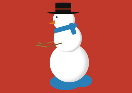
在2014年的圣诞节,爱编程小编给大家分分享一款纯css3实现的雪人动画特效。该实例实现一个雪人跳动的特效,效果图如下:
实现的代码。
html代码:
lolwut-@rsmswlln
css代码:
body { background: #c0392b;}.body { width: 250px; height: 250px; background: #ffffff; border-radius: 50%; box-shadow: inset -20px -5px 35px rgba(0, 0, 0, 0.2); position: absolute; right: 0; left: 0; margin: 300px auto; animation: jump 1s infinite;}.body:before { z-index: 2; content: ""; width: 180px; height: 180px; background: #ffffff; border-radius: 50%; box-shadow: inset -10px -5px 10px rgba(0, 0, 0, 0.2); position: relative; display: inline-block; top: -120px; left: 25px;}.body:after { content: ""; width: 140px; height: 140px; background: #ffffff; border-radius: 50%; box-shadow: inset -10px -5px 10px rgba(0, 0, 0, 0.2); position: relative; display: inline-block; top: -400px; left: 20px;}.body > .hat { width: 200px; height: 15px; border-radius: 50%; background-color: #111111; position: absolute; z-index: 4; top: -200px; left: -15px;}.body > .hat:before { content: ""; width: 100px; height: 65px; background-color: #111111; display: inline-block; position: relative; top: -55px; left: 51px;}.body > .hat:after { z-index: 5; content: ""; display: inline-block; position: relative; top: -145px; left: 51px; width: 100px; height: 5px; border-radius: 50%; background-color: #2b2b2b;}.body > .hat > .ribbon { height: 10px; width: 100px; background-color: #6d2018; position: relative; top: -90px; left: 51px; z-index: 6;}.body > .face { z-index: 3; width: 12px; height: 12px; background-color: #2c3e50; border-radius: 50%; position: absolute; top: -170px; left: 38px;}.body > .face:before { content: ""; background-color: transparent; display: inline-block; position: relative; top: 30px; left: -45px; transform: rotate(-15deg); border-top: 12px solid transparent; border-bottom: 12px solid transparent; border-right: 40px solid #e67e22;}.body > .face:after { content: ""; background-color: transparent; display: inline-block; position: relative; top: 0; left: -46px; transform: rotate(-15deg); border-top: 12px solid transparent; border-right: 40px solid #bf6516;}.body > .scarf { z-index: 3; width: 150px; height: 30px; background-color: #2980b9; position: absolute; top: -110px; left: 25px; transform: rotate(-15deg); border-radius: 20%;}.body > .scarf:after { content: ""; width: 75px; height: 30px; background-color: #2980b9; display: inline-block; position: relative; top: 16px; left: 80px; transform: rotate(85deg); border-radius: 20%;}.body > .left-arm,.body .right-arm { z-index: 7; width: 100px; height: 6px; background-color: #825a2c; position: absolute; top: 10px; left: -20px; transform: rotate(-15deg); animation: rub-right 0.5s infinite;}.body > .left-arm > .hand,.body .right-arm > .hand { width: 25px; height: 6px; background-color: #825a2c; position: absolute; top: -32px; left: -60px; transform: rotate(75deg);}.body > .left-arm:after,.body .right-arm:after { content: ""; width: 75px; height: 6px; background-color: #a87439; display: inline-block; position: relative; top: -24px; left: -70px; transform: rotate(25deg);}.body > .left-arm.left-arm,.body .right-arm.left-arm { background-color: #a87439; animation: rub-left 0.5s infinite; top: -15px; z-index: 1;}.body > .left-arm.left-arm > .hand,.body .right-arm.left-arm > .hand { background-color: #a87439; top: -14px; transform: rotate(45deg);}.body > .left-arm.left-arm:after,.body .right-arm.left-arm:after { background-color: #825a2c; transform: rotate(5deg); top: -12px; left: -74px;}.puddle { z-index: -1; width: 200px; height: 100px; background: #2980b9; border-radius: 50%; position: absolute; right: 0; left: -50px; margin: 500px auto;}.puddle:after { content: ""; width: 120px; height: 80px; display: inline-block; border-radius: 50%; left: 150px; position: relative; background-color: #2980b9;}.text { text-align: center; font-family: 'Lobster', cursive; font-size: 74px; display: inline-block; transform: rotate(-15deg); position: absolute; margin: 50px 30px; color: #ffffff; text-shadow: 3px 3px 2px rgba(0, 0, 0, 0.5);}.text > small { font-size: 20px; display: block;}@keyframes rub-left { 0% { margin-left: 0px; margin-top: 0; } 50% { margin-left: 5px; margin-top: 1px; } 100% { margin-left: 0px; margin-top: 0; }}@keyframes rub-right { 0% { margin-left: 4px; } 50% { margin-left: 0px; } 100% { margin-left: 4px; }}@keyframes jump { 0% { margin: 300px auto; } 40% { margin: 250px auto; } 80% { margin: 300px auto; }} via:
