svg基础+微信公众号交互(一)
发布日期:2021-05-14 15:25:22
浏览次数:19
分类:原创文章
本文共 5991 字,大约阅读时间需要 19 分钟。
svg基础+公众号交互
欢迎点击: .
前言: svg是矢量图,像我们平时用到的png、jpg等都是位量图即为一个一个像素点堆起来的 。
需要注意一点,svg 中子标签是不能带单位的,其写法像canvas。
svg的优势:
- SVG 可被非常多的工具读取和修改(比如记事本);
- SVG 与 JPEG 和 GIF 图像比起来,尺寸更小,且可压缩性更强;
- SVG 图像可在任何的分辨率下被高质量地打印;
- SVG 可在图像质量不下降的情况下被放大,也就是不会失真;
- SVG 图像中的文本是可选的,同时也是可搜索的(很适合制作地图);
- SVG 文件是纯粹的 XML;
svg常用标签
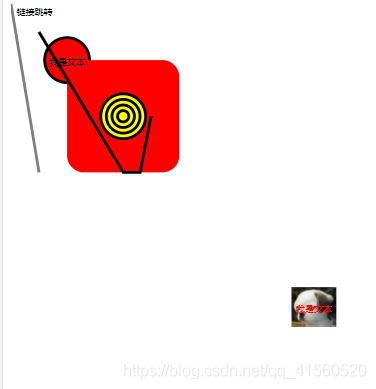
<svg style="height: 100%; width:100%; " version="1.1" viewBox="0 0 640 800" xmlns="http://www.w3.org/2000/svg"> <!-- viewBox="x, y, width, height" x:左上角横坐标,y:左上角纵坐标,width:宽度,height:高度 --> <!-- viewbox指的是,svg 标签在 viewport 中的实际占位 --> <a xlink:href="https://www.baidu.com/"> <text x="10" y="20">链接跳转</text> </a> <circle cx="100" cy="100" r="40" fill="red" stroke="black" stroke-width="5"></circle> <rect width="200" height="200" x="100" y="100" fill="red" rx="30" ry="30"></rect> <line x1="50" y1="300" x1="50" y1="600" stroke-width="5" stroke-opacity="0.5" stroke="black"></line> <polyline points="50 50 200 300 230 300 250 200" stroke-width="5" stroke="black" fill="none"></polyline> <!-- polyline类似于line,polyline是折线,更平滑,无缝隙 --> <text x="100" y="108" font-size="16" text-anchor="middle">我是文本</text> <g transform="translate(500,500)"> <!-- g 标签就是group 组的意思,分组是为了更好的操控一块一块的内容,如动画,位移。 --> <image height="80" width="80" xlink:href="/image/0.jpg"></image> <text x="40" y="48" font-size="16" fill="red" stroke="red;" text-anchor="middle">我是文本</text> </g> <g transform="translate(200,200)" stroke="black" stroke-width="5" fill="yellow"> <!-- 像一些共有的属性可以直接写在g标签里面,可以不重复写 --> <circle r="40"></circle> <circle r="30"></circle> <circle r="20"></circle> <circle r="10"></circle> </g> <path d="M37.1,124.13v3.45a20.83,20.83,0,0,1-3.36,12.28,21.27,21.27,0,0,0-3.54,11.86,3.45,3.45,0,0,0,3.45,3.45h0a3.45,3.45,0,0,0,3.45-3.45h0c0-3.88,1.1-5.78,2.62-8.41A27.61,27.61,0,0,0,44,127.58v-3.45H37.1Z" transform="translate(-16.4 0)" fill="#c83741"></path> <!-- <path>内的属性什么意思,待会重点讲 --> </svg>svg动画
<g> <animate attributeName="x" begin="click" dur="3000ms" from="0" to="100%" fill="freeze"> </animate> <animate attributeName="opacity" begin="0.5s" dur="0.1s" values="0;1" fill="freeze" restart="never"></animate> <text x="200" y="540" fill="#fff" style="font-size: 30px">文字</text> </g> <animateTransform attributeName="transform" type="translate" values="0 0;0 -350" repeatCount="1" fill="freeze" begin="click" dur="0.5s" restart="whenNotActive"></animateTransform> attributeName为要改变的属性名,
begin为开始的时间,begin="click"表示点击开始
dur是动画持续多少秒,
过渡的过程有from-to和values两种写法,values="0;1"表示透明度从0到1,
fill="freeze"表示动画过渡后维持在结束的状态,
restart="never"表示在整个SVG执行的过程中,元素动画不能被重置,简而言之只执行一次,
重点:animate只对当前所在g标签内的标签起作用也就是
,不会影响其他地方,这就是为什么要分组
demo1
<svg xmlns="http://www.w3.org/2000/svg" width="300px" height="100px"> <rect x="0" y="0" width="300" height="100" stroke="red" fill="red" stroke-width="1" /> <circle cx="0" cy="50" r="15" fill="blue" stroke="black" stroke-width="1"> <animate attributeName="cx" from="0" to="100" dur="5s" repeatCount="indefinite" /> </circle> </svg>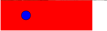
demo2
<svg xmlns="http://www.w3.org/2000/svg" width="300px" height="200px"> <rect x="0" y="0" width="200" height="200" fill="red" stroke="red" stroke-width="1" /> <rect x="20" y="50" width="15" height="34" fill="blue" stroke="black" stroke-width="1" transform="rotation"> <animateTransform attributeType="XML" attributeName="transform" begin="0s" dur="5s" type="rotate" from="20 60 60" to="360 100 60" repeatCount="indefinite" /> </rect> </svg>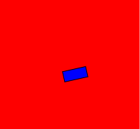
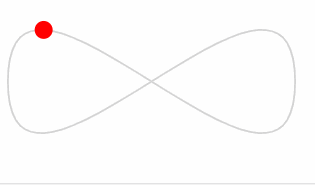
demo3
<svg viewBox="0 0 200 100" xmlns="http://www.w3.org/2000/svg"> <path fill="none" stroke="lightgrey" d="M20,50 C20,-50 180,150 180,50 C180-50 20,150 20,50 z" /> <circle r="5" fill="red"> <animateMotion dur="10s" repeatCount="indefinite" path="M20,50 C20,-50 180,150 180,50 C180-50 20,150 20,50 z" /> </circle> </svg>这里是引用 animateMotion 元素定义了一个元素如何突破运动路径进行移动。
案例一
<svg style="display: block; background-image: url("https://135editor.cdn.bcebos.com/files/images/editor_styles/d7d1434fee6ace6e80762f6eb8385b36.jpg"); background-repeat: no-repeat; background-size: 100%;" width="100%" viewBox="0 0 1280 2275" xmlns="http://www.w3.org/2000/svg" version="1.1"> <rect x="0" y="0" width="100%" height="100%" style="fill: #f1f7ff;"> <animate attributeName="x" begin="click" dur="3000ms" from="0" to="100%" fill="freeze"></animate> </rect> </svg>点击效果
案例二
<section style="box-sizing:border-box;width: 100%; vertical-align: top; overflow-y: auto; background-image: url("https://135editor.cdn.bcebos.com/files/images/editor_styles/460179cdc7ef0f15b846ed03cc385c27.jpg"); background-position: 50% 50%; background-repeat: no-repeat; background-size: cover; background-attachment: scroll;"> <section style="box-sizing:border-box;width: 100%;vertical-align: top; overflow-y: scroll;overflow-x: hidden;" data-role="animate"> <section style="box-sizing:border-box;width: 100%;"> <img style="box-sizing:border-box;width: 100%; display: block;" src="https://135editor.cdn.bcebos.com/files/images/editor_styles/c470dddd1b72798fec2ae2ac4696ede3.jpg" data-ratio="0.7413793103448276" data-w="1080" class="" data-op="change" /> </section> <section style="height: 0;" data-role="list"> <section> <img style="box-sizing:border-box;width: 100%; display: block;" src="https://135editor.cdn.bcebos.com/files/images/editor_styles/b9484a847fcb00f405da89434873ba7c.jpg" data-ratio="0.7407407407407407" data-w="1080" class="" /> </section> </section> </section> </section>滑动效果

后续更精彩!!!
发表评论
最新留言
做的很好,不错不错
[***.243.131.199]2025年04月11日 20时49分25秒
关于作者

喝酒易醉,品茶养心,人生如梦,品茶悟道,何以解忧?唯有杜康!
-- 愿君每日到此一游!
推荐文章
问题的计算复杂度:排序问题
2021-05-14
算法的伪码表示
2021-05-14
递推方程与算法分析
2021-05-14
主定理的应用
2021-05-14
最优装载问题
2021-05-14
最大团问题
2021-05-14
圆排列问题
2021-05-14
课程总结
2021-05-14
认识CMake及应用
2021-05-14
CMake的主体框架
2021-05-14
微积分(三)
2021-05-14
Oracle
2021-05-14
软件工程应用
2021-05-14
数据科学
2021-05-14
函数与高级变量
2021-05-14
键盘事件
2021-05-14
注册页面案例
2021-05-14
np.bincount(x)的简单解释
2021-05-14
LeetCode Top-100 T22-括号生成
2021-05-14
vscode设置eslint保存文件时自动修复eslint错误
2021-05-14
白红宇的个人博客 - 记录点点滴滴的事 - 您是第 461295257 位访客