控制标签元素样式
小心得:
样式有继承(遗传)效果(子元素将继承父元素的样式,如果子元素单独设置了该样式,那么子元素的样式就是子元素单独设置的样式) (可以做统一设置)
注意在调样式时,加了没用的样式记得删除掉(避免造成冲突,对后续新增的样式造成影响)
当然你先要排除样式冲突时选择器优先级导致的情况(class=“d1” id=“id1” --> #id{color: red;} 中间一堆css代码 .d1{color: red;},你会发现 d1的css代码中color不生效,冲突,且优先级不够)
注意行内元素(标签)和块级元素的区别
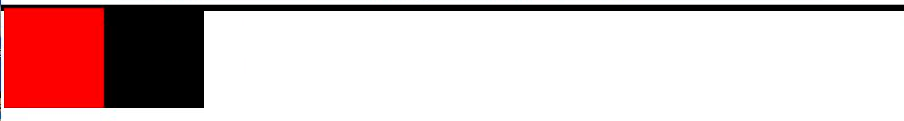
行内元素的宽度(width)、高度(height)、内边距的top/bottom(padding-top/padding-bottom)和外边距的top/bottom(margin-top/margin-bottom)设置无效(padding/margin-left/right还是有效的),测试参见博客:
长宽属性、字体属性、文本对齐、文本装饰、首行缩进
div{ ------------长宽属性-------- 设置长宽只对块级标签有效(没有占满一行会自动用margin占位) width: 300px; height: 300px;}p{ ------------字体属性-------- 文字字体 font-family: "Microsoft Yahei", "微软雅黑", "Arial", sans-serif; 字体大小 font-size: 24px; 字重 font-weight: lighter; 字体颜色 color: red; color: #ffffff; color: rgb(0,0,0); color: rgba(0,0,0,0); 最后一个参数a只能调节颜色透明度,不能调节文本 ------------文字对齐-------- text-align: center; text-align: left; text-align: right; text-align: justify; 好像没效果 垂直对齐 line-height: 50px; 垂直对齐(这个50是它父标签的高度,在父标签中垂直对齐) ------------文字装饰(可以改a标签属性)-------- text-decoration: underline; text-decoration: overline; text-decoration: line-through; 和 <s></s> 的效果一样 text-decoration: none; 一般给<a></a>加 ------------首行缩进-------- font-size: 16px text-indent: 32px; 调成字体大小的两倍,就是空两格}背景属性、边框属性、圆角
div{ ------------背景属性-------- 背景颜色 color: white; background-color: black; 背景图片 width: 400px; height: 400px; background-image: url("1.png"); 重复 background-repeat: no-repeat; 不重复 background-repeat: repeat-x; 水平方向重复 background-repeat: repeat-y; 垂直方向重复 背景位置(精灵图) background-position: center center; 第一个参数调节左右,第二个参数调上下, 负的的是反过来的,x负的,从右往左移 简写 background: black no-repeat center center; 固定背景(窗口背景的效果) background-attachment: fixed; ------------边框属性-------- border-color: red; border-style: solid; border-width: 1px; 简写 border: 1px solid red; 顺序无所谓,可以调线宽、虚实线型、边框颜色 border-left: 1px solid red; 可以单独设置不同的边 ------------圆角(画圆)-------- border-radius: 50%; 园 }雪碧图/精灵图(比较老的技术) 【】、【】
利用的是
background-position svg(可以了解一下)
display 显示方式
div{ ------------display显示方式------- display: none; 标签不显示,且不再占位置 visibility: hidden; 标签不显示,但是位置还占着(透明度应该也可以实现) display: block; 转换成块级元素(标签)(可以设置长宽) display: inline; 转换成行内元素(长宽会失效,没有内容会直接看不到(行内元素的大小是由内容决定的)) display: inline-block; 既有块级标签能设置长宽的特点,又有行内标签都在一行的特点 阴影 box-shadow: 3px 3px grey;}盒子模型 margin、padding...
div{ ------------盒子模型-------- 外边距(margin)、边框(border)、内边距(padding)、内容本身大小(content) 外边距: 标签与标签的距离(两个盒子之间的距离) 边框: 边框(盒子厚度) 内边距:内容与边框的距离(盒子里物体和盒子边框的距离) 内容:标签内的内容(盒子里放的东西) margin: 5px 10px 15px 25px; 上右下左(顺时针)参数效果不同,根据浏览器调调看就行了,不用记 margin: 0; body自带8px的外边距,子元素会继承这一特性(验证一下*****) margin: 0 auto; 水平居中(垂直没用,padding用不了auto) margin-top: 10px; 上边距10px border: 3px solid red; padding: 10px; 写法和margin差不多,只是作用对象(外边距/内边距)不一样}科普(可以谷歌检查去看该元素的盒模型,然后把不需要的改成0)
body自带8px的外边距margin
p标签默认自带 16px(根据字体大小来的)的外边距
ul自带40px的padding内边距
float浮动
浮动的元素是脱离正常文档流的,也就意味着没有独占一行之说,也不再占用原来的位置(不会把父元素撑大)-----浮动的元素会造成父标签塌陷
.c1{ float: left; 浮动之后就相当于浮起来了,脱离了文档流,有多大就多大}div{ # clear 清除浮动带来的父标签塌陷, clear: left; clear left 左边不能有浮动元素,如果有,另起一行(变向撑大父标签) }清除浮动的终极写法(要想用的地方加上这个class即可 --> class="clearfix").clearfix:after{ clearfix清除浮动的通用名字 content: ''; display: block; clear: both; 左右两边都不能有浮动的元素 }这里的线是边框(不然div没有内容没有没有边框会直接看不出来)
overflow 清除溢出(超出div大小的部分)
div{ overflow: hidden; overflow: auto; 自适应,有个滚动条可以看 overflow: scoll; 有水平和垂直滚动条 overflow: visible; 默认值,不会清除溢出,直接显示 overflow-x: auto; 可以设置水平的溢出 overflow-y: auto; 可以设置垂直的溢出 (圆形头像)图片最大宽度 max-width: 100%; width: 100%; 和上面一样}position 定位
相对定位
相对于标签自身原来的位置做一个定位绝对定位
相对于已经定位过的父标签做一个定位(购物车展开)
*** 当只给你一个父标签的属性让你做定位时,就用绝对定位
固定定位
相对于浏览器窗口,一直固定在某个位置(回到顶部)
所有标签默认都是静态的,无法直接调节位置
div{ position: static; 默认值,静态的,top、left无法改变位置 position: relative; top: 100px; left: 50px; position: fixed; bottom: 100px; 这些都是相对于浏览器而言的了 right: 60px;}想用绝对定位一定要先让父元素定位(position: relative; 不用指定 top 、left等,不会影响父元素位置),自身再postion: abosulte; top: 50px; left: 50px浏览器会优先展示文本内容,哪怕文本被盖住了(浏览器做的优化)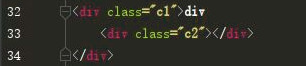
对文档流的影响
参考链接(可以了解一下):
浮动的元素都是脱离文档流的
相对定位(relative)的元素不是脱离文档流的
绝对定位(absolute)的元素也是脱离文档流的(只要变了就脱离文档流了)
固定定位(fixed)的元素也是脱离文档流的(只要变了就脱离文档流了)
z-index 层级
模态框(百度登录)
<!--模态框案例--><!--文档流默认值 0--><!--只要比上一个大,就在上面--><!DOCTYPE html><html lang="en"><head> <meta charset="UTF-8"> <title>Title</title> <style> body { margin: 0; } .cover { position: fixed; top: 0; left: 0; right: 0; bottom: 0; background-color: rgba(128,128,128,0.45); z-index: 999; } .modal { height: 200px; width: 400px; background-color: white; position: fixed; left: 50%; top: 50%; z-index: 1000; margin-top: -100px; margin-left: -200px; } </style></head><body><div>我是最底层的</div><div class="cover"></div><div class="modal"> <p><label for="d1">username:<input type="text" id="d1"></label></p> <p><label for="d2">password:<input type="text" id="d2"></label></p> <input type="submit"></div></body></html>opacity 标签整体透明度
p{ opacity: 0.4; 可以调节颜色、字体等属性的透明度}去掉li 前面的标识
li{ list-style: none; 或 list-style-type: none;}文本垂直居中
多行垂直剧中可参考:
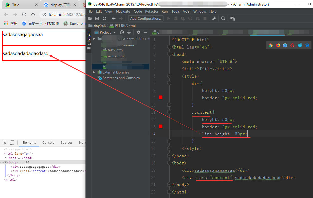
有很多种写法,但其他的不太熟悉,还是比较习惯这个.text-center{ height: 50px; div的高度 line-height: 50px; 此时文本就可以居中了 border: 2px solid red; 加个边框让效果更明显一点}单行文本居中
作业案例
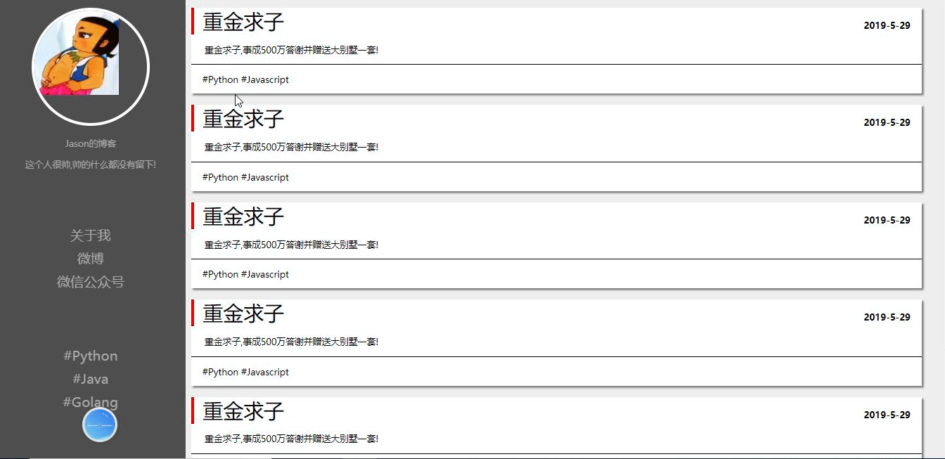
代码
<!DOCTYPE html><html lang="en"><head> <meta charset="UTF-8"> <title>Title</title> <style rel="stylesheet"> body{ margin: 0; background-color: lightgrey; } .blog-left{ width: 18%; float: left; background-color: darkslategrey; text-align: center; color: darkgray; position: absolute; height: 100%; } .blog-right{ width: 82%; float: right; padding-bottom: 10% } .avatar{ width: 60%; border: 5px solid white; border-radius: 50%; margin: 50px auto; overflow: hidden; } .avatar img{ width: 100%; } .blog-left p{ font-size: 20px; } .blog-left ul{ list-style: none; padding: 0; font-size: 26px; margin-top: 70px; } .blog-left ul li a{ text-decoration: none; color: darkgray; } .blog-left ul li a:hover{ text-decoration: none; color: whitesmoke; } .blog-article{ width: 95%; background-color: white; margin: 20px; box-shadow: 3px 3px grey; border-radius: 10px; } .blog-article hr{ margin: 0; } .title h1{ border-left: 5px solid rgb(235,50,35); padding-left: 30px; display: inline-block; float: left; margin: 0; } .title b{ display: inline-block; float: right; padding: 14px; padding-bottom: 0px; } .clearfix:after{ content: ''; display: block; clear: both; } .content{ border-bottom: 2px solid darkslategrey; padding: 20px; } .bottom-tag{ padding: 15px; } </style></head><body> <div class="blog-left"> <div class="avatar"> <img src="https://timgsa.baidu.com/timg?image&quality=80&size=b9999_10000&sec=1567680319452&di=760a1964b01400d5f7a9e25bc93e480c&imgtype=0&src=http%3A%2F%2Fpic3.zhimg.com%2F50%2Fv2-ae5a069afcdd54e74fffbd73ca66a538_hd.jpg" alt=""> </div> <p>tank的博客</p> <p>更秃更强!</p> <ul> <li><a href="#">关于我</a></li> <li><a href="#">微博</a></li> <li><a href="#">微信公众号</a></li> </ul> <ul> <li><a href="#">#Python</a></li> <li><a href="#">#Java</a></li> <li><a href="#">Golang</a></li> </ul> </div> <div class="blog-right"> <div class="blog-article"> <div class="title clearfix"> <h1>重金求子</h1> <b>2019-5-29</b> </div> <div class="content">重金求子,事成送贤淑老公一枚!</div> <div class="bottom-tag">#生活 #八卦</div> </div> <div class="blog-article"> <div class="title clearfix"> <h1>重金求子</h1> <b>2019-5-29</b> </div> <div class="content">重金求子,事成送贤淑老公一枚!</div> <div class="bottom-tag">#生活 #八卦</div> </div> <div class="blog-article"> <div class="title clearfix"> <h1>重金求子</h1> <b>2019-5-29</b> </div> <div class="content">重金求子,事成送贤淑老公一枚!</div> <div class="bottom-tag">#生活 #八卦</div> </div> </div></body></html>上述代码页面效果

关于自适应(不需要了解)
参考博客:(仅个人兴趣,把觉得不错的文章放个连接)
