本文共 26845 字,大约阅读时间需要 89 分钟。
plotnine语法框架
plotnine主要包括数据绘图部分与美化细节部分。
对于plotnine包可以使用"pip install poltnine"语句进行安装,在python中默认的导入语句为:
from plotnine import *
如果要导入plotnine自带的数据集,则可以使用如下语句:
from plotnine.data import
具体语法框架如下:
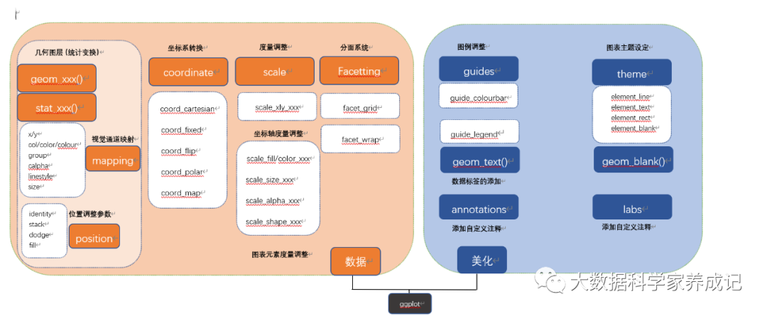
plotnine绘图包含必须的图表输入信息:
(1)ggplot():底层绘图函数。data为数据集,主要是数据框格式的数据集,mapping表示变量的映射,用来表示变量X和Y,还可以用来控制颜色(color)、大小(size)或形状(shape)。
(2)geom_xxx()|stat_xxx():几何图层或统计变换,比如常见的散点图geom_point()、柱形图geom_bar()、统计直方图geom_histogram()、箱形图geom_boxplot()、折线图geom_line()等。通过使用geom_XXX()就可以绘制大部分图表,有时通过设定stat参数可以实现统计变换。
plotnine可选的图表输入信息包括如下5部分,主要用于实现对图表的美化与变换。
(1)scale_xxx:度量调整,调整具体的度量,包括颜色(color)、大小(size)或形状(shape)等,跟mapping的映射变量相对应。
(2)face_xxx:分面系统,将某个变量进行分面变换,包括按行、按列和按网格等形式进行分面绘图。
(3)coord_xxx():笛卡尔坐标系。
(4)guides():图例调整,主要包括连续型和离散型的图例。
(5)theme():主题设定,主要是调整图表的细节,包括图表背景颜色、网格线的间隔与颜色。

01
geom_xxx()与stat_xxx()
1.几何对象函数:geom_xxx():
plotnine包中包含几十种不同的对象函数geom_xxx()和统计变换函数stat_xxx()。根据函数输入的变量总数与数据类型(连续型或者离散型),可以总结成如下形式:
| 变量数 | 类型 | 函数 | 常见图表类型 |
| 1 | 连续型 | geom_histogram()、geom_density()、geom_dotplot()、geom_freqploly()、geom_qq()、geom_area() | 统计直方图、核密度估计曲线图 |
| 1 | 离散型 | geom_bar() | 柱形图系列 |
| 2 | X-连续型Y-连续型 | geom_point()、geom_area()、geom_line()、geom_jitter()、geom_smooth()、geom_label()、geom_text()、geom_bin2d()、geom_density2d()、geom_step()、geom_quantile()、geom_rug() | 散点图系列、面积图系列、折线图系列;散点抖动图、平滑曲线图;文本、标签、二维统计直方图、二维核密度图 |
| 2 | X-离散型Y-连续型 | geom_boxplot()、geom_violin()、geom_dotplot()、geom_col() | 箱形图、小提琴图、点阵图、统计直方图 |
| 2 | X-连续型Y-离散型 | geom_count() | 二维统计直方图 |
| 3 | X,Y,Z连续型 | geom_title() | 热力图 |
除此之外还有以下两类:
(1)图元系列函数:
geom_curve()、geom_path()、geom_polygon()、geom_rect()、geom_ribbon()、geom_linerange()、geom_abline()、geom_hline()、geom_vline、geom_segment()、geom_spoke()这些函数用于绘制基本的图表元素,例如矩形方块、多边形、线段等
(2)误差展示函数:
geom_crossbar()、geom_errorbar()、geom_errorbarh()、geom_pointrange()可以分别绘制误差框、竖直误差线、水平误差线、带误差棒的均值点。这些函数需要先设置统计(stat)变换参数,才能自动根据数据计算得到均值与标准差。
2.统计变换函数:stat_xxx():
统计变换函数(stat_xxx())在数据被绘制出来之前对数据进行聚合和其他计算。stat_xxx()确定了数据的计算方法,不同方法的计算会产生不同的结果,stat_xxx()函数必须与一个geom_xxx()函数对应进行数据的计算。
通过以下两段代码来说明stat_xxx()的使用场景:
均值散点图
(a)(ggplot(mydata,aes(x='class',y='value',fill='class'))+ stat_summary(fun_data='mean_sdl',fun_args={ 'mul':1},geom='point',fill='w',color='black',size=5)) (b)(ggplot(mydata,aes(x='class',y='value',fill='class'))+ geom_point(stat='summary',fun_data='mean_sdl',fun_args={ 'mul':1},geom='point',fill='w',color='black',size=5)) 语句(a)与语句(b)的效果是一样的,语句(a)是使用指定geom='point'(散点)的stat_summary()语句,而语句(b)是使用指定stat='summary'的geom_point语句,其中fun.data表示指定完整的汇总函数,输入数字向量,输出数据框,常见4种为mean_cl_boot、mean_cl_normal、mean_sdl、median_hilow。fun.y表示指定对y的汇总函数,同样是输入数字向量,返回单个数字median或mean等,这里的y通常会被分组,汇总后是每组返回1个数字。
当绘制的图表不涉及统计变换时,可以直接使用geom_xxx()函数,也无须设定stat参数,因为默认stat='identuty'(无数据变换)。只有涉及统计变换处理时,才需使用更改stat的参数,或者直接使用stat_xxx()以强调数据的统计变换。
02
美学参数映射
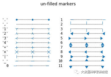
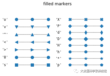
plotnine可用作变量的美学映射参数主要包括color/col/colour、fill、size、angle、linetype、shape、vjust和hjust。
plotnine和matplotlib中可供选择的形状
import numpy as np import matplotlib.pyplot as plt from matplotlib.lines import Line2D points = np.ones(3) # Draw 3 points for each line text_style = dict(horizontalalignment='right', verticalalignment='center', fontsize=12, fontdict={ 'family': 'monospace'}) marker_style = dict(linestyle=':', color='k', markersize=10, mfc="C0", mec="C0") def format_axes(ax): ax.margins(0.2) ax.set_axis_off() ax.invert_yaxis() def nice_repr(text): return repr(text).lstrip('u') def math_repr(text): tx = repr(text).lstrip('u').strip("'").strip("$") return r"'\${}\$'".format(tx) def split_list(a_list): i_half = len(a_list) // 2 return (a_list[:i_half], a_list[i_half:]) fig, axes = plt.subplots(ncols=2) fig.suptitle('un-filled markers', fontsize=14) # Filter out filled markers and marker settings that do nothing. unfilled_markers = [m for m, func in Line2D.markers.items() if func != 'nothing' and m not in Line2D.filled_markers] for ax, markers in zip(axes, split_list(unfilled_markers)): for y, marker in enumerate(markers): ax.text(-0.5, y, nice_repr(marker), **text_style) ax.plot(y * points, marker=marker, **marker_style) format_axes(ax) plt.show() fig, axes = plt.subplots(ncols=2) for ax, markers in zip(axes, split_list(Line2D.filled_markers)): for y, marker in enumerate(markers): ax.text(-0.5, y, nice_repr(marker), **text_style) ax.plot(y * points, marker=marker, **marker_style) format_axes(ax) fig.suptitle('filled markers', fontsize=14) plt.show() 具体形状如下:
不同的美学参数映射效果
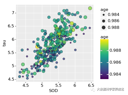
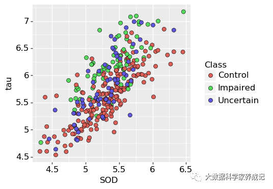
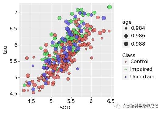
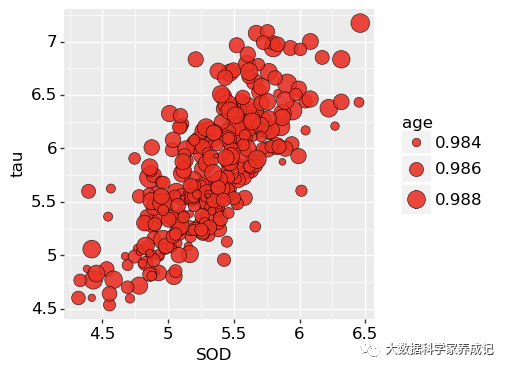
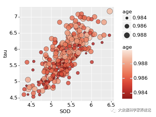
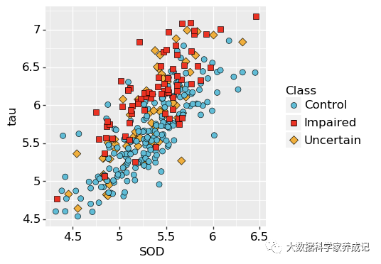
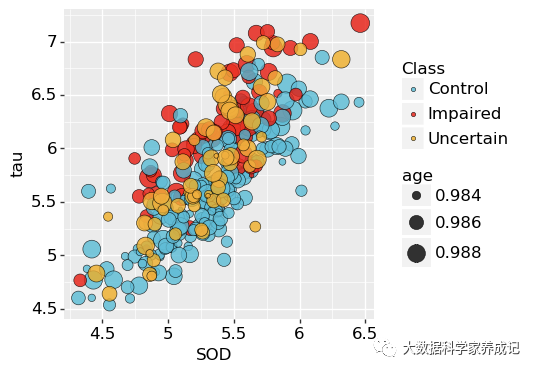
import pandas as pd import numpy as np from plotnine import * #from plotnine.data import * import matplotlib.pyplot as plt import matplotlib #plt.rc('font',family='Times New Roman') matplotlib.rcParams['font.family'] = 'Times New Roman' df=pd.read_csv("Facet_Data.csv") #-----------------------------------(a) age映射到点的大小size-------------------------- p1=(ggplot(df, aes(x='SOD',y='tau',size='age')) + geom_point(shape='o',color="black", fill="#336A97",stroke=0.25,alpha=0.8)+ theme(text=element_text(size=12,colour = "black"), aspect_ratio =1, dpi=100, figure_size=(4,4))) #shape=21,color="black",fill="red",size=3,stroke=0.1 print(p1) #p1.save("plotnine1.pdf") #----------------------------------(b) age映射到点的大小size和填充颜色fill------------------ p2=(ggplot(df, aes(x='SOD',y='tau',size='age',fill='age')) + geom_point(shape='o',color="black",stroke=0.25, alpha=0.8)+ #scale_fill_distiller(type='seq', palette='blues') + theme(text=element_text(size=12,colour = "black"), aspect_ratio =1, dpi=100, figure_size=(4,4))) #shape=21,color="black",fill="red",size=3,stroke=0.1 print(p2) #p2.save("plotnine2.pdf") #-------------------------(c) Class映射到点的颜色填充fill---------------------------------- p3=(ggplot(df, aes(x='SOD',y='tau',fill='Class')) + geom_point(shape='o',size=3,colour="black",stroke=0.25)+ #scale_fill_hue(s = 0.90, l = 0.65, h=0.0417,color_space='husl')+ theme(text=element_text(size=12,colour = "black"), aspect_ratio =1, dpi=100, figure_size=(4,4))) #shape=21,color="black",fill="red",size=3,stroke=0.1 print(p3) #p3.save("plotnine3.pdf") #-------------------------(d) age和Class分别映射到点的大小size和颜色fill-------------------- p4=(ggplot(df, aes(x='SOD',y='tau',size='age',fill='Class')) + geom_point(shape='o',colour="black",stroke=0.25, alpha=0.8)+ #scale_fill_hue(s = 0.90, l = 0.65, h=0.0417,color_space='husl')+ theme(text=element_text(size=12,colour = "black"), aspect_ratio =1, dpi=100, figure_size=(4,4))) #shape=21,color="black",fill="red",size=3,stroke=0.1 print(p4) p4.save("plotnine4.pdf") 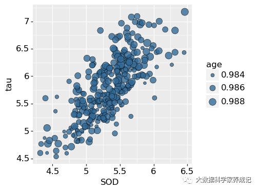
不同的字体格式
from matplotlib.font_manager import FontProperties import matplotlib.pyplot as plt fig =plt.figure() plt.subplot(111, facecolor='w') font0 = FontProperties() alignment = { 'horizontalalignment': 'center', 'verticalalignment': 'baseline'} # Show family options families = ['serif', 'sans-serif', 'cursive', 'fantasy', 'monospace'] font1 = font0.copy() font1.set_size('large') t = plt.text(-0.8, 0.9, 'family', fontproperties=font1, **alignment) yp = [0.8, 0.7, 0.6, 0.5, 0.4, 0.3, 0.2] for k, family in enumerate(families): font = font0.copy() font.set_family(family) t = plt.text(-0.8, yp[k], family, fontproperties=font, **alignment) # Show style options styles = ['normal', 'italic', 'oblique'] t = plt.text(-0.4, 0.9, 'style', fontproperties=font1, **alignment) for k, style in enumerate(styles): font = font0.copy() font.set_family('sans-serif') font.set_style(style) t = plt.text(-0.4, yp[k], style, fontproperties=font, **alignment) # Show variant options variants = ['normal', 'small-caps'] t = plt.text(0.0, 0.9, 'variant', fontproperties=font1, **alignment) for k, variant in enumerate(variants): font = font0.copy() font.set_family('serif') font.set_variant(variant) t = plt.text(0.0, yp[k], variant, fontproperties=font, **alignment) # Show weight options weights = ['light', 'normal', 'medium', 'semibold', 'bold', 'heavy', 'black'] t = plt.text(0.4, 0.9, 'weight', fontproperties=font1, **alignment) for k, weight in enumerate(weights): font = font0.copy() font.set_weight(weight) t = plt.text(0.4, yp[k], weight, fontproperties=font, **alignment) # Show size options sizes = ['xx-small', 'x-small', 'small', 'medium', 'large', 'x-large', 'xx-large'] t = plt.text(0.8, 0.9, 'size', fontproperties=font1, **alignment) for k, size in enumerate(sizes): font = font0.copy() font.set_size(size) t = plt.text(0.8, yp[k], size, fontproperties=font, **alignment) # Show bold italic font = font0.copy() font.set_style('italic') font.set_weight('bold') font.set_size('x-small') t = plt.text(-0.4, 0.1, 'bold italic', fontproperties=font, **alignment) font = font0.copy() font.set_style('italic') font.set_weight('bold') font.set_size('medium') t = plt.text(-0.4, 0.2, 'bold italic', fontproperties=font, **alignment) font = font0.copy() font.set_style('italic') font.set_weight('bold') font.set_size('x-large') t = plt.text(-0.4, 0.3, 'bold italic', fontproperties=font, **alignment) plt.axis([-1.2, 1.2, 0, 1.05]) plt.show() 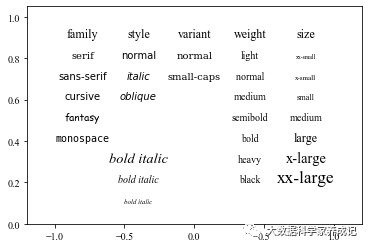
修改字体的显示
import matplotlib.pyplot as plt plt.rcParams['font.sans-serif']=['SimHei'] #用来正常显示中文标签 plt.rcParams['axes.unicode_minus']=False #用来正常显示正负号
03
度量调整
度量用于控制变量映射到视觉对象的具体细节,比如X轴和Y轴、colour(轮廓颜色)、fill(填充颜色)、alpha(透明度)、linetype(线性状)、shape(形状)和size(大小),它们都有相应的度量函数,度量函数分为数值型和类别型两大类。plotnine的默认度量为scale_xxx_identity()。需要主要的是:scale_*_manual()表示手动自定义离散的度量,包括color、fill、alpha、linetype、shape和size等美学映射参数。
常见的度量函数如下:
| 度量(sacle) | 数值型 | 类别型 |
| x:X轴度量y:Y轴度量 | scale_x/y_contimous()scale_x/y_log10()scale_x/y_sqrt()scale_x/y_reverse()scale_x/y_date()scale_x/y_datetime()scale_x/y_time() | scale_x/y_discrete() |
| colour:轮廓颜色度量fill:填充颜色度量 | scale_fill_cmap()scale_color/fill_continuous()sacle_fill_distiller()scale_color/fill_gradient()scale_color/fill_gradient2()scale_color/fill_gradientn() | scale_color_hue()scale_color_discrete()scale_color_brwer()scale_color_manual() |
| alpha:透明度 | sacle_alpha_continuous() | sacle_alpha_discreeate()sacle_alpha_manual() |
| linetype:线性状 | scale_linetype_discrete()sacle_linetype_manual() | |
| shape:形状度量 | scale_shape()sacle_shape_manual() | |
| scale:大小度量 | scale_size()scale_size_area() | scale_size_manual() |
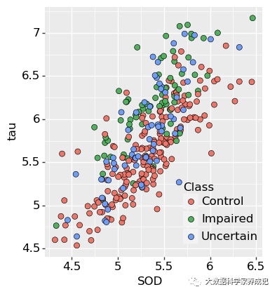
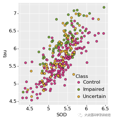
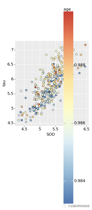
还是用之前的数据集分别展示散点图的不同度量的调整效果,这里的(a)图是将数值离散型变量age映射到散点的大小(size),在使用scale_size(range=(a,b))调整散点大小(size)的度量,range表示美学映射参数变量转化后气泡面积的映射显示范围。(b)图的基础上添加了颜色的映射,使用scale_fill_distiller(type='seq',palette='Reds')函数将数值离散型变量age映射到红色渐变色条。(c)图将类别离散型变量class映射到不同的填充(fill)和形状(shape),使用scale_*_manual()手动自定义fill和shape的度量。(d)图是将数值离散型变量age和类别离散型变量class分别映射到点的大小(size)和填充颜色(fill),再将scale_size()和scale_fill_manual()分别调整散点大小(size)的映射范围与填充颜色(fill)的颜色数值。
(a)图
(b)图
(c)图
(d)图
具体代码如下:
散点图的不同度量的调整效果
import pandas as pd import numpy as np from plotnine import * #from plotnine.data import * import matplotlib.pyplot as plt import matplotlib #plt.rc('font',family='Times New Roman') matplotlib.rcParams['font.family'] = 'Times New Roman' df=pd.read_csv("Facet_Data.csv") #-------------------------------(a) 点大小size的度量调整 ------------------------ p5=(ggplot(df, aes(x='SOD',y='tau',size='age')) + geom_point(shape='o',color="black", fill="#FF0000",stroke=0.25,alpha=0.8)+ scale_size(range = (1, 8))+ theme(text=element_text(size=12,colour = "black"), aspect_ratio =1, dpi=100, figure_size=(4,4))) #shape=21,color="black",fill="red",size=3,stroke=0.1 print(p1) #p1.save("plotnine1.pdf") #---------------------------(b) 点大小size和填充颜色fill的度量调整---------------- p6=(ggplot(df, aes(x='SOD',y='tau',fill='age',size='age')) + geom_point(shape='o',color="black",stroke=0.25,alpha=0.8)+ scale_size(range = (1, 8))+ scale_fill_distiller(type='seq', palette="Reds")+ theme(text=element_text(size=12,colour = "black"), aspect_ratio =1, dpi=100, figure_size=(4,4))) #shape=21,color="black",fill="red",size=3,stroke=0.1 print(p2) #p2.save("plotnine2.pdf") #-------------------------------(c)点颜色填充fill与形状shape的度量调整------------------- p7=(ggplot(df, aes(x='SOD',y='tau',fill='Class',shape='Class')) + geom_point(size=3,colour="black",stroke=0.25)+ scale_fill_manual(values=("#36BED9","#FF0000","#FBAD01"))+ scale_shape_manual(values=('o','s','D'))+ #scale_fill_hue(s = 0.90, l = 0.65, h=0.0417,color_space='husl')+ theme(text=element_text(size=12,colour = "black"), aspect_ratio =1, dpi=100, figure_size=(4,4))) #shape=21,color="black",fill="red",size=3,stroke=0.1 print(p3) p3.save("plotnine3.pdf") #-------------------------------(d)点大小size和颜色fill的度量调整----------------- p8=(ggplot(df, aes(x='SOD',y='tau',size='age',fill='Class')) + geom_point(shape='o',colour="black",stroke=0.25, alpha=0.8)+ scale_fill_manual(values=("#36BED9","#FF0000","#FBAD01"))+ scale_size(range = (1, 8))+ theme(text=element_text(size=12,colour = "black"), aspect_ratio =1, dpi=100, figure_size=(4,4))) #shape=21,color="black",fill="red",size=3,stroke=0.1 print(p4) 04
坐标系及其度量
plotnine的直角坐标系包括coord_cartesian()、coord_fixed()、coord_fixed()和coord_flip()和coord_trans()四种类型。plotnine默认为直角坐标系coord_cartesian()。
在绘制条形图或者水平箱形图时,需要使用coord_flip()函数转坐标系。会将X轴和Y轴对换,从而将竖直的柱形图转换成水平的条形图。
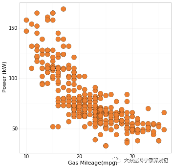
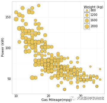
以下就是常用的直角坐标系下的散点图和气泡图:
直角坐标系下的散点图和气泡图
import pandas as pd import numpy as np from plotnine import * mydata=pd.read_csv("Bubble_Data.csv") Colnames=mydata.columns.values.tolist() base_plot=(ggplot(mydata, aes('Gas Mileage(mpg)','Power (kW)')) #其气泡的颜色填充由Class映射,大小由age映射 +geom_point(fill='#FE7A00',colour="black",size=8,stroke=0.2,alpha=1) # #+scale_size_continuous(range=[3,12]) +theme_light() +theme( #text=element_text(size=15,face="plain",color="black"), axis_title=element_text(size=16,face="plain",color="black"), axis_text = element_text(size=14,face="plain",color="black"), legend_text=element_text(size=14,face="plain",color="black"), legend_title=element_text(size=16,face="plain",color="black"), legend_background=element_blank(), #legend_position='none', legend_position = (0.81,0.75), figure_size = (8, 8), dpi = 50 )) print(base_plot) #base_plot.save('Bubble1.pdf') base_plot=(ggplot(mydata, aes('Gas Mileage(mpg)','Power (kW)',size='Weight (kg)')) #其气泡的颜色填充由Class映射,大小由age映射 +geom_point(fill='#EEC642',colour="black",stroke=0.2,alpha=1) #size=7, +scale_size_continuous(range=[3,12]) +theme_light() +theme( #text=element_text(size=15,face="plain",color="black"), axis_title=element_text(size=16,face="plain",color="black"), axis_text = element_text(size=14,face="plain",color="black"), legend_text=element_text(size=14,face="plain",color="black"), legend_title=element_text(size=16,face="plain",color="black"), legend_background=element_blank(), #legend_position='none', legend_position = (0.81,0.75), figure_size = (8, 8), dpi = 50 )) print(base_plot) (a)二维散点图
(b)二维气泡图
在plotnine的绘图系统中,数字坐标轴度量包括sacale_x/y_continuous()、scale_x/y_log10()、scale_x/y_sqrt、scale_x/y_reverse();分类坐标轴度量包括scale_x/y_discrete();时间坐标轴度量包括scale_x/y_date()、scale_x/y_datetime()、scale_x/y_time()。这些度量的主要参数包括:(1)name表示指定坐标轴的名称,也作为对应的图例名;
(2)break表示指定坐标轴刻度位置;
(3)labels表示指定坐标轴刻度表情内容;
(4)limits表示指定坐标轴显示范围;
(5)expand表示扩展坐标轴显示范围;
(6)trans表示指定坐标转换函数,自带有exp、log、log10,还支持scales包内其他转换函数。
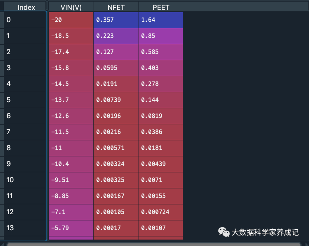
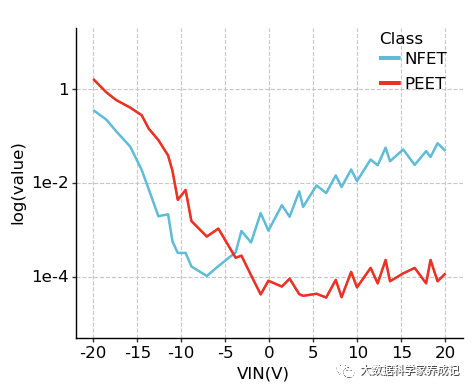
以下以logarithmic_scale数据集来进行坐标轴转换;
数据内容包括VIN(V)、NFET、PEET三个字段:
具体代码:
坐标标尺的转换
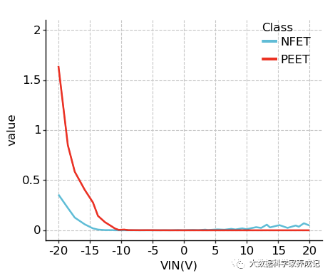
import pandas as pd import numpy as np from plotnine import * #from plotnine.data import * import matplotlib.pyplot as plt import matplotlib #plt.rc('font',family='Times New Roman') matplotlib.rcParams['font.family'] = 'Times New Roman' df=pd.read_csv("logarithmic_scale.csv") df_melt=pd.melt(df,id_vars='VIN(V)',var_name='Class',value_name='value') p1=(ggplot(df_melt,aes(x='VIN(V)',y='value',color='Class')) + geom_line(size=1)+ scale_x_continuous(breaks=np.arange(-20,21,5),limits=(-20,20)) + scale_y_continuous(breaks=np.arange(0,2.1,0.5),limits=(0,2))+ scale_color_manual(values=("#36BED9","#FF0000"))+ theme_classic()+ theme(text=element_text(size=12,colour = "black"), panel_grid_major=element_line(color="#C7C7C7",linetype ='--'), aspect_ratio =0.8, dpi=100, figure_size=(5,5), legend_position=(0.8,0.8), legend_background=element_rect(fill="none"))) #shape=21,color="black",fill="red",size=3,stroke=0.1 print(p1) #p1.save("logarithmic_scale1.pdf") p2=(ggplot(df_melt,aes(x='VIN(V)',y='value',color='Class')) + geom_line(size=1)+ scale_x_continuous(breaks=np.arange(-20,21,5),limits=(-20,20)) + scale_y_log10(name='log(value)',limits=(0.00001,10))+ scale_color_manual(values=("#36BED9","#FF0000"))+ theme_classic()+ theme(text=element_text(size=12,colour = "black"), panel_grid_major=element_line(color="#C7C7C7",linetype ='--'), aspect_ratio =0.8, dpi=100, figure_size=(5,5), legend_position=(0.8,0.8), legend_background=element_rect(fill="none"))) #shape=21,color="black",fill="red",size=3,stroke=0.1 print(p2) #p2.save("logarithmic_scale2.pdf") 具体效果如下:
(a)图
(b)图
05
主题系统
主题系统包括绘图区背景、网格线、坐标轴线条等图表的细节部分,图标风格主要是绘图区背景、网格线、坐标轴线条等的格式设定所展示的效果。plotnine图表的主题系统主要对象包括文本(text)、矩形(rect)和线条(line)三大类,对应的包括element_text()、element_rect()、element_line(),另外还有element_blank()表示该对象设置为无,以下是主题系统的主要对象:
| 对象 | 函数 | 图形对象整体 | 绘图区(面板) | 坐标轴 | 图例 | 分面系统 |
| text | eleent_text()参数:family、face、Colour、size、hjust、vjust、angle、lineheight | plot_title、plot_subtitle、plot_caption | axis_titleaxis_title_xaxis_title_yaxis_textaxis_text_xaxis_text_y | legend_text、legend_text_align、legend_text_tile、legend_text_align | strip_text、strip_text_x、strip_text_y | |
| rect | element_rect()参数:colour、size、type | plot_background、plot_sapcingplot_margin | panel_background、pancel_border、panel_spacing | legend_background、legend_margin、legend_spacing、legend_spacing_x、legend_spacing_y | strip_background | |
| line | element_line()参数:fill、colour、size、type | panel_grid_major、panel_grid_minor、panel_grid_major_x、panel_grid_major_y、panel_grid_major_y、panel_grid_minor_y | axis_lineaxis_line_xaxis_line_yaxis_ticksaxis_ticks_xaxis_ticks_yaxis_ticks_lengthaxis_ticks_margin |
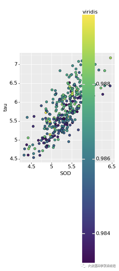
plotnine自带的主题模版有多种,包括them_gray()、them_minimal()、them_bw()、them_light()、them_classic()等。相同的数据及数据格式,可以结合不同的图表风格,以上分别是离散型数据和连续型数据的不同主题方案:
这里用到的数据集是Facet_Data,内容如下
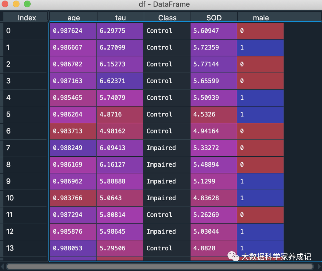
代码实现如下:
离散型数据主题解决方案
import pandas as pd import numpy as np from plotnine import * #from plotnine.data import * import matplotlib.pyplot as plt import matplotlib #plt.rc('font',family='Times New Roman') matplotlib.rcParams['font.family'] = 'Times New Roman' df=pd.read_csv("Facet_Data.csv") p1=(ggplot(df, aes(x='SOD',y='tau',fill='Class')) +geom_point(shape='o',color="black",size=3, stroke=0.25,alpha=1) +scale_fill_discrete() +theme(text=element_text(size=12,colour = "black"), legend_background=element_blank(), legend_position=(0.75,0.25), aspect_ratio =1.15, dpi=100, figure_size=(4,4))) #shape=21,color="black",fill="red",size=3,stroke=0.1 print(p1) p2=(ggplot(df, aes(x='SOD',y='tau',fill='Class')) +geom_point(shape='o',color="black",size=3, stroke=0.25,alpha=1) +scale_fill_brewer(type='qualitative', palette='Set1') +theme(text=element_text(size=12,colour = "black"), legend_background=element_blank(), legend_position=(0.75,0.25), aspect_ratio =1.15, dpi=100, figure_size=(4,4))) #shape=21,color="black",fill="red",size=3,stroke=0.1 print(p2) p3=(ggplot(df, aes(x='SOD',y='tau',fill='Class')) +geom_point(shape='o',color="black",size=3, stroke=0.25,alpha=1) +scale_fill_hue(s = 1, l = 0.65, h=0.0417,color_space='husl') +theme(text=element_text(size=12,colour = "black"), legend_background=element_blank(), legend_position=(0.75,0.25), aspect_ratio =1.15, dpi=100, figure_size=(4,4))) #shape=21,color="black",fill="red",size=3,stroke=0.1 print(p3) p4=(ggplot(df, aes(x='SOD',y='tau',fill='Class')) +geom_point(shape='o',color="black",size=3, stroke=0.25,alpha=1) +scale_fill_manual(values=("#E7298A","#66A61E","#E6AB02")) +theme(text=element_text(size=12,colour = "black"), legend_background=element_blank(), legend_position=(0.75,0.25), aspect_ratio =1.15, dpi=100, figure_size=(4,4))) #shape=21,color="black",fill="red",size=3,stroke=0.1 print(p4) 得到如下4个结果:
p1
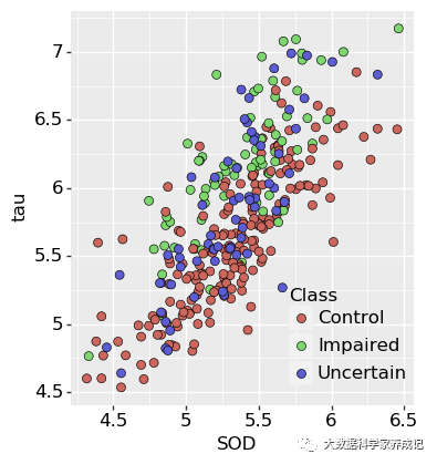
p2
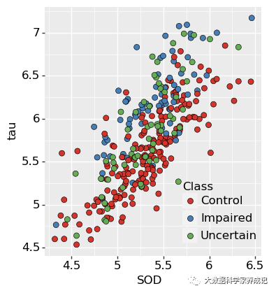
p3
p4
连续型数据主题解决方案
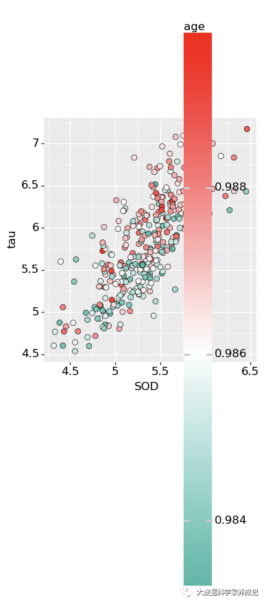
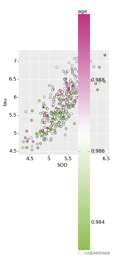
import pandas as pd import numpy as np from plotnine import * #from plotnine.data import * import matplotlib.pyplot as plt import matplotlib #plt.rc('font',family='Times New Roman') matplotlib.rcParams['font.family'] = 'Times New Roman' df=pd.read_csv("Facet_Data.csv") #--------------------------------------------------------------------------------- m1=(ggplot(df, aes(x='SOD',y='tau',fill='age')) +geom_point(shape='o',color="black",size=3, stroke=0.25,alpha=1) +scale_fill_distiller(type='div',palette="RdYlBu") +guides(fill=guide_colorbar(barheight =80,barwidth=20)) +theme(text=element_text(size=12,colour = "black"), legend_background=element_blank(), legend_position=(0.75,0.3), aspect_ratio =1.15, dpi=100, figure_size=(4,4))) #shape=21,color="black",fill="red",size=3,stroke=0.1 print(m1) m1.save('m1.pdf') m2=(ggplot(df, aes(x='SOD',y='tau',fill='age')) +geom_point(shape='o',color="black",size=3, stroke=0.25,alpha=1) +scale_fill_cmap(name='viridis') +guides(fill=guide_colorbar(barheight =80,barwidth=20)) +theme(text=element_text(size=12,colour = "black"), legend_background=element_blank(), legend_position=(0.75,0.3), aspect_ratio =1.15, dpi=100, figure_size=(4,4))) #shape=21,color="black",fill="red",size=3,stroke=0.1 print(m2) m2.save('m2.pdf') m3=(ggplot(df, aes(x='SOD',y='tau',fill='age')) +geom_point(shape='o',color="black",size=3, stroke=0.25,alpha=1) +scale_fill_gradient2(low="#00A08A",mid="white",high="#FF0000",midpoint = np.mean(df.age)) +guides(fill=guide_colorbar(barheight =80,barwidth=20)) +theme(text=element_text(size=12,colour = "black"), legend_background=element_blank(), legend_position=(0.75,0.3), aspect_ratio =1.15, dpi=100, figure_size=(4,4))) #shape=21,color="black",fill="red",size=3,stroke=0.1 print(m3) m3.save('m3.pdf') m4=(ggplot(df, aes(x='SOD',y='tau',fill='age')) +geom_point(shape='o',color="black",size=3, stroke=0.25,alpha=1) +scale_fill_gradientn(colors= ("#82C143","white","#CB1B81")) +guides(fill=guide_colorbar(barheight =80,barwidth=20)) +theme(text=element_text(size=12,colour = "black"), legend_background=element_blank(), legend_position=(0.75,0.3), aspect_ratio =1.15, dpi=100, figure_size=(4,4))) #shape=21,color="black",fill="red",size=3,stroke=0.1 print(m4) m4.save('颜色主题方案8.pdf') m1
m2
m3
m4
以上分别针对离散型数据和连续型数据四种不同主题来绘制。
06
位置调整
在geom_xxx()函数中,参数position表示绘图函数系列的位置调整,默认为“identity”(无位置调整),以下是plotnine绘图语法中的位置调整参数:
| 函数 | 功能 | 参数说明 |
| position_dodge() | 水平并列放置 | position_dodge(width=Null,preserve=("total","single")),作用于簇状柱形图、箱形图 |
| position_identity() | 位置不变 | 对于散点图和和折线图可行,默认为identity,但对于多分类柱形图,序列间会存在遮盖问题 |
| position_stack() | 垂直堆叠放置 | position_stack(vjust=1,reverse=False)柱形图和面积图默认堆积(stack) |
| position_fill() | 百分比填充 | position_fill(vjust=1,reverse=False)垂直堆叠,但只能反映各组百分比 |
| position_jitter() | 扰动处理 | position_jitter(width=NULL,high=NULL)部分堆叠,作用于散点图 |
| position_jitterdodge() | 并列抖动 | position_jitterdodge(jitter_width=NULL,jitter_height=0,jitter_width=0.75),仅仅用于箱型图和点图在一起的情形,且有顺序,必须箱子在前,点图在后,抖动只能在散点几何对象中 |
| position_nudge() | 整体位置微调 | position_nudge(x=0,y=0),整体向x和y方向平移的距离,常用于geom_text()文本对象 |
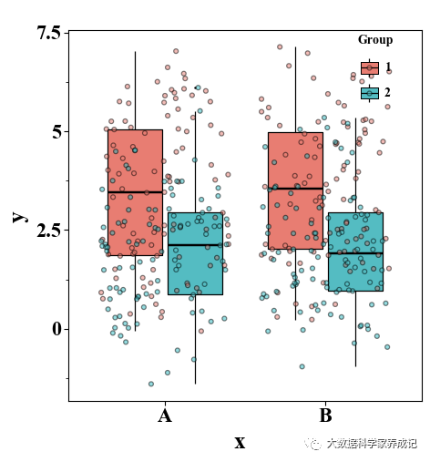
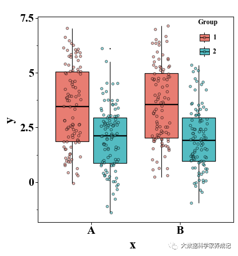
以下内容展示箱形图和抖动散点图的调整语法:
箱型图和抖动散点图的位置调整
import pandas as pd import numpy as np from plotnine import * #from plotnine.data import * import matplotlib.pyplot as plt N=100 df=pd.DataFrame(dict(group=np.repeat([1,2], N*2), y=np.append(np.append(np.random.normal(5,1,N),np.random.normal(2,1,N)), np.append(np.random.normal(1,1,N),np.random.normal(3,1,N))), x=np.tile(["A","B","A","B"], N))) #------------------------------------(a)#未调整箱型图和抖动散点图的间距-------------------- base_plot=(ggplot(df, aes(x='x', y='y',fill='factor(group)' )) +geom_boxplot(outlier_size = 0,colour='k') +geom_jitter(aes(group='factor(group)'), shape = 'o', alpha = 0.5) +scale_fill_manual(values = ("#F8766D","#00BFC4"),guide = guide_legend(title='Group')) +theme_matplotlib() +theme( #text=element_text(size=15,face="plain",color="black"), axis_title=element_text(size=18,face="plain",color="black"), axis_text = element_text(size=16,face="plain",color="black"), legend_position=(0.8,0.8), aspect_ratio =1.05, figure_size = (5,5), dpi = 100 ) ) print(base_plot) #base_plot.save('位置调整1.pdf') #------------------------------(b)#调整抖动散点图的间距---------------------------------- base_plot=(ggplot(df, aes(x='x', y='y',fill='factor(group)' )) +geom_boxplot(outlier_size = 0,colour='k') +geom_jitter(aes(group='factor(group)'), shape = 'o', alpha = 0.5, position=position_jitterdodge()) +scale_fill_manual(values = ("#F8766D","#00BFC4"),guide = guide_legend(title='Group')) +theme_matplotlib() +theme( #text=element_text(size=15,face="plain",color="black"), axis_title=element_text(size=18,face="plain",color="black"), axis_text = element_text(size=16,face="plain",color="black"), legend_position=(0.8,0.8), aspect_ratio =1.05, figure_size = (5,5), dpi = 100 ) ) print(base_plot) #base_plot.save('位置调整2.pdf') #-----------------------------(c)#同时调整箱型图和抖动散点图的间距----------------------- base_plot=(ggplot(df, aes(x='x', y='y',fill='factor(group)' )) +geom_boxplot(position = position_dodge(0.85),outlier_size = 0,colour='k') +geom_jitter(aes(group='factor(group)'), shape = 'o', alpha = 0.5, position=position_jitterdodge(dodge_width = 0.85)) +scale_fill_manual(values = ("#F8766D","#00BFC4"),guide = guide_legend(title='Group')) +theme_matplotlib() +theme( #text=element_text(size=15,face="plain",color="black"), axis_title=element_text(size=18,face="plain",color="black"), axis_text = element_text(size=16,face="plain",color="black"), legend_position=(0.8,0.8), aspect_ratio =1.05, figure_size = (5,5), dpi = 100 ) ) print(base_plot) #base_plot.save('位置调整3.pdf') (a)未调整箱型图和抖动散点图的间距
(b)调整抖动散点图的间距
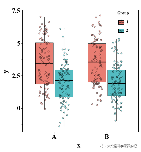
(c)同时调整箱型图和抖动散点图的间距
结语
以上就是分享关于plotnine的内容,感谢关注,欢迎留言提问题。
转载地址:https://blog.csdn.net/weixin_33865450/article/details/112353804 如侵犯您的版权,请留言回复原文章的地址,我们会给您删除此文章,给您带来不便请您谅解!
发表评论
最新留言
关于作者