小程序自定义组件使用详解
发布日期:2021-05-13 21:11:51
浏览次数:19
分类:原创文章
本文共 3528 字,大约阅读时间需要 11 分钟。
之前写过怎么使用小程序的组件,Weui,今天总结一下,怎么使用自定义组件,以 select 下拉框为例
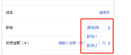
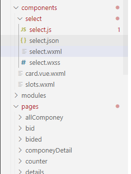
首先,自定义组件,肯定要有组件,我们先在 components 里面新建 select 文件夹 (如果是小程序原生的,里面文件应该会自动生成,我这里用的是 mpvue ,里面的文件 select.js , select.json , select.wxml , select.wxss 是要自己添加的)
select.wxml
<view class='com-selectBox'> <view class='com-sContent' bindtap='selectToggle'> <view class='com-sTxt'>{ {nowText}}</view> <image class="" src="../../../../../static/images/user.png" class='com-sImg' animation="{ {animationData}}"></image> </view> <view class='com-sList' wx:if="{ {selectShow}}"> <view wx:for="{ {propArray}}" data-index="{ {index}}" data-level='{ {item.level}}' wx:key='index' class='com-sItem' bindtap='setText'> { {item.text}} </view> </view></view>select.wxss
.com-sContent { border: 1px solid #e2e2e2; background: white; font-size: 24rpx; position: relative; height: 30px; line-height: 30px;}.com-sImg { position: absolute; right: 10px; top: 11px; width: 16px; height: 9px; transition: all .3s ease;}.com-sTxt { overflow: hidden; text-overflow: ellipsis; white-space: nowrap; padding: 0 20px 0 6px; font-size: 14px;}.com-sList { background: white; width: inherit; position: absolute; border: 1px solid #e2e2e2; border-top: none; box-sizing: border-box; z-index: 3; max-height: 120px; overflow: auto;}.com-sItem { height: 30px; line-height: 30px; border-top: 1px solid #e2e2e2; padding: 0 6px; text-align: left; overflow: hidden; text-overflow: ellipsis; white-space: nowrap; font-size: 14px;}.com-sItem:first-child { border-top: none;}select.json
{ "component": true}select.js
// Componet/Componet.jsComponent({ /** * 组件的属性列表 */ properties: { propArray: { type: Array } }, /** * 组件的初始数据 */ data: { selectShow: false, // 初始option不显示 nowText: '请选择', // 初始内容 animationData: {}, // 右边箭头的动画 }, /** * 组件的方法列表 */ methods: { // option的显示与否 selectToggle: function () { var nowShow = this.data.selectShow // 获取当前option显示的状态 // 创建动画 var animation = wx.createAnimation({ timingFunction: 'ease' }) this.animation = animation if (nowShow) { animation.rotate(0).step() this.setData({ animationData: animation.export() }) } else { animation.rotate(180).step() this.setData({ animationData: animation.export() }) } this.setData({ selectShow: !nowShow }) }, // 设置内容 setText: function (e) { var nowData = this.properties.propArray // 当前option的数据是引入组件的页面传过来的,所以这里获取数据只有通过this.properties console.log('level============', this.properties.level) console.log(nowData) var nowIdx = e.target.dataset.index // 当前点击的索引 var nowText = nowData[nowIdx].text // 当前点击的内容 // 再次执行动画,注意这里一定,一定,一定是this.animation来使用动画 this.animation.rotate(0).step() this.setData({ selectShow: false, nowText: nowText, animationData: this.animation.export() }) var nowDate = { id: nowData[nowIdx].id, text: nowText } this.triggerEvent('myget', nowDate) } }})到这里自定义组件的组件就写好了,然后我们在需要使用的页面引用

在需要使用的页面对应的 .json 文件里面添加
"usingComponents": { "Select": "/components/select/select" }
<Select name='post' propArray='{ {jobList}}' data-type='job' bind:myget='getProjectType'></Select>.js 里面 getProjectType 方法是和 组件里面的 myget 是对应的, 打印出 e.detail 就是组件里面设置的数据了,
getProjectType: function (e) { console.log(e.detail) },
以上直接复制,稍微改改就可以看的明白了
现在讲一下细节
组件之间的传值
具体的可以看


才疏学浅,如有不足,欢迎指出 ,不胜感激 (•̀ᴗ•́)و ̑̑
发表评论
最新留言
初次前来,多多关照!
[***.217.46.12]2025年04月20日 12时42分25秒
关于作者

喝酒易醉,品茶养心,人生如梦,品茶悟道,何以解忧?唯有杜康!
-- 愿君每日到此一游!
推荐文章
python struct 官方文档
2019-03-07
Android DEX加固方案与原理
2019-03-07
Android Retrofit2.0 上传单张图片和多张图片
2019-03-07
iOS_Runtime3_动态添加方法
2019-03-07
Leetcode第557题---翻转字符串中的单词
2019-03-07
Problem G. The Stones Game【取石子博弈 & 思维】
2019-03-07
Unable to execute dex: Multiple dex files
2019-03-07
Java多线程
2019-03-07
Unity监听日记
2019-03-07
AndroidStudio跳到错误位置
2019-03-07
木马开发的基本理论基础(五)
2019-03-07
openssl服务器证书操作
2019-03-07
expect 模拟交互 ftp 上传文件到指定目录下
2019-03-07
linux系统下双屏显示
2019-03-07
PDF.js —— vue项目中使用pdf.js显示pdf文件(流)
2019-03-07
我用wxPython搭建GUI量化系统之最小架构的运行
2019-03-07
我用wxPython搭建GUI量化系统之Sizer布局管理与页面切换
2019-03-07
我用wxPython搭建GUI量化系统之多只股票走势对比界面
2019-03-07
我用wxPython搭建GUI量化系统之财务选股工具添加日历和排序
2019-03-07
selenium+python之切换窗口
2019-03-07
白红宇的个人博客 - 记录点点滴滴的事 - 您是第 461222837 位访客
访问时间: 2025-05-04 23:44:49
访问IP: 18.219.74.193
Copyright © 2020 - 2025 css8.cn 京ICP备2021015314号-1
手机版