解决position: fixed;弹框的中input自定义表单1px border看起来模糊问题
发布日期:2021-05-07 19:33:00
浏览次数:25
分类:原创文章
本文共 3098 字,大约阅读时间需要 10 分钟。
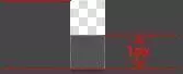
出现的问题:

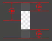
我们想要的效果:

结构:
<body> 咩咩咩咩咩咩咩咩咩咩咩咩咩咩咩咩咩咩咩 <div class="box"> <div class="box_bg"></div> <div class="box_bubble"> <h2>hello!muzidigbig</h2> <input type="text"> </div> </div></body>出现问题的样式:
<style> .box { position: fixed; left: 0; top: 0; height: 100%; width: 100%; text-align: center; } .box_bg { position: fixed; left: 0; top: 0; z-index: -1; width: 100%; height: 100%; background-color: #000; filter: alpha(opacity=30); opacity: .3; } .box_bubble { background: #fff; width: 400px; padding: 50px; text-align: left; border: 2px solid pink; /* 这种定位方式会使input表单设有border的边框线加粗 */ position: absolute; left: 50%; top: 50%; transform: translate(-50%, -50%); } input { border: 1px solid #666; } </style>我们想要的效果的样式:
<!DOCTYPE html><html lang="en"><head> <meta charset="UTF-8"> <meta name="viewport" content="width=device-width, initial-scale=1.0"> <meta http-equiv="X-UA-Compatible" content="ie=edge"> <title>Document</title> <style> .box { position: fixed; left: 0; top: 0; height: 100%; width: 100%; text-align: center; } .box::before { content: ""; height: 100%; display: inline-block; vertical-align: middle; } .box_bg { position: fixed; left: 0; top: 0; z-index: -1; width: 100%; height: 100%; background-color: #000; filter: alpha(opacity=30); opacity: .3; } .box_bubble { background: #fff; width: 400px; padding: 50px; text-align: left; border: 2px solid pink; position: static; top: auto; left: auto; transform: none; margin-left: 0; display: inline-block; vertical-align: middle; } input { border: 1px solid #666; } </style></head><body> 咩咩咩咩咩咩咩咩咩咩咩咩咩咩咩咩咩咩咩 <div class="box"> <div class="box_bg"></div> <div class="box_bubble"> <h2>hello!muzidigbig</h2> <input type="text"> </div> </div></body></html>这里我也有疑问 就是不知道下面这块代码表达的原理是什么?
.box::before { content: ""; height: 100%; display: inline-block; vertical-align: middle; }2.css3---缩放的方式
-webkit-transform:scaleY(0.5)
transform:scaleY(0.5);
3.css3---边框图的方式
用类似的1px图片做border图片
border-width: 0 0 1px 0; border-image: url(linenew.png) 0 0 2 0 stretch;
border-width: 1px 0; border-image: url(linenew.png) 2 0 stretch;
固定,有颜色还得换图
发表评论
最新留言
逛到本站,mark一下
[***.202.152.39]2025年03月31日 14时50分03秒
关于作者

喝酒易醉,品茶养心,人生如梦,品茶悟道,何以解忧?唯有杜康!
-- 愿君每日到此一游!
推荐文章
6.14编一个程序,将两个字符串s1和s2比较,不要用strcmp函数。
2021-05-08
Java纯文本文件显示工具制作
2021-05-08
Unity2D Fixed Joint 2D详解
2021-05-08
六、Numpy的使用(详解)
2021-05-08
三、案例:留言板 & url.parse()
2021-05-08
Python中的filter()函数!!!1
2021-05-08
(新手小白必学!)用Python设计和实现聪明的尼姆游戏(人机对战)!!!!
2021-05-08
Python实验26:计算文件MD5值
2021-05-08
端口探测
2021-05-08
LeetCode:28. 实现 strStr()——————简单
2021-05-08
LeetCode:697. 数组的度————简单
2021-05-08
LeetCode:1052. 爱生气的书店老板————中等
2021-05-08
C语言的6大基本数据类型!(学习C语言小白必备!!)
2021-05-08
Vue——mock模拟数据的使用
2021-05-08
Nginx配置反向代理与负载均衡
2021-05-08
高阶函数reduce
2021-05-08
Lionheart万汇:布林线双底形态分析技巧
2021-05-08
Lionheart万汇:台积电大幅提升资本开支,2021有望续创辉煌
2021-05-08
LHCM万汇:在需求上升中,美国贸易赤字创下历史新高
2021-05-08
白红宇的个人博客 - 记录点点滴滴的事 - 您是第 457321755 位访客