本文共 2474 字,大约阅读时间需要 8 分钟。
目录
教程
basic html and html5
Basic css
position
float
animation
Applied Visual design
Applied Accessibility
tabindex
responsive web design principles
Media Queries
img { max-width: 100%; height: auto; }
Make Typography Responsive: Viewport units
相对设备的高度或者宽度
和百分比的不同在于,百分比是相对父容器的。
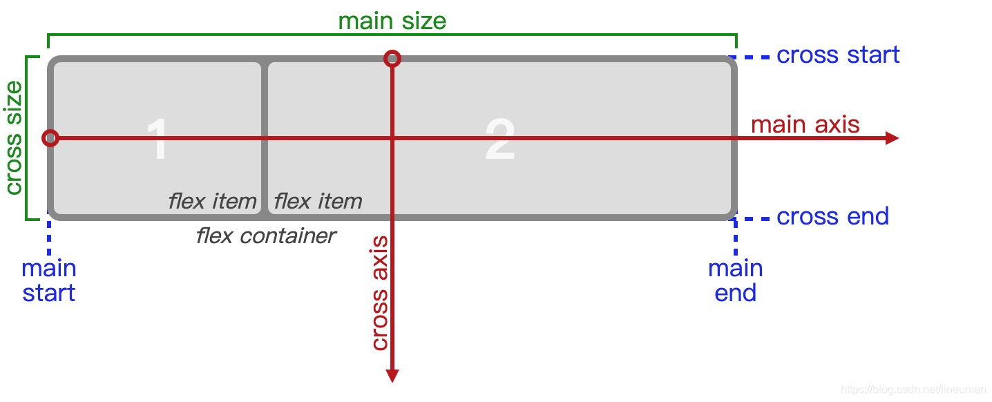
css flexbox
flex container
flex items
flex container
display: flex
flex-direction
flex布局会占用原本的文档流吗?
justify-content: flex-start;
justify-content: center
justify-content: flex-end;
justify-content: space-around;
justify-content: space-between;
align-items
flex-start: aligns items to the start of the flex container. For rows, this aligns items to the top of the container. For columns, this aligns items to the left of the container.
flex-end: aligns items to the end of the flex container. For rows, this aligns items to the bottom of the container. For columns, this aligns items to the right of the container.
center: align items to the center. For rows, this vertically aligns items (equal space above and below the items). For columns, this horizontally aligns them (equal space to the left and right of the items).
stretch: stretch the items to fill the flex container. For example, rows items are stretched to fill the flex container top-to-bottom. This is the default value if no align-items value is specified.
baseline: align items to their baselines. Baseline is a text concept, think of it as the line that the letters sit on.
flex-wrap
nowrap
wrap 换行
wrap-reverse 逆向
Properties for the flex items
flex-shrink
当容器小的时候,可以给items指定收缩比例
When it’s used, it allows an item to shrink if the flex container is too small.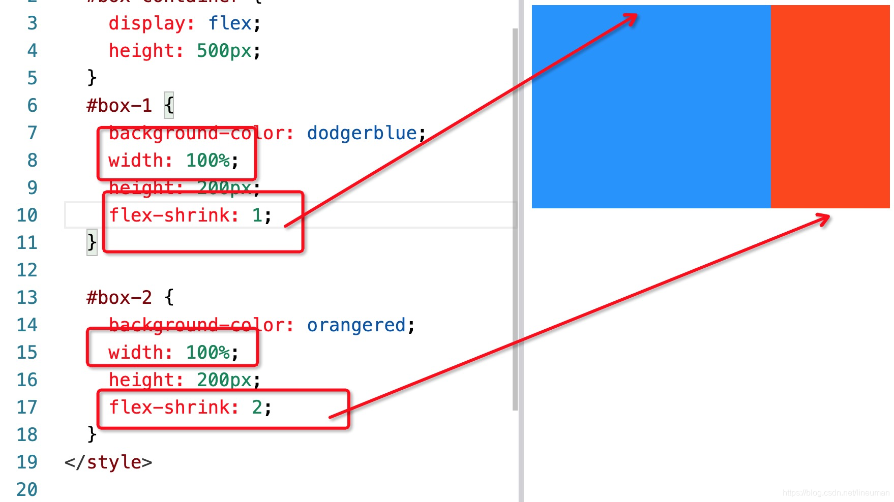
flex-grow
flex-basis
The flex-basis property specifies the initial size of the item before CSS makes adjustments with flex-shrink or flex-grow.
css grid
grid 容齐的属性
display: grid;
Turn any HTML element into a grid container by setting its display property to grid. This gives you the ability to use all the other properties associated with CSS Grid.
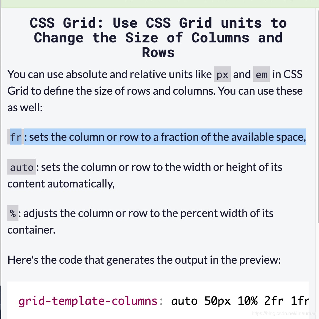
grid-template-columns: 100px 100px 100px;
grid-template-rows: 50px 50px;
grid-column-gap 设置列之间空隙
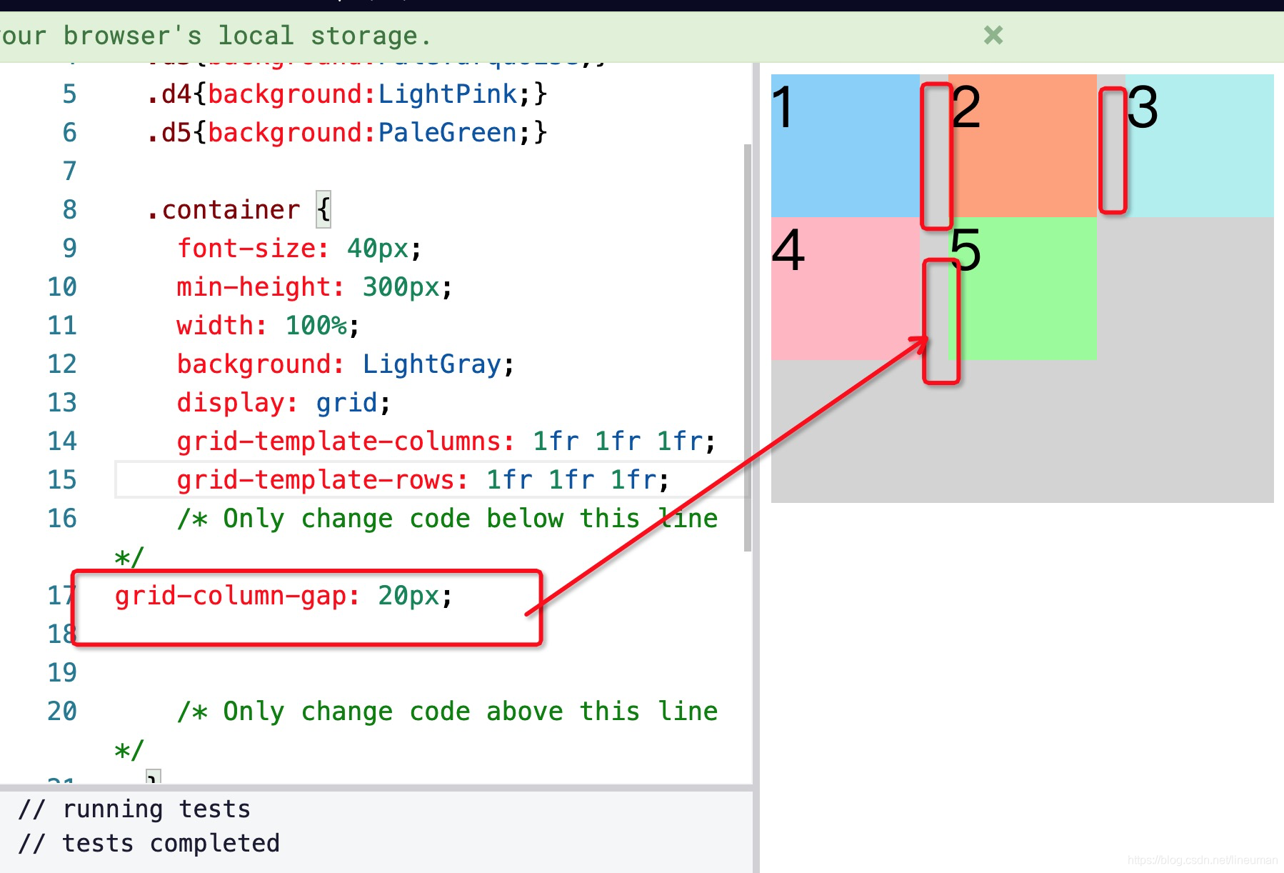
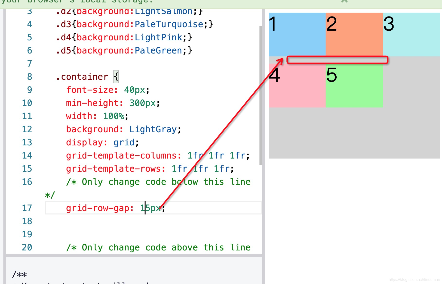
grid-row-gap设置行之间的空隙
grid item的属性
grid-column:
the grid-column CSS property is a shorthand property for grid-column-start and grid-column-end specifying a grid item’s size and location within the grid column by contributing a line, a span, or nothing (automatic) to its grid placement, thereby specifying the inline-start and inline-end edge of its grid area.
grid-row
justify-self
align-self
其他
给每个区域起个名字
grid-template-areas
发表评论
最新留言
关于作者
