HTML——携程旅游案例
 搜索框里的放大镜用::before伪类加绝对定位的方式插入背景图片。宽高25px。 右边的登录部分宽高44px,头像同样是::before伪类的方式插入背景图片,宽高23px。
发布日期:2021-06-29 11:16:37
浏览次数:2
分类:技术文章
本文共 10194 字,大约阅读时间需要 33 分钟。
flex布局概念
flex布局=弹性布局=伸缩布局=伸缩盒布局
1.原理:通过为父盒子添加flex属性,来控制子盒子的位置和排列方式 2.当我们为父盒子设为flex布局后,子元素的float、clear和vertical-align属性失效 3.常见父项属性 ·flex-direction:设置主轴的方向(X轴为主轴,Y轴为侧轴):row(默认值,从左到右)、row-reverse(从右到左)、column(从上到下)、column-reverse(从下到上) ·justify-content:设置主轴上子元素的排列方式:flex-start(默认值,从头开始)、flex-end(尾部开始)、center(居中对齐)、space-arond(平分剩余空间)、space-between(先贴两边,再平分剩余空间!!!!) ·flex-wrap:设置子元素是否换行(flex布局中默认子元素不会换行,如果装不下会默认缩小子元素的宽度):nowrap(不换行,默认)、wrap(换行) ·※align-items:设置侧轴上的子元素排列方式(在单行时候使用):flex-start(默认值,从头开始)、flex-end(尾部开始)、center(居中对齐)、stretch(拉伸,但不要给子盒子高度) ·align-content:设置侧轴上的子元素排列方式(在多行时候使用):flex-start(默认值,从头开始)、flex-end(尾部开始)、center(居中对齐)、stretch(拉伸,但不要给子盒子高度)、space-arond(平分剩余空间)、space-between(先贴两边,再平分剩余空间!!!!) ·flex-flow:flex-direction和flex-wrap的复合属性:row wrap; 4.常见子项属性: ·flex属性定义子项目剩余空间,number输入数字,表示子项目占了几份 span{ flex:number; } ·align-self:允许单个项目在侧轴上与其他项目有不同的对齐方式(会覆盖align-items) ·order:定义项目的排列顺序(数字越小排的越前)
案例
一、整体样式
body { max-width: 540px; min-width: 320px; margin: 0 auto; font: normal 14px/1.5 Tahoma, "Lucida Grande", Verdana, "Microsoft Yahei", STXihei, hei; color: #000; background: rgb(240, 240, 240); overflow-x: hidden; -webkit-tap-highlight-color: transparent;} 二、搜索模块
搜索模块固定在页面顶端,因此需要用到固定定位。用flex进行布局,宽100%(固定定位的盒子必须有宽度),高44px。 搜索框占父盒子的全部,flex:1,舍去右边的登录部分剩下的都是搜索框部分。上边距6px、左边距10px,文本左边距35px。如果不设置边距会变成下面这种情况。 搜索框里的放大镜用::before伪类加绝对定位的方式插入背景图片。宽高25px。 右边的登录部分宽高44px,头像同样是::before伪类的方式插入背景图片,宽高23px。 搜索:目的地/酒店/景点/航班号我 的
.search-index { display: flex; /* 固定定位和父级无关,以屏幕为准 */ position: fixed; top: 0; left: 50%; /* 固定的盒子应该有宽度 */ -webkit-transform: translateX(-50%); transform: translateX(-50%); width: 100%; height: 44px; max-width: 540px; min-width: 320px;}.search-index .search { flex: 1; height: 35px; line-height: 35px; margin: 6px 0 0 10px; border: 1px solid #ccc; background-color: white; border-radius: 15px; padding: 0 0 0 35px;}.search-index .search::before { content: ""; position: absolute; /* 这里采用绝对定位而不用display:block是绝对定位不占位置,display块级元素会独占一行,后面的文字会被挤到下面去 */ top: 10px; left: 20px; width: 25px; height: 25px; background: url(../image/wode.png) no-repeat 0 4px; background-size: 25px;}.search-index .user { width: 44px; height: 44px; text-align: center; font-size: 12px; color: white;}.search-index .user::before { content: ""; display: block; /* 转换为块级元素,才有大小 */ width: 23px; height: 23px; background: url(../image/wode.png) no-repeat 0 -40px; background-size: 23px; margin: 4px auto 0;} 
盒子阴影: box-shadow:h-shadow v-shadow blur spread color inset;
①h-shadow:必需,水平阴影位置,可负数
②v-shadow:必需,垂直阴影位置,可负数 ③blur:选填,模糊距离 ④spread:选填,阴影尺寸 ⑤inset:选填,外部阴影(outset)改为内部的文字阴影: text-shadow:h-shadow
v-shadow blur color;
注意这里要加background-size,否则背景图片无法显示出来。
背景缩放background-size
①background-size:图片的宽度 图片的高度;(空格隔开) ②只写一个参数即宽度,高度自动省略,等比缩放 ③里面的单位可以跟%,相对父盒子来说 ④cover:要扩大到足够大,使得完全覆盖盒子,因此部分背景显示不全 ⑤contain:高度和宽度等比拉伸,当其中一个铺满后就不再拉伸了,因此会有部分空白
.img { width: 100%; height: 225px; border-radius: 0 0 10px 10px; background-image: url(../image/背景.png); background-repeat: no-repeat; background-size: 100% 225px; box-shadow: inset 0px 50px 30px -50px #000;} 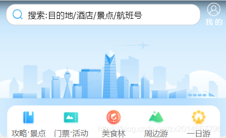
.daohang ul { display: flex; height: 64px; border-radius: 15px; margin: -52px 12px 10px; padding: 4px 0 8px; background-color: white;}.daohang ul li { flex: 1;}.daohang ul li a { display: flex; flex-direction: column; align-items: center;}.daohang ul li a span:nth-child(1) { width: 32px; height: 32px; background-image: url(../image/导航栏精灵图.png); background-size: 32px; background-repeat: no-repeat;}.daohang ul li a .loacl-nav-icon { background-position: 0 0px;}.daohang ul li a .loacl-nav-active { background-position: 0 -32px;}.daohang ul li a .loacl-nav-food { background-position: 0 -64px;}.daohang ul li a .loacl-nav-swim { background-position: 0 -97px;}.daohang ul li a .loacl-nav-day { background-position: 0 -128px;}.daohang ul li a span { font-size: small;} 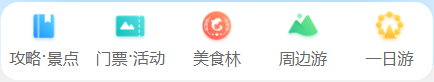
背景颜色渐变: background:linear-grantent(起始位置,颜色1,颜色2)
.nav { margin: 0 4px 3px; border-radius: 8px; overflow: hidden;}.nav .nav-common { display: flex; /* 父盒子要设置display:flex,子盒子才能使用flex:1 */ height: 88px;}.nav .nav-common:nth-child(2) { margin: 3px 0;}.nav .nav-common .nav-items { /* flex:1与display:flex不冲突,他是a的父盒子,是nav-common和子盒子 */ flex: 1; display: flex; flex-direction: column; /* 这里不用align-items: center的原因是如果用了,后面设置边框会出问题,只有内容文本大小的宽度有边框,而不是整个盒子 */ text-align: center; line-height: 44px;}/* 背景颜色线性渐变 */.nav .nav-common:nth-child(1) { /* 背景渐变必须添加浏览器私有前缀 */ background: -webkit-linear-gradient(left, #fc1414, #f5900b);}.nav .nav-common:nth-child(2) { background: -webkit-linear-gradient(left, #4614fc, #1572fc);}.nav .nav-common:nth-child(3) { background: -webkit-linear-gradient(left, #1f880a, #0abe31);}/* 第一第二个盒子设置右边框 */.nav .nav-common .nav-items:nth-child(-n+2) { border-right: 1px solid white;}/* 第二第三个盒子分为上下两个部分 */.nav .nav-common .nav-items a { flex: 1; color: white; text-shadow: 1px 1px rgba(0, 0, 0, .5);}.nav .nav-common .nav-items a:nth-child(1) { border-bottom: 1px solid white;}/* 左边的大盒子设置背景图片,边框去除 */.nav .nav-common .nav-items:nth-child(1) a { border: none; background: url(../image/飞机.png) no-repeat bottom center; background-size: 104px auto;}.nav .nav-common:nth-child(2) .nav-items:nth-child(1) a { background: url(../image/真飞机.png) no-repeat bottom center; background-size: 104px auto;}.nav .nav-common:nth-child(3) .nav-items:nth-child(1) a { background: url(../image/休闲椅.png) no-repeat bottom center; background-size: 104px auto;} 
七、副导航栏模块
这个模块布局思路利用flex并设置flex-wrap: wrap;换行显示,每个li的flex设为20%(flex可以写%,相对于父盒子而言)。这样就能实现两行显示,每行5个li。 每个li里放入超链接a,设置display:flex,把纵轴设为主轴,并侧轴居中。.fu { margin: 5px 4px 5px; border-radius: 8px; overflow: hidden; background-color: white; box-shadow: 1px 1px 10px #ccc;}.fu ul { display: flex; flex-wrap: wrap;}.fu ul li { flex: 20%; /* flex可以写%,相对于父盒子而言 */}.fu ul li a { display: flex; flex-direction: column; align-items: center; justify-content: center;}.fu ul li a .pic { /* 一开始a设置了display: flex后没给.pic设置宽高,导致出错,没有显示效果 */ width: 28px; height: 28px; background: url(../image/下.png) no-repeat 0 0; background-size: 28px;}.fu ul li:nth-child(2) a .pic { background: url(../image/下.png) no-repeat 0 -28px; background-size: 28px;}.fu ul li:nth-child(3) a .pic { background: url(../image/下.png) no-repeat 0 -56px; background-size: 28px;}.fu ul li:nth-child(4) a .pic { background: url(../image/下.png) no-repeat 0 -84px; background-size: 28px;}.fu ul li:nth-child(5) a .pic { background: url(../image/下.png) no-repeat 0 -112px; background-size: 28px;}.fu ul li:nth-child(6) a .pic { background: url(../image/下.png) no-repeat 0 -140px; background-size: 28px;}.fu ul li:nth-child(7) a .pic { background: url(../image/下.png) no-repeat 0 -168px; background-size: 28px;}.fu ul li:nth-child(8) a .pic { background: url(../image/下.png) no-repeat 0 -196px; background-size: 28px;}.fu ul li:nth-child(9) a .pic { background: url(../image/下.png) no-repeat 0 -224px; background-size: 28px;}.fu ul li:nth-child(10) a .pic { background: url(../image/下.png) no-repeat 0 -252px; background-size: 28px;} 
footer { display: flex; margin: 0 5px; overflow: hidden;}footer div { flex: 1; background-color: white; padding: 5px 0;}footer div a { display: flex; flex-direction: column; align-items: center;}footer div a .pic { width: 20px; height: 20px; background: url(../image/wode.png) no-repeat 0 0; background-size: 20px;} 
转载地址:https://blog.csdn.net/zx2014567296/article/details/117430596 如侵犯您的版权,请留言回复原文章的地址,我们会给您删除此文章,给您带来不便请您谅解!
发表评论
最新留言
很好
[***.229.124.182]2024年04月28日 20时37分57秒
关于作者

喝酒易醉,品茶养心,人生如梦,品茶悟道,何以解忧?唯有杜康!
-- 愿君每日到此一游!
推荐文章
左连接、右连接、内连接
2019-04-29
MySQL DQL语句基础(随堂博客)
2019-04-29
MySQL基础练习
2019-04-29
利用MySQL进行数据复杂查询(1)
2019-04-29
利用MySQL进行数据复杂查询(2)
2019-04-29
MySQL 表与表之间的关系
2019-04-29
Python数据处理
2019-04-29
Java练习题(面向对象)
2019-04-29
Python 利用os和shutil复制系统文件
2019-04-29
Python 循环输出菱形字符串
2019-04-29
MySQL常见错误总结
2019-04-29
pymysql 的基础应用
2019-04-29
Html+Css实现 启橙装饰网 项目
2019-04-29
JavaScript 实现哥德巴赫猜想
2019-04-29
JavaScript DOM
2019-04-29
Python 管理程序改进——连接MYSQL
2019-04-29
Python 爬虫
2019-04-29
Python 爬虫-百度风云榜的电影top50
2019-04-29
Python 爬虫-豆瓣影星图片下载
2019-04-29
Excel数据基础操作
2019-04-29
白红宇的个人博客 - 记录点点滴滴的事 - 您是第 309771258 位访客
访问时间: 2024-05-01 22:04:21
访问IP: 18.117.189.7
Copyright © 2020 - 2023 blog.css8.cn 京ICP备2021015314号-1
手机版