HTML——布局技巧
 代码部分:
代码部分: 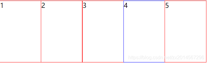


发布日期:2021-06-29 11:16:33
浏览次数:2
分类:技术文章
本文共 2316 字,大约阅读时间需要 7 分钟。
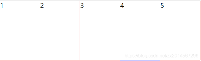
一、margin负值的运用
效果:每个盒子相互紧挨,但是鼠标选中时整个盒子边框都能变色。
代码部分:
- 1
- 2
- 3
- 4
- 5
.box1 ul li { float: left; width: 100px; height: 150px; list-style: none; border: 1px solid red; margin-left: -1px; /* 向左移-1px,让后面的边框压住前面的 */}ul li:hover { /* 如果没有定位,则鼠标经过添加相对定位即可(保留位置) */ position: relative; border: 1px solid blue;}.box1 ul li:hover { /* 如果有定位,则运用z-index提高层级 */ z-index: 1; border: 1px solid blue;} 没有加定位或者z-index提高层级就会被压住
二、文字围绕浮动
浮动最开始的初衷就是为了让文字环绕。
效果:文字围绕浮动的图片
哈哈哈哈哈哈哈哈哈哈哈哈哈哈哈哈哈哈哈哈哈哈
.box2 { width: 300px; height: 70px; background-color: chocolate; margin: 50px auto; padding: 5px;}.box2 .pic { /* 浮动最开始就是为了让文字环绕,因此给图片左浮动文字会默认环绕图片,不用给文字再添加浮动 */ float: left; width: 120px; height: 70px; margin-right: 5px;}.box2 .pic img { width: 100%; height: 100%;} 三、行内块元素运用
行内块元素默认元素一行显示,但彼此之间会有一点空隙,因此可以利用这点省略边距的设置。
效果:元素之间会有空隙 .box3 { /* 父元素设置居中对齐后,里面的行内块元素也会跟着居中,减少了工作量 */ text-align: center;}.box3 a { /* 把每个a变为行内块元素,这样既能设置宽高,又能同一行。同时行内块元素之间默认有空隙,减少了代码量 */ display: inline-block; font-size: 12px; padding: 10px 15px; text-decoration: none; background-color: #ccc; color: rgb(49, 48, 48);}.box3 .no { border: 0; background-color: white;}.box3 input { width: 40px; height: 36px; outline: none;}.box3 button { width: 46px; height: 36px; font-size: 16px; font-weight: 500;} 四、CSS制作三角形
.box4 { width: 0; height: 0; /* 然后把上边距宽度设置大点,颜色改为透明 border-top: 150px solid transparent; border-right: 50px solid yellow; 先把左边框和下边框的宽度设置为0,做出直角三角形 border-bottom: 0 solid blue; border-left: 0 solid purple; */ /* 简写代码如下所示 */ border-color: transparent red transparent transparent; border-style: solid; border-width: 22px 8px 0 0;} 应用场景
五、CSS制作三角框
一个盒子设置上边框和右边框,然后沿着z轴旋转45deg(下右边框则需要旋转-45deg)
效果 .box6 { margin: 0 auto; width: 50px; height: 50px; border-top: 5px solid #ccc; border-right: 5px solid #ccc; transform: rotateZ(45deg);} 转载地址:https://blog.csdn.net/zx2014567296/article/details/116503205 如侵犯您的版权,请留言回复原文章的地址,我们会给您删除此文章,给您带来不便请您谅解!
发表评论
最新留言
初次前来,多多关照!
[***.217.46.12]2024年04月24日 17时19分07秒
关于作者

喝酒易醉,品茶养心,人生如梦,品茶悟道,何以解忧?唯有杜康!
-- 愿君每日到此一游!
推荐文章
Java练习题(面向对象)
2019-04-29
Python 利用os和shutil复制系统文件
2019-04-29
Python 循环输出菱形字符串
2019-04-29
MySQL常见错误总结
2019-04-29
pymysql 的基础应用
2019-04-29
Html+Css实现 启橙装饰网 项目
2019-04-29
JavaScript 实现哥德巴赫猜想
2019-04-29
JavaScript DOM
2019-04-29
Python 管理程序改进——连接MYSQL
2019-04-29
Python 爬虫
2019-04-29
Python 爬虫-百度风云榜的电影top50
2019-04-29
Python 爬虫-豆瓣影星图片下载
2019-04-29
Excel数据基础操作
2019-04-29
网页端数据库操作界面—主题函数文件
2019-04-29
网页端数据库操作界面-Html页面(1)
2019-04-29
网页端数据库操作界面-Html页面(2)
2019-04-29
网页端数据库操作界面-Html页面(3)
2019-04-29
Excel 高级筛选
2019-04-29
Python爬虫 百度热搜热点
2019-04-29
Python 百度热搜 全页面爬取
2019-04-29
白红宇的个人博客 - 记录点点滴滴的事 - 您是第 309812772 位访客
访问时间: 2024-05-02 00:16:43
访问IP: 3.145.59.187
Copyright © 2020 - 2023 blog.css8.cn 京ICP备2021015314号-1
手机版