Flutter设置TabBar indicator宽度(爆改UnderlineTabIndicator )

发布日期:2021-06-28 19:09:52
浏览次数:3
分类:技术文章
本文共 5658 字,大约阅读时间需要 18 分钟。
文章目录
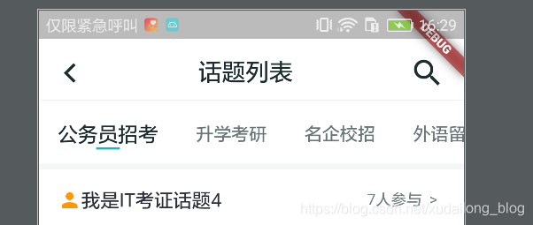
在默认的TabBar中,indicator的宽度是不可以修改的,每个长度都是平分一个Item的,如下图:

这个是未修改的图,下面是修改的图,总的宽度为20
总的在源码里翻来翻去,发现并没有可以设置Indicator的字段,这时候,尝试着通过源码来修改indicator的宽度,同时也是借助了这篇文章,不过,给的有些随意,故在这记录之。
源码探索:
点进TabBar的源码
const TabBar({ Key key, @required this.tabs, this.controller, this.isScrollable = false, this.indicatorColor, this.indicatorWeight = 2.0, this.indicatorPadding = EdgeInsets.zero, this.indicator, //这是我们要修改的indicator this.indicatorSize, this.labelColor, this.labelStyle, this.labelPadding, this.unselectedLabelColor, this.unselectedLabelStyle, this.dragStartBehavior = DragStartBehavior.start, this.onTap, }) : assert(tabs != null), assert(isScrollable != null), assert(dragStartBehavior != null), assert(indicator != null || (indicatorWeight != null && indicatorWeight > 0.0)), assert(indicator != null || (indicatorPadding != null)), super(key: key); 再点进去indicator的源码,发现了有一个默认的UnderlineTabIndicator。

这时候我们再点进去默认的UnderlineTabIndicator,看下是否有进行修改宽度的地方。
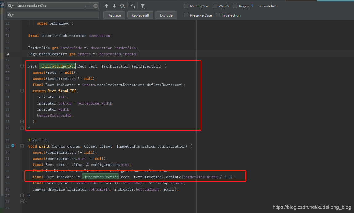
刚好,我们看到了一个print输出,输出的是一个Rect,这个可能恰好是我们说要修改的。
修改:
这时候我们将整个UnderlineTabIndicatorcopy过来,重命名为MyUnderlineTabIndicator,为了避免与官方相冲突。再对上面截图的地方进行修改,下面是总的源码
// Copyright 2018 The Chromium Authors. All rights reserved.// Use of this source code is governed by a BSD-style license that can be// found in the LICENSE file.import 'package:flutter/material.dart';import 'package:flutter/widgets.dart';/// Used with [TabBar.indicator] to draw a horizontal line below the/// selected tab.////// The selected tab underline is inset from the tab's boundary by [insets]./// The [borderSide] defines the line's color and weight.////// The [TabBar.indicatorSize] property can be used to define the indicator's/// bounds in terms of its (centered) widget with [TabIndicatorSize.label],/// or the entire tab with [TabIndicatorSize.tab].class MyUnderlineTabIndicator extends Decoration { /// Create an underline style selected tab indicator. /// /// The [borderSide] and [insets] arguments must not be null. const MyUnderlineTabIndicator({ this.borderSide = const BorderSide(width: 2.0, color: Colors.white), this.insets = EdgeInsets.zero, }) : assert(borderSide != null), assert(insets != null); /// The color and weight of the horizontal line drawn below the selected tab. final BorderSide borderSide; /// Locates the selected tab's underline relative to the tab's boundary. /// /// The [TabBar.indicatorSize] property can be used to define the /// tab indicator's bounds in terms of its (centered) tab widget with /// [TabIndicatorSize.label], or the entire tab with [TabIndicatorSize.tab]. final EdgeInsetsGeometry insets; @override Decoration lerpFrom(Decoration a, double t) { if (a is UnderlineTabIndicator) { return UnderlineTabIndicator( borderSide: BorderSide.lerp(a.borderSide, borderSide, t), insets: EdgeInsetsGeometry.lerp(a.insets, insets, t), ); } return super.lerpFrom(a, t); } @override Decoration lerpTo(Decoration b, double t) { if (b is MyUnderlineTabIndicator) { return MyUnderlineTabIndicator( borderSide: BorderSide.lerp(borderSide, b.borderSide, t), insets: EdgeInsetsGeometry.lerp(insets, b.insets, t), ); } return super.lerpTo(b, t); } @override _MyUnderlinePainter createBoxPainter([ VoidCallback onChanged ]) { return _MyUnderlinePainter(this, onChanged); }}class _MyUnderlinePainter extends BoxPainter { _MyUnderlinePainter(this.decoration, VoidCallback onChanged) : assert(decoration != null), super(onChanged); final MyUnderlineTabIndicator decoration; BorderSide get borderSide => decoration.borderSide; EdgeInsetsGeometry get insets => decoration.insets; Rect _indicatorRectFor(Rect rect, TextDirection textDirection) { assert(rect != null); assert(textDirection != null); final Rect indicator = insets.resolve(textDirection).deflateRect(rect); //希望的宽度 double wantWidth = 20; //取中间坐标 double cw = (indicator.left + indicator.right) / 2; return Rect.fromLTWH(cw - wantWidth / 2, indicator.bottom - borderSide.width, wantWidth, borderSide.width); } @override void paint(Canvas canvas, Offset offset, ImageConfiguration configuration) { assert(configuration != null); assert(configuration.size != null); final Rect rect = offset & configuration.size; final TextDirection textDirection = configuration.textDirection; final Rect indicator = _indicatorRectFor(rect, textDirection).deflate(borderSide.width / 2.0); final Paint paint = borderSide.toPaint()..strokeCap = StrokeCap.square; canvas.drawLine(indicator.bottomLeft, indicator.bottomRight, paint); }} 使用:
Container( height: 46, child: TabBar( indicatorColor: MyColorRes.primaryColor, labelColor: MyColorRes.tvMainSelectColor, unselectedLabelColor: MyColorRes.tvMainUnSelectColor, unselectedLabelStyle: TextStyle(fontSize: 15), labelStyle: TextStyle(fontSize: 17), isScrollable: true, indicator: MyUnderlineTabIndicator(borderSide: BorderSide(width: 2.0, color: MyColorRes.primaryColor)), controller: _tabController, tabs: mTabs.map((value) { return Text(value.name); }).toList(), ), alignment: Alignment.centerLeft, color: MyColorRes.bg_white, ), 更多资源请访问:
关注「蛇崽网盘教程资源」公众号 ,在微信后台回复「领取资源」,获取IT资源200G干货大全。
在微信后台回复「130个小程序」,即可免费领取享有导入就能跑的微信小程序
在微信后台回复「Flutter移动电商」,即可免费领取Flutter移动电商系列全套
转载地址:https://blog.csdn.net/xudailong_blog/article/details/98965866 如侵犯您的版权,请留言回复原文章的地址,我们会给您删除此文章,给您带来不便请您谅解!
发表评论
最新留言
表示我来过!
[***.240.166.169]2024年04月04日 05时17分55秒
关于作者

喝酒易醉,品茶养心,人生如梦,品茶悟道,何以解忧?唯有杜康!
-- 愿君每日到此一游!
推荐文章
虚拟机字节码执行引擎
2019-04-29
HashMap小记
2019-04-29
类的热编译+热加载的功能
2019-04-29
Vector类与ArrayList类
2019-04-29
String特性之 “字符串驻留池”
2019-04-29
集合篇-----ArrayList与LinkedList之间的那些小事
2019-04-29
Linux系统的优点小结
2019-04-29
15个Google面试题,看看自己能答对几个,看你是否真的聪明。。。
2019-04-29
Clone使用方法详解
2019-04-29
Java clone() 浅克隆与深度克隆
2019-04-29
Java中对象与引用
2019-04-29
JDK 1.7 Integer.parseInt 源码解析
2019-04-29
Java单例模式
2019-04-29
三种方法拆分字符串
2019-04-29
贪心算法基本思想和典型例题
2019-04-29
坑爹的小学数学题
2019-04-29
快速找出一个数组中的两个数字,让这两个数字之和等于一个给定的值
2019-04-29
[经典排序算法][集锦]
2019-04-29
无处不在的二分查找
2019-04-29
Java集合框架List,Map,Set等全面介绍
2019-04-29
白红宇的个人博客 - 记录点点滴滴的事 - 您是第 309178893 位访客
访问时间: 2024-04-30 01:13:07
访问IP: 18.226.251.68
Copyright © 2020 - 2023 blog.css8.cn 京ICP备2021015314号-1
手机版